Windows Phone 8.1 Review
by Anand Lal Shimpi on April 14, 2014 10:00 PM EST- Posted in
- Smartphones
- Microsoft
- Mobile
- windows phone
- Windows Phone 8.1
Word Flow Keyboard with Shape Writing Support
The keyboard in WP8.1 gets a pretty big update with the addition of shape writing support. Similar to Swype, SwiftKey Flow and other systems on Android, instead of tapping individual letters on the Word Flow keyboard you can now trace a path over the same letters to form a word. Instead of tapping out A-N-A-N-D, shape writing allows me to start with my finger on A, trace down and to the right to hit N, trace back to hit A, go down/to the right again to hit N, and then drag my thumb/finger one last time to the left and land on the D key before finally lifting off.
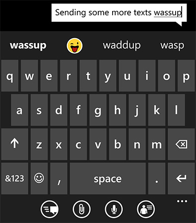
Although new to Windows Phone, shape writing has been around for years on other platforms including Android. The implementation on WP8.1 is excellent however. Shape writing does a great job of leveraging Windows Phone’s predictive text engine. I found that right off the bat I made almost no mistakes while shape writing on WP8.1’s Word Flow keyboard. I could just draw on the screen with my thumb without ever having to look to make sure what I was typing was correct. The only times shape writing didn’t work for me were if I was trying to spell a word that wasn’t yet in the dictionary, or if I was trying to use a contraction that wasn’t immediately obvious (e.g. it’s vs. its). The Word Flow keyboard is extremely quick at adding corrections to its database, so most mistakes happen one time only.
As far as performance goes, I’m still faster at two thumb typing than I am with shape writing. Compared to me typing with a single thumb however, shape writing is substantially quicker. I went through a simple one line typing test several times in all three configurations and recorded my average typing speed on the Nokia Lumia Icon WP8.1 dev preview device:
| Windows Phone 8.1 Word Flow Keyboard Typing Speed | ||||||
| One Handed | One Handed Shape Writing | Two Handed | ||||
| Typing Rate (Higher is Better) | ~41 wpm | ~51 wpm | ~60 wpm | |||
With Windows Phone 8, Microsoft added emoji support to the Word Flow keyboard. In WP8.1, emojis are part of the predictive text engine. If you type a word that has an emoji associate with it, you’ll see the emoji in the suggestion bar. Draw out a word with shape writing and the next suggestion will be the emoji representing that word (if one exists).

Autocorrect suggestions still won’t appear if you’re typing too quickly. If you’re typing above ~45 wpm you won’t see any suggestions. Drop below that point and they’ll populate in the suggestions bar.
Camera UI
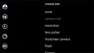
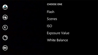
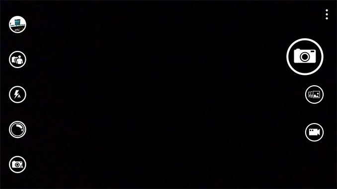
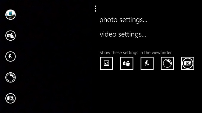
The Camera UI in Windows Phone 8.1 sees a significant set of updates. Like Action Center, there are five customizable buttons directly on the camera UI. By default you get access to the camera roll, front facing camera, scenes, lenses and flash settings without first going into the overflow menu. Every single one of those buttons is customizable though.
 |
 |
There’s a new low resolution (1080p) burst mode that will capture 15 frames and allow you to save all or only the ones that you want. Unsaved frames are automatically deleted after a customizable period of time (7 days by default) or can be removed manually.
The improvements to the camera UI are nice but on devices like Nokia’s Lumia Icon you’re going to be using Nokia’s Camera app instead, making the enhancements more useful on lower end devices.
Calendar
I won’t spend too much time on the updated Calendar app other than to say that the new week view is awesome:
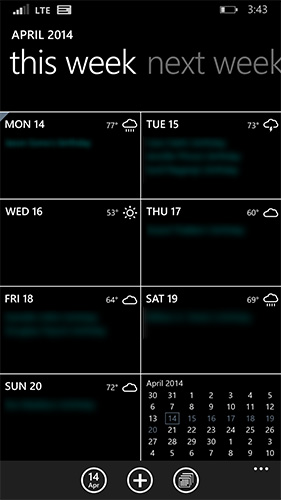
You get a glance at what you’re doing every day of the week, as well as a tiny view of the month as a whole. Swipe to the right to look at next week, and the week after that. Week view in WP8.1’s calendar app is probably one of the most useful things to me personally on any mobile platform. If you’re Apple or a player in the Android space: copy this feature.




111 Comments
View All Comments
sonicmerlin - Monday, April 14, 2014 - link
Why doesn't anyone add test reflow to their browsers? Only android browsers have it, and it makes reading on the web so much easier. Instead with IE 11 MS actually made the font smaller. The added "reader" mode doesn't work on forums or comment sections, and I actually like the layout amd colors of web pages.I would totally buy a windows phone if the browser had text reflow.
at80eighty - Monday, April 14, 2014 - link
ios has had it a while nowMyrandex - Sunday, April 20, 2014 - link
The iPhone 4s that I had running iOS 5 didn't contain this feature.comomolo - Tuesday, April 15, 2014 - link
Actually both Chrome and Firefox for Android DO NOT reflow text. I think Opera for Android is still the best in that regards. Firefox DID it at some point, so there's hope it'll be re-enabled in the future.emn13 - Tuesday, April 15, 2014 - link
Reflow is a standard part of every webbrowser. What specific UI or use-case are you talking about?UpSpin - Wednesday, April 16, 2014 - link
No, I just tested it on the latest Opera Mobile and Chrome for Android.Just open this website here. Of course, Chrome does arrange the website content to make the best of it on a mobile display, but if you want to further zoom in, the text doesn't get rearranged, only increased and you have to scroll to the sides to continue reading. That's different with Opera. As soon as you zoom in, the text gets rearranged so you don't have to scroll to the left or right.
looncraz - Thursday, April 17, 2014 - link
Go to settings and turn it on.Omega215D - Monday, April 21, 2014 - link
The standard Android web browser does this. I'm using it right now on the stock broswer in my HTC One. As for Chrome I think you have to enable it, though some sites may not play well with text reflow.girishp - Tuesday, April 22, 2014 - link
The standard web browser for Android is Chrome, HTC doesn't use Chrome by default. HTC ships a tweaked version of the browser and enables Tex-Reflow on.The problem with Text-Reflow is that it re-arranges the visual elements, typically with poor results. Text is readable, but the content looks bad. I used to disable this on HTC phones.
KarenKLawler - Tuesday, April 15, 2014 - link
Compared to images, text is *obviously* language dependent. I often think the white text on black background motif is overdone since it makes apps look rather monotonous. Screens have color for a reason, color communicates a LOT more densely that text ever will. http://s6x.it/l521