Windows Phone 8.1 Review
by Anand Lal Shimpi on April 14, 2014 10:00 PM EST- Posted in
- Smartphones
- Microsoft
- Mobile
- windows phone
- Windows Phone 8.1
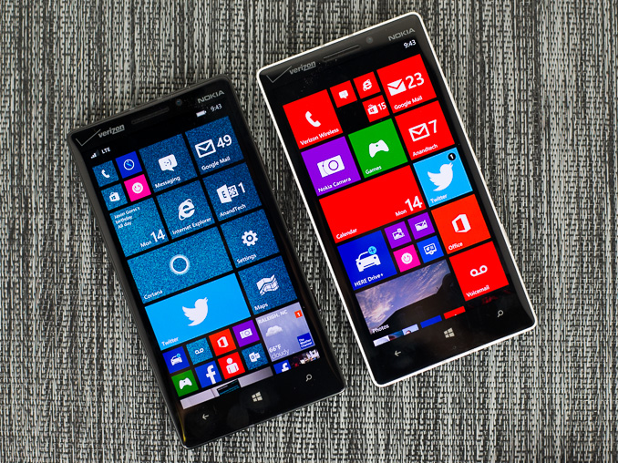
I was an early fan of Windows Phone 7. I remember completely switching over to the platform for about a month back in 2010, and being relatively happy. It wasn’t until I needed tethering support (which didn’t exist in the first release of WP7) that I had to move away. Unfortunately, Microsoft’s software and hardware update cadence for Windows Phone couldn’t pull me back.
In its first three years of existence, Windows Phone received roughly the same number of major updates as Android and iOS. From 2010 - 2013, Google took Android from Gingerbread to KitKat, Apple revved iOS from version 4 to 7, and Microsoft gave us Windows Phone 7, 7.5 and 8.0. At best, you can consider the software release cadence competitive. At worst, it’s not enough. Windows Phone started behind both Android and iOS. To come out ahead, Windows Phone updates had to be more substantive, more frequent or both.
The same could be said about hardware. Microsoft lagged behind Apple and Google to dual-core, 28/32nm silicon, higher resolution displays, and LTE support among other things. Although the situation has improved over the past year, if the goal is to take the #1 or #2 spot, the upgrade cadence needs to be more aggressive.
It always felt like the point of Windows Phone was to be a midpoint between the flexibility of Android and iOS’ guarantee of a certain level of user experience. The platform was born during a time when Android was not yet ready for the mainstream (Gingerbread) as an iOS alternative, and when it still looked like the Windows licensing model would work for handset OEMs.
Today the world is a different place. Android is far more mature than it was in 2010, and it’s polished enough where it can easily be a solution for the enthusiast as well as the first time smartphone user. While Microsoft’s strategy in 2010 might have been one of eyeing the crown, in 2014 the strategy is more humble and focused.
Improve the platform, address issues both little and big, and continue to grow. That’s the mantra these days and today we see it put in action with the arrival of Windows Phone 8.1, the fourth major release of the platform since its arrival in 2010.
I’ve spent the past few days using a Nokia Lumia Icon with the Windows Phone 8.1 developer preview (software available today). All devices capable of running Windows Phone 8 will be getting the 8.1 update for free over the next couple of months. Any new hardware vendors looking to ship Windows Phone 8.1 will be able to do so without paying Microsoft any licensing fees for the software itself.
Although the biggest change to Windows Phone 8.1 happens to be at the API level (including support for universal apps that can run on PCs, tablets and phones), there are a number of user facing feature enhancements that are worth talking about. Microsoft’s reviewer’s guide for Windows Phone 8.1 clocks in at 239 pages, so there’s no way I’ll be able to get to everything here, but I’ll go through several of the highlights.
Start Screen Updates
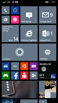
With the GDR3 update to Windows Phone 8, Microsoft added support for a third column of medium sized tiles on 1080p devices with a large display. With Windows Phone 8.1, that flexibility comes to all devices.
The third column is pretty nice, although admittedly the Lumia Icon I was testing WP8.1 on already had it thanks to the WP8.0 GDR3 update. You can use the third column to either have an insane amount of tiles on the display at once or keep everything nice and spread out. Windows Phone ends up covering the broadest spectrum of information density on its home screen as a result.
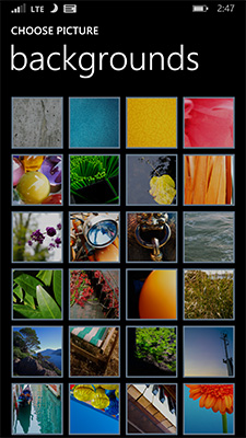
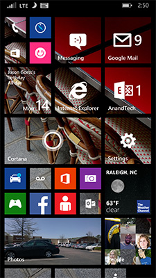
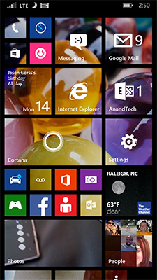
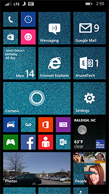
The other big change to the start screen is you can now set a photo as a background, instead of being limited to just white/black. With a photo as your background, your live tiles become transparent and allow your background to show through. Tiles that have a colored logo (e.g. Xbox Games, Facebook app) as well as any hub tiles (e.g. People) remain opaque. Despite going through three major revisions of the OS, Windows Phone hasn’t really changed much visually since its introduction in 2010. The ability to personalize the start screen goes a long way in making the UI more interesting.
The multitasking UI gets a slight update as well in WP8.1. You still tap and hold the back button to activate the UI, but you can now quit out of apps by swiping down on the app’s card.
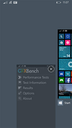
This is quite similar to what’s supported under iOS 7 (where it’s swipe up to quit). Unlike the iOS implementation however you can only swipe down one app at a time.
Revised System Specs
At the introduction of Windows Phone, Microsoft required that all OEMs have a physical camera button in addition to physical or capacitive buttons for back, home and search. It didn’t take long for Microsoft to remove the physical camera button requirement. With Windows Phone 8.1 the back/home/search buttons can be relocated on-screen, similar to what’s done on many Android handsets today. To accommodate those devices that inevitably ship without dedicated OS buttons, the screenshot button combination has changed from Power + Windows button to Power + Volume up.
The adjusted hardware requirements should make it easier for OEMs to take an existing Android hardware design and port it over to Windows Phone.
People Hub API, Disconnected Music+Videos Hub
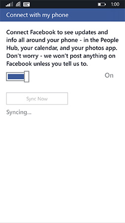
When Windows Phone launched one of the major focal points was the People Hub, a single location for all of your contacts across all accounts/social networks. Previously you had to add accounts to Windows Phone in order for the People Hub to grab contacts from those accounts. With Windows Phone 8.1 Microsoft moves the People Hub from a push to a pull based service. If a 3rd party app supports it, all you need to do is login to the app itself and the People Hub will automatically pull in data from the app. Facebook is the best example of this as you no longer need to login to the Facebook app and then add your Facebook account separately to the People Hub. It’s a subtle change but one that echoes Microsoft’s new position on Windows Phone: rather than you conforming to Windows Phone, the OS should try and conform to you.
The other big hub change is the Music+Videos hub has been split up into two individual apps, each which can be updated independently of the OS.





111 Comments
View All Comments
sonicmerlin - Monday, April 14, 2014 - link
Why doesn't anyone add test reflow to their browsers? Only android browsers have it, and it makes reading on the web so much easier. Instead with IE 11 MS actually made the font smaller. The added "reader" mode doesn't work on forums or comment sections, and I actually like the layout amd colors of web pages.I would totally buy a windows phone if the browser had text reflow.
at80eighty - Monday, April 14, 2014 - link
ios has had it a while nowMyrandex - Sunday, April 20, 2014 - link
The iPhone 4s that I had running iOS 5 didn't contain this feature.comomolo - Tuesday, April 15, 2014 - link
Actually both Chrome and Firefox for Android DO NOT reflow text. I think Opera for Android is still the best in that regards. Firefox DID it at some point, so there's hope it'll be re-enabled in the future.emn13 - Tuesday, April 15, 2014 - link
Reflow is a standard part of every webbrowser. What specific UI or use-case are you talking about?UpSpin - Wednesday, April 16, 2014 - link
No, I just tested it on the latest Opera Mobile and Chrome for Android.Just open this website here. Of course, Chrome does arrange the website content to make the best of it on a mobile display, but if you want to further zoom in, the text doesn't get rearranged, only increased and you have to scroll to the sides to continue reading. That's different with Opera. As soon as you zoom in, the text gets rearranged so you don't have to scroll to the left or right.
looncraz - Thursday, April 17, 2014 - link
Go to settings and turn it on.Omega215D - Monday, April 21, 2014 - link
The standard Android web browser does this. I'm using it right now on the stock broswer in my HTC One. As for Chrome I think you have to enable it, though some sites may not play well with text reflow.girishp - Tuesday, April 22, 2014 - link
The standard web browser for Android is Chrome, HTC doesn't use Chrome by default. HTC ships a tweaked version of the browser and enables Tex-Reflow on.The problem with Text-Reflow is that it re-arranges the visual elements, typically with poor results. Text is readable, but the content looks bad. I used to disable this on HTC phones.
KarenKLawler - Tuesday, April 15, 2014 - link
Compared to images, text is *obviously* language dependent. I often think the white text on black background motif is overdone since it makes apps look rather monotonous. Screens have color for a reason, color communicates a LOT more densely that text ever will. http://s6x.it/l521