Windows Phone 8.1 Review
by Anand Lal Shimpi on April 14, 2014 10:00 PM EST- Posted in
- Smartphones
- Microsoft
- Mobile
- windows phone
- Windows Phone 8.1
Action Center
With Windows Phone 8.1, all three of the major smartphone platforms now have some form of a unified notification hub, all accessed by pulling a shade down from the top of the screen. Microsoft’s attempt is called Action Center, and like most aspects of Windows Phone it occupies a middle ground between Android and iOS.
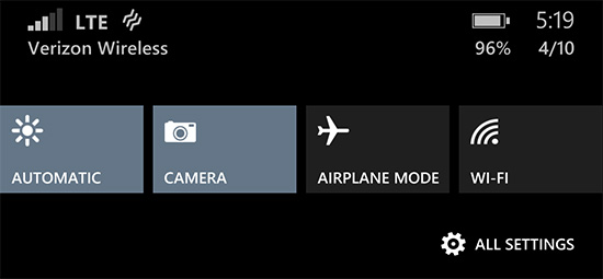
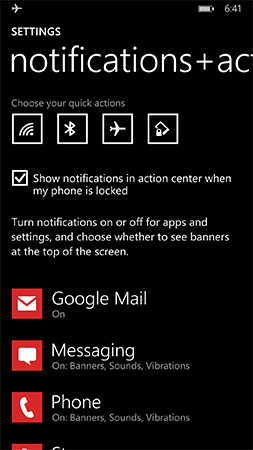
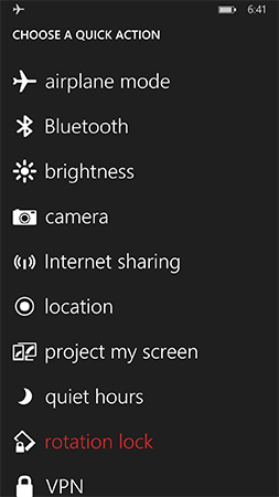
Microsoft’s Action Center gives you direct access to four different shortcuts, the settings menu, and notifications from your apps. All aspects of Action Center are user definable. You can control what shortcuts appear at the top of the shade and you can choose what apps get to display their notifications.
The user customizable launch shortcuts are awesome, although I would like to have one or two more shortcuts to avoid scrolling through the mess that is the Windows Phone settings page.
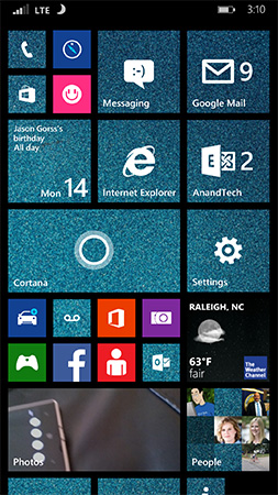
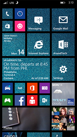
There’s a clear all button in Action Center that not only wipes the screen clean of all notifications, but also propagates the clearing effect down to live tiles as well. In the screenshot below you see I have two emails in my AnandTech account and nine in my Gmail account:
Clearing all notifications in Action Center clears the unread email counter on both live tiles.
The emails remain unread in the apps themselves, which is what you’d expect. If you want to just clear notifications for a single app, just swipe anywhere over the notifications for that app.
Pulling down on the Action Center also reveals a little more information in the Windows Phone status bar. You now get a battery percentage indicator, today’s date and the name of the cellular network you’re connected to. The status bar no longer automatically hides itself either. WiFi and cellular signal strength, notification (if applicable) and battery indicators are all permanently on display.
Microsoft also exposes individual volume controls for notifications (including the ringer) and media playback.
Cortana
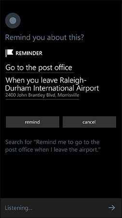
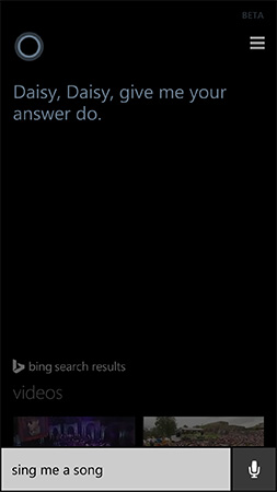
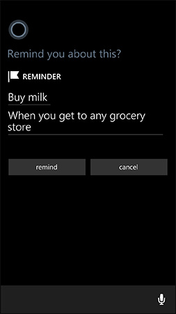
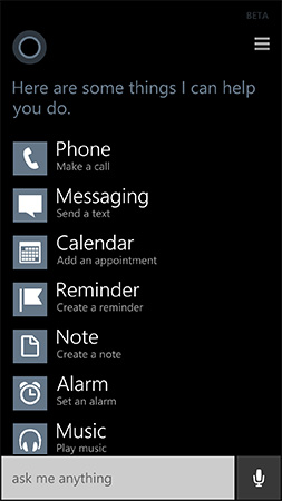
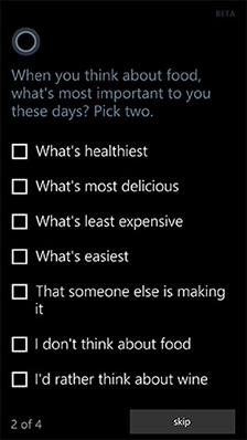
Apple has Siri, Google has Google Now, and Microsoft has Cortana. Pulled straight out of the Halo universe, Cortana ends up being a mix of Siri and Google Now. Cortana launches in beta with the same sort of basic voice assistance you get with Siri in iOS. Hitting the search button will take you to Cortana, while holding it down automatically puts her in listening mode. You can set reminders (including those based on location), create/move calendar events, ask about nearby shops/restaurants, place calls and dictate text messages.
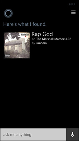
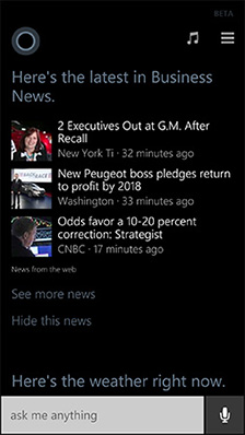
Anything that doesn’t fall into a category that guarantees a verbal response from Cortana triggers a Bing search. By default all Bing searches are aimed at the web but by swiping to the right you can redirect search towards your device itself. Phone search is universal and it’ll index everything from apps to text messages and emails. Cortana features integrated music recognition as well. Just tap the music icon and within a few seconds, if the track exists in the Xbox Music store it'll be identified.
 |
 |
Cortana’s basics work well thanks to Microsoft’s extremely accurate (and speedy) voice recognition. You don’t have to use voice to interact with Cortana, typing is supported as well.
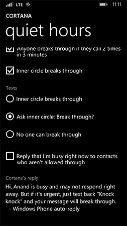
Cortana can prevent incoming notifications from surfacing while you sleep or are in a meeting using a feature called quiet hours. Similar to iOS6’s Do Not Disturb mode, Quiet Hours can be configured to allow certain contacts to break through. In an expansion over what iOS DND can do, Cortana can also instruct contacts who aren’t a part of your “inner circle” to text with a certain passphrase in order to break through quiet hours. Similarly, if any contact calls twice within a 3 minute period they’ll be exempted from quiet hours as well.
Unfortunately Cortana’s usefulness, much like Siri’s, can be quite limited. She’s great for settling alarms and creating meetings, but deeper natural language conversations just can’t happen yet. Cortana can save you from typing something, but that’s about the extent of her usefulness as a voice interaction tool.
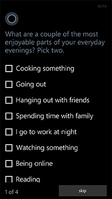
This is where Cortana’s notebook comes in handy. If you allow her to, Cortana will look at your emails and monitor your behavior to determine what information she should float up to your attention. The result is a Google Now like experience, where you get things like reminders of upcoming flights based on emails in your inbox, as well as estimated commute time based on where Cortana thinks you live and work. You can give Cortana hints about your interests and she’ll use Bing news to grab headlines you might want to read. I feel like this is ultimately where these virtual digital assistants will end up, but we’re still at a very early stage in their evolution.
It’s interesting to note that Apple is now the only major smartphone player without a notebook/Google Now-like feature on its mobile platform. It’s no coincidence that the two players that do have that feature also derive revenue from selling advertising against user data. Once features like Cortana and Google Now get good enough, the obvious next step is to send highly targeted advertisements to the end user. It’s not necessarily a bad thing, but it’s clear that’s going to be the next major jump in advertising on mobile.





111 Comments
View All Comments
sonicmerlin - Monday, April 14, 2014 - link
Why doesn't anyone add test reflow to their browsers? Only android browsers have it, and it makes reading on the web so much easier. Instead with IE 11 MS actually made the font smaller. The added "reader" mode doesn't work on forums or comment sections, and I actually like the layout amd colors of web pages.I would totally buy a windows phone if the browser had text reflow.
at80eighty - Monday, April 14, 2014 - link
ios has had it a while nowMyrandex - Sunday, April 20, 2014 - link
The iPhone 4s that I had running iOS 5 didn't contain this feature.comomolo - Tuesday, April 15, 2014 - link
Actually both Chrome and Firefox for Android DO NOT reflow text. I think Opera for Android is still the best in that regards. Firefox DID it at some point, so there's hope it'll be re-enabled in the future.emn13 - Tuesday, April 15, 2014 - link
Reflow is a standard part of every webbrowser. What specific UI or use-case are you talking about?UpSpin - Wednesday, April 16, 2014 - link
No, I just tested it on the latest Opera Mobile and Chrome for Android.Just open this website here. Of course, Chrome does arrange the website content to make the best of it on a mobile display, but if you want to further zoom in, the text doesn't get rearranged, only increased and you have to scroll to the sides to continue reading. That's different with Opera. As soon as you zoom in, the text gets rearranged so you don't have to scroll to the left or right.
looncraz - Thursday, April 17, 2014 - link
Go to settings and turn it on.Omega215D - Monday, April 21, 2014 - link
The standard Android web browser does this. I'm using it right now on the stock broswer in my HTC One. As for Chrome I think you have to enable it, though some sites may not play well with text reflow.girishp - Tuesday, April 22, 2014 - link
The standard web browser for Android is Chrome, HTC doesn't use Chrome by default. HTC ships a tweaked version of the browser and enables Tex-Reflow on.The problem with Text-Reflow is that it re-arranges the visual elements, typically with poor results. Text is readable, but the content looks bad. I used to disable this on HTC phones.
KarenKLawler - Tuesday, April 15, 2014 - link
Compared to images, text is *obviously* language dependent. I often think the white text on black background motif is overdone since it makes apps look rather monotonous. Screens have color for a reason, color communicates a LOT more densely that text ever will. http://s6x.it/l521