The HTC One M9 Review: Part 1
by Joshua Ho on March 22, 2015 7:00 PM EST- Posted in
- Smartphones
- HTC
- Qualcomm
- Mobile
- Snapdragon 810
- One M9
Software: Sense 7
On the software side of things, HTC has refreshed Sense for its latest incarnation, but the changes are relatively few and we’ve generally covered most of them in the launch article, but it’s still well worth going over again. With this new generation of Sense, HTC seems to be more focused upon refining Sense rather than a major redesign. To this end, they’ve introduced a few new key features, but everything else has had only a few minor changes in terms of aesthetics in order to clean things up.
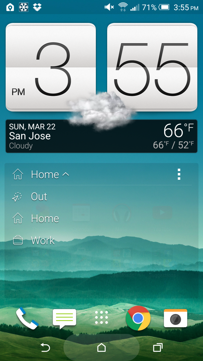
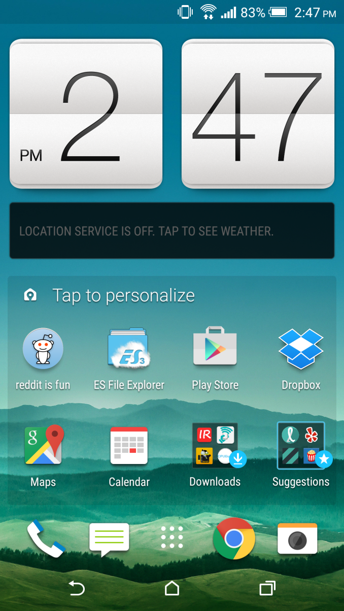
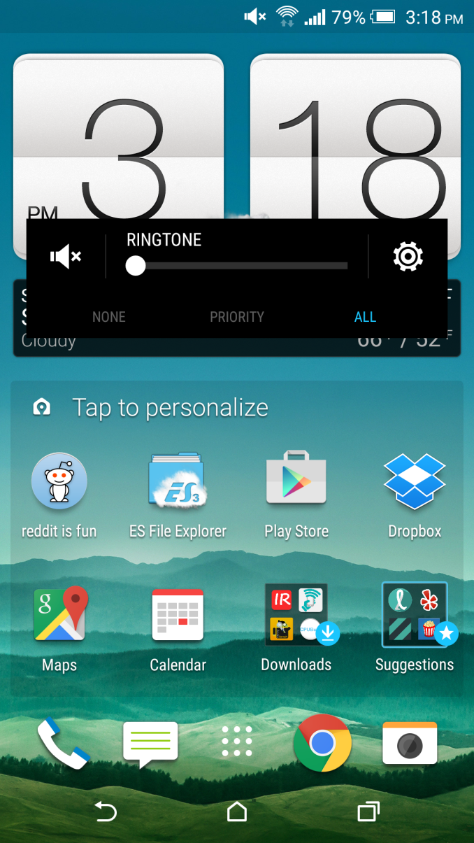
The first major feature that HTC wants to highlight is Sense Home, which is effectively a system that relies on location and time of day to present applications and to avoid cluttering home screens with a sea of icons, as HTC puts it. To this end, I found that the system actually works pretty well, but I’m not really sure if it’s all that valuable as I tend to use a small set of the same applications regardless of location and the time of day. I think the harder problem that HTC needed to solve to really make this a compelling experience is to try and predict cases where applications aren’t on a homescreen but are likely to be used in the near future. However, the problem here is that Google Now basically solves that problem as well. As a result, power users aren’t really going to be very interested in using this widget. There are also some issues with how the app requires a “recommended apps” folder, which ends up rather intrusive in practice feels closer to sponsored placement than anything else.
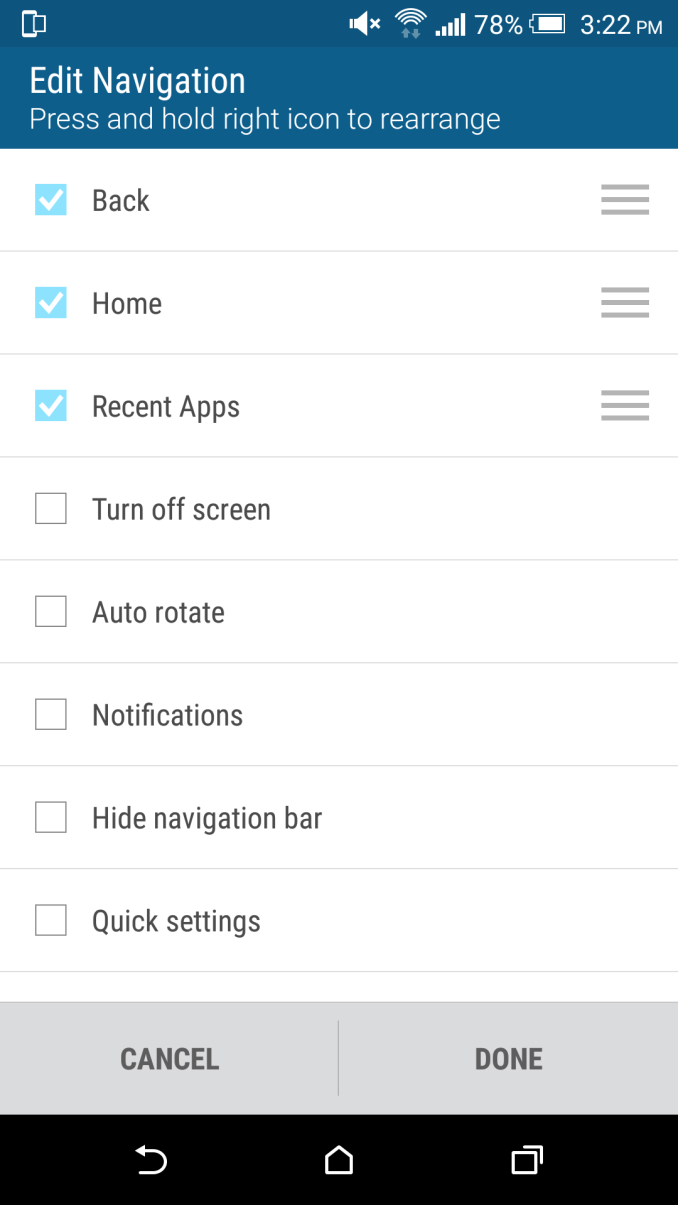
The other features HTC highlighted as new additions were additional personalization and lock screen recommendations. In general, these are definitely helpful additions to the UI. The personalization allowed on the on screen buttons makes it possible to do things like enable and disable rotation, hide the on screen buttons, put the phone to sleep, open the notification drawer, or open the quick settings drawer. The ability to customize and rearrange these navigation buttons is definitely a neat feature, and it’s good to see that HTC is taking advantage of the on screen buttons even if it isn’t a novel idea.
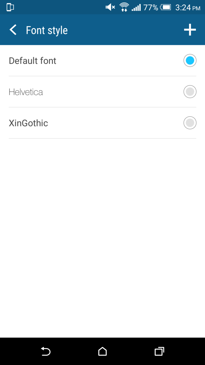
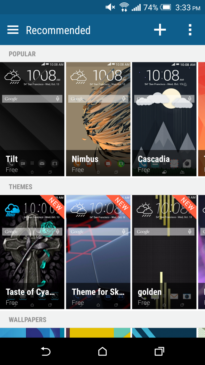
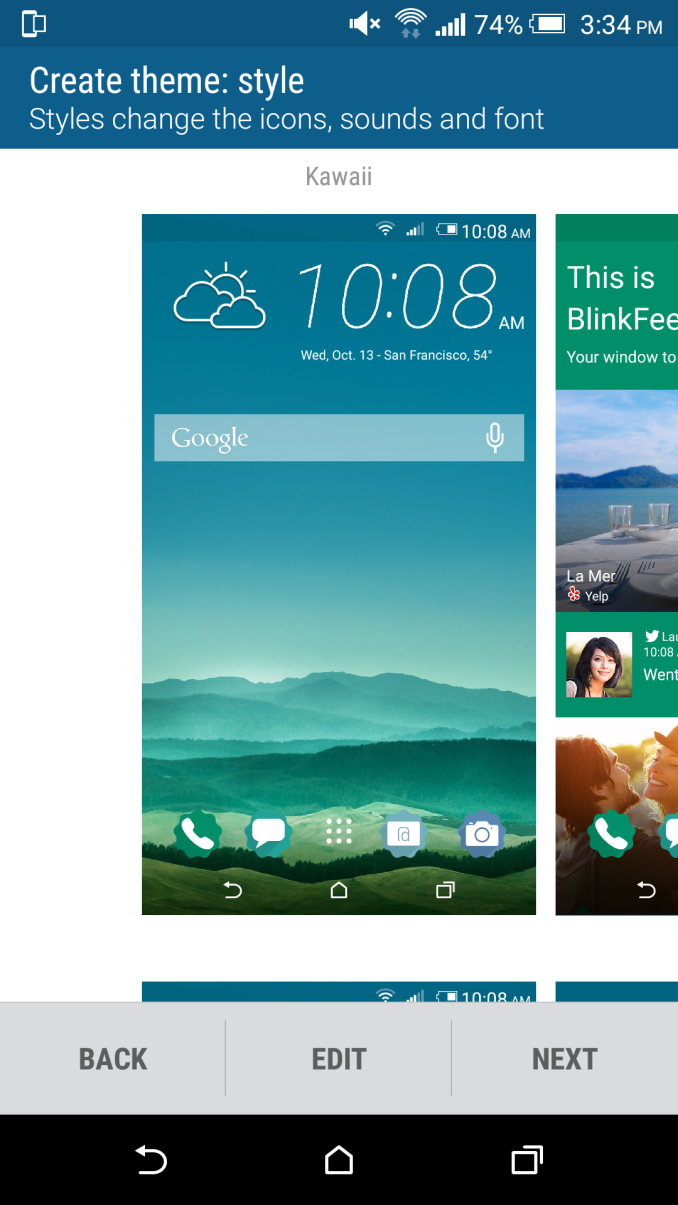
Themes were the other aspect that was meant to make Sense 7 more personal for the end user, and this is probably the single biggest change to Sense 7 when compared against the previous version. HTC has really made it easy to customize themes with a single tap, by taking a wallpaper or any photo and automatically generating icons, backgrounds, and color schemes based upon the photo given. In addition, it’s possible to download themes from HTC’s theme application, and it’s also possible to make a custom theme online for extra control. In practice, after testing out the theming system, I’m not really sure that the default system is really all that useful. It does work as promised, but the results aren’t really going to fit with anything that follows Holo or Material Design guidelines. I definitely think that someone that makes a determined effort could make a compelling theme, but this is by no means guaranteed.
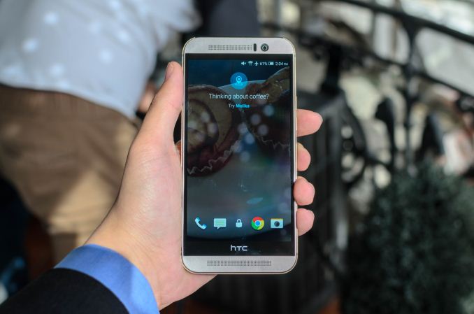
The final change is to the lock screen, which introduces food and drink recommendations on the lock screen. Once again, there’s a sense that this isn’t done purely for the sake of user experience, but in my experience this aspect of Sense is at least somewhat helpful, even if most suggestions end up being ignored. In practice, I’m not sure that a lot of users will find this feature all that helpful, and there is some level of concern that such location polling could reduce battery life, but it’s hard to notice such impacts without extensive usage and comparison.
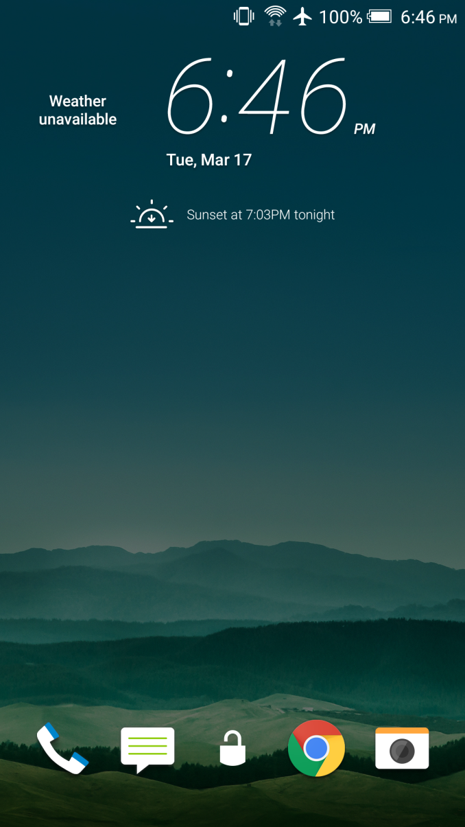
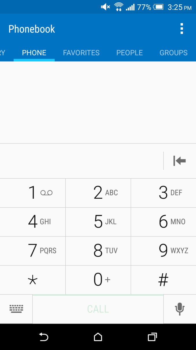
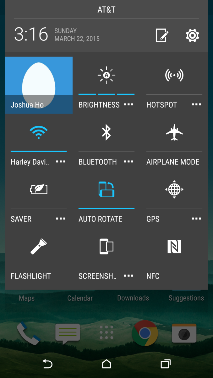
Outside of these changes, Sense 7 is mostly composed of cosmetic changes. These do help to make the UI look a bit more modern, but HTC definitely needs to do a redesign to make everything fit in with material design. Unfortunately, it’s rather hard to show this with pictures as so much of Material Design is focused on animations which help to introduce a sense a continuity. While Lollipop’s animations help to make it feel like everything is grounded in a certain way, Sense 7 seems to have some rather jarring animations, such as returning to home screens without any real transition at all. There are cases where HTC does get this right, like the quick settings menu, but in general this seems to be a weakness of Sense 7.
Overall, Sense 7 remains a relatively strong UI, even if the additions over Sense 6 aren’t particularly compelling. HTC has managed to do a good job here, but future versions definitely need to focus more strongly on keeping up with Google’s design guidelines. There also seems to be some minor frame drops in rare cases in the UI, which seems to suggest either that Sense 7 isn’t as optimized as Sense 6 or that the Snapdragon 810 isn’t able to ramp up as quickly to respond to demand as previous SoCs.




132 Comments
View All Comments
PC Perv - Sunday, March 22, 2015 - link
"Unfortunately, with the move to the Peel remote application it seems that the default application no longer supports receiving OR codes."What the heck doss that mean?
Ryan Smith - Sunday, March 22, 2015 - link
IR codes, we meant.PC Perv - Sunday, March 22, 2015 - link
Really, so can I use it as a remote or not?JoshHo - Sunday, March 22, 2015 - link
The key distinction is IR receiving vs transmitting. Transmission is generally universal, receiving is generally not as universal among smartphones.leexgx - Friday, March 27, 2015 - link
to bad you do not compare 2 generations back as well (in this case the M7) as most people have 2 year contracts not 1 year (as i have the M7 i had to look at the charts)so GPU side seems to be twice as fast CPU side seems to be 50% faster than the M7 (and that horrible cam on the M7 is now 20MB witch should of happened on the M8) battery looks like its going to be good (but need the m9 part 20) but most of that is due to Larger battery (witch in my view should be 3000-3100mAh
PC Perv - Sunday, March 22, 2015 - link
"Doing some quick calculations would mean that the M9 consumed about an average of 1.22 watts throughout the test, while the M8 consumed about an average of .91 watts throughout the test."Average of what? Per minute? Per hour? Per run? Average throughout the test?!
"Running this same test on HSPA+ actually increases the gap in efficiency between the M8 and M9, but the difference is around 5%."
5% of what exactly?
"..in PCMark I noticed that the M9 reached about 40C, which brings it close enough to the new update's maximum skin temperatures that all three tests must be re-done."
Huh?
In page 2, is the charge time measured with the supplied charger (1.5A) or using a 2.0A charger?
I only finished reading the first 2 pages.
Ryan Smith - Sunday, March 22, 2015 - link
"Average of what? Per minute? Per hour? Per run? Average throughout the test?!"An average of 1.22 watts throughout the duration of the test.
wiz329 - Sunday, March 22, 2015 - link
A Watt is a unit of power, not energy, so it makes perfect sense.It's an average power usage throughout the entire test. It used X energy per time on average throughout the entire test.
garbagedisposal - Sunday, March 22, 2015 - link
Are you genuinely retarded?I feel for AT's writers who have to hold back when they reply to comments by idiots like these.
GC2:CS - Monday, March 23, 2015 - link
One watt = one joule per second