The HTC One M9 Review: Part 1
by Joshua Ho on March 22, 2015 7:00 PM EST- Posted in
- Smartphones
- HTC
- Qualcomm
- Mobile
- Snapdragon 810
- One M9
For the most part, HTC’s story in the recent past has been well-understood. Starting with the G1, HTC was the first to adopt Android, with massive success as others lagged behind. However, around the time of the Sensation, we saw HTC’s fortunes peak and begin to fall. With the strength of Samsung’s success, HTC crumbled under competitive pressure as their product line became increasingly fragmented, with no real direction. HTC reacted with the One line of phones, but the One X was hurt by the use of Tegra 3 over Snapdragon S4 for most variants, the flexible back cover could easily damage antenna connectors and ruin reception, and in general the One X wasn’t really well-differentiated.
The One M7 was essentially the phone that saved HTC. While at the time it wasn’t as clear, the One M7 was ultimately a better phone than any flagship phone that competed with it. The display was and still is incredible, the design clearly differentiated and well-executed, Sense 5 was smooth and well-designed, the front-facing speakers made for amazing media experiences, and the camera was somewhat of a revelation at the time for its low light quality. The One M8 continued this by refreshing the M7 in some key areas, but areas like the camera weren’t really improved upon, the design was a bit too rounded, and the ergonomics of the bigger phone weren’t the greatest due to the top-mounted power button.
The One M9 attempts to take the M8 and address all of these issues. To get the basic changes out of the way, I’ve included the spec sheet below.
| HTC One M8 | HTC One M9 | |
| SoC | MSM8974ABv3 2.26 GHz Snapdragon 801 | MSM8994 2/1.5 GHz A57/A53 Snapdragon 810 |
| RAM/NAND | 2GB LPDDR3 16/32GB NAND + microSD |
3GB LPDDR4 32GB NAND + microSD |
| Display | 5” 1080p LCD | 5” 1080p LCD |
| Network | 2G / 3G / 4G LTE (Qualcomm MDM9x25 IP UE Category 4 LTE) | 2G / 3G / 4G LTE (Qualcomm UE Category 7/9 LTE) |
| Dimensions | 146.36 x 70.6 x 9.35mm max, 160 grams | 144.6 x 69.7 x 9.61mm max, 157 grams |
| Camera | 4.0 MP (2688 × 1520) Rear Facing with 2.0 µm pixels, 1/3" CMOS size, f/2.0, 28mm (35mm effective) and rear depth camera 5MP Front Facing, f/2.0 |
20MP Rear Facing w/ 1.12 µm pixels, 1/2.4" CMOS size, f/2.2, 27.8mm (35mm effective) 4MP Front Facing, 2.0 µm pixels, f/2.0 26.8mm (35mm effective) |
| Battery | 2600 mAh (9.88 Whr) | 2840 mAh (10.79 Whr) |
| OS | Android 5 with Sense 6 | Android 5 with Sense 7 |
| Connectivity | 802.11a/b/g/n/ac (WCN36880) + BT 4.0, USB2.0, GPS/GNSS, MHL, DLNA, NFC | 802.11a/b/g/n/ac (BCM4356) + BT 4.1, USB2.0, GPS/GNSS, MHL, DLNA, NFC |
| SIM Size | NanoSIM | NanoSIM |
As we can see, some of the primary areas of improvement include the new Snapdragon 810 SoC, more RAM, more internal storage, better cameras, and a bigger battery. As we’ll soon see, some of these might not be improvements. Before we get into the review though, it's important to emphasize that HTC released a major update to the software around Friday morning which significantly impacted key aspects of the experience, which include throttling performance and aspects of camera tuning. Although we have results for these areas from previous firmware builds, casual testing revealed that there were significant differences in many results. We will explore all of these changes in the second part of the review. This part of the review will only cover aspects which didn't change across firmware builds.
Design
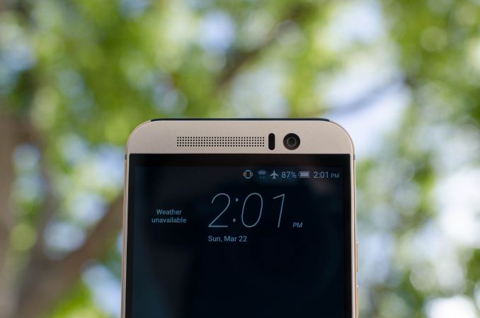
At any rate, one of the more immediate aspects of the phone is the design. HTC has been a leader in the Android space for design and build quality for the past few years, and the M9 clearly shares its lineage with the M7 and M8. In some ways, it’s basically a combination of the two. The same front speaker design is shared with the M8, but the plastic bezel has been updated to surround the entire front of the device instead of just the speakers. It’s a bit unfortunate that the speaker grilles still aren’t made of aluminum, but I suspect that there are some cost and quality control concerns that are affecting this decision. The speakers appear to be mostly the same, but there's a new NXP TFA9895 amp/speaker protection IC, which should help improve quality and volume of the speakers.
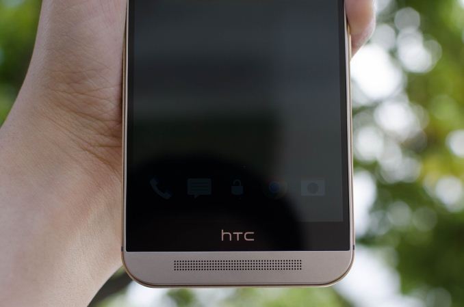
One of the notably divisive elements of this phone remains the bottom bezel, often called the “logo bar”. It is a bit unfortunate that this remains, but we’re basically fighting physics here. Casual examination of any number of teardowns online will reveal that there’s a pretty significant bezel requirement for any smartphone. The only real question is how to best deal with it, and I suspect it may make more sense to either find a way to integrate three capacitive buttons on this bezel or move it to the top of the display to make typing less uncomfortable. Other than this, the front of the device is somewhat unremarkable. The corners have a noticeably tighter radius of curvature, but other than that there really isn’t much to discuss.
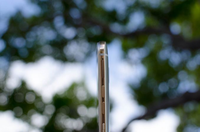
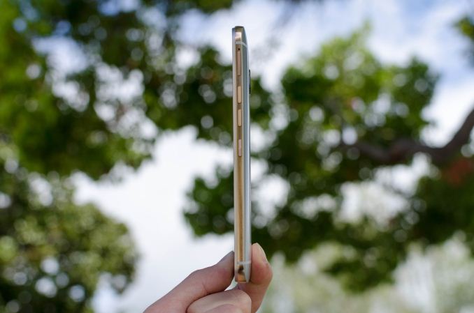
The side and back cover of the phone is really where most of the changes are. The power button has been moved from the top-right on the M8 to the center of the right side on the M9. Unfortunately, this makes the power button a bit too low for my taste. It’s hard to press it when holding the phone in my hand normally, but it’s extremely easy to press it on accident when setting it down. It would definitely help if the power button was higher, and if the volume buttons were moved to the left side of the phone. Other than this, HTC’s port configuration is pretty standard. The USB port and 3.5mm jack are both on the bottom of the phone but offset to the right to improve usability when the phone is in landscape with either port in use. It would be nice to see USB type C here, but given that the latest phones are still launching with microUSB ports I suspect there have been other issues preventing adoption in this case. The left side of the phone has nothing on it, and the top of the phone has a plastic window to allow things like the infrared port to work properly. Unfortunately, with the move to the Peel remote application it seems that the default application no longer supports receiving IR codes.
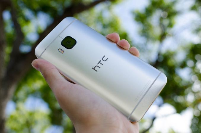
On the back of the phone, we see that the second camera for depth sensing is gone, and that the camera lens is now square instead of a circle and made of sapphire to avoid scratches that seemed to be an issue on the M8. There’s a camera hump, but it’s basically inconsequential here.The edge between the side and the back of the phone is also no longer rounded, and is sharp as there isn’t a chamfer. It turns out that this is actually pretty uncomfortable and even sharper than the M7 in the hand as a result. HTC claims that this is done for better grip, but in practice it feels like HTC may have pushed too far here. To their credit, the new brushed finish is awesome and managed to fix a lot of the issues with feel of the brushed finish with the M8. HTC states that the dual anodization finish of the M9 takes twice as long, and that the brushed finish is also quite difficult to pull off as yield is much lower than the typical sand-blasted finish of other aluminum unibodies. I’m sure some will appreciate this attention to detail, but I’m not sure most will notice the difference when compared to the M7 and M8. Overall, I can appreciate the improvements from the M8 but I’m not sure HTC took the right direction here, as they’ve dramatically increased cost and reduced yield of the back cover in order to achieve an effect that may be hard to appreciate in practice. The ergonomics of the phone have meaningfully improved, but the improvements in design overall are quite subtle and casual observers will probably view the M9 and M8 as basically interchangeable.




132 Comments
View All Comments
PC Perv - Sunday, March 22, 2015 - link
"Unfortunately, with the move to the Peel remote application it seems that the default application no longer supports receiving OR codes."What the heck doss that mean?
Ryan Smith - Sunday, March 22, 2015 - link
IR codes, we meant.PC Perv - Sunday, March 22, 2015 - link
Really, so can I use it as a remote or not?JoshHo - Sunday, March 22, 2015 - link
The key distinction is IR receiving vs transmitting. Transmission is generally universal, receiving is generally not as universal among smartphones.leexgx - Friday, March 27, 2015 - link
to bad you do not compare 2 generations back as well (in this case the M7) as most people have 2 year contracts not 1 year (as i have the M7 i had to look at the charts)so GPU side seems to be twice as fast CPU side seems to be 50% faster than the M7 (and that horrible cam on the M7 is now 20MB witch should of happened on the M8) battery looks like its going to be good (but need the m9 part 20) but most of that is due to Larger battery (witch in my view should be 3000-3100mAh
PC Perv - Sunday, March 22, 2015 - link
"Doing some quick calculations would mean that the M9 consumed about an average of 1.22 watts throughout the test, while the M8 consumed about an average of .91 watts throughout the test."Average of what? Per minute? Per hour? Per run? Average throughout the test?!
"Running this same test on HSPA+ actually increases the gap in efficiency between the M8 and M9, but the difference is around 5%."
5% of what exactly?
"..in PCMark I noticed that the M9 reached about 40C, which brings it close enough to the new update's maximum skin temperatures that all three tests must be re-done."
Huh?
In page 2, is the charge time measured with the supplied charger (1.5A) or using a 2.0A charger?
I only finished reading the first 2 pages.
Ryan Smith - Sunday, March 22, 2015 - link
"Average of what? Per minute? Per hour? Per run? Average throughout the test?!"An average of 1.22 watts throughout the duration of the test.
wiz329 - Sunday, March 22, 2015 - link
A Watt is a unit of power, not energy, so it makes perfect sense.It's an average power usage throughout the entire test. It used X energy per time on average throughout the entire test.
garbagedisposal - Sunday, March 22, 2015 - link
Are you genuinely retarded?I feel for AT's writers who have to hold back when they reply to comments by idiots like these.
GC2:CS - Monday, March 23, 2015 - link
One watt = one joule per second