A Month with the iPhone 5s: Impressions from an Android User
by Joshua Ho on August 24, 2014 7:00 AM EST
Introduction
I must confess that the last time I used an iPhone was three or four years ago. While I’ve followed the hardware changes from generation to generation, I’ve never really been able to write about the iPhone or iOS in detail. While objective data is great to work with, a great deal of evaluation relies on subjective experience. To fix this gap in knowledge, I received an iPhone 5s. After a month, I’ve really come to have a much more nuanced view of how Android and iOS compare, along with how Apple’s iPhone compares to the rest of the smartphone market.
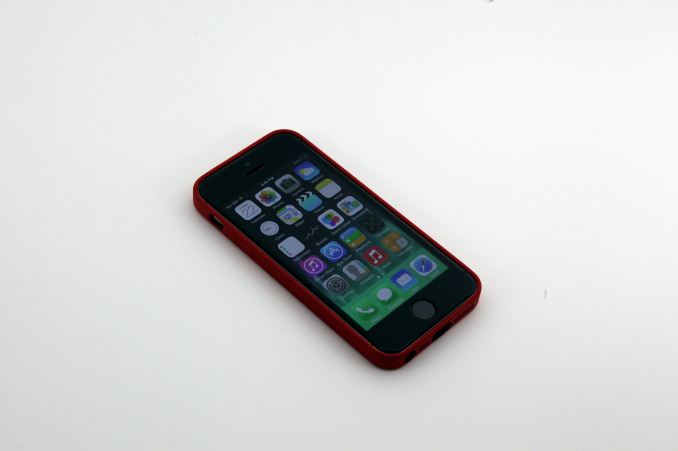
At this point, the iPhone 5s is a phone that doesn’t need much in the way of introduction. After all, it’s been almost a year since it was first announced, and Apple is ready to announce a new iPhone within the coming months if their yearly release cycle holds. For those that need a bit of a refresh on the iPhone 5s, I’ve included a spec table below.
| Apple iPhone 5s | |||
| SoC | Apple A7 | ||
| Display | 4-inch 1136 x 640 LCD sRGB coverage with in-cell touch | ||
| RAM | 1GB LPDDR3 | ||
| WiFi | 2.4/5GHz 802.11a/b/g/n, BT 4.0 | ||
| Storage | 16GB/32GB/64GB | ||
| I/O | Lightning connector, 3.5mm headphone | ||
| Current OS | iOS 7.1.2 | ||
| Battery | 1570 mAh, 3.8V, 5.96 Whr | ||
| Size / Mass | 123.8 x 58.6 x 7.6 mm, 112 grams | ||
| Camera | 8MP iSight with 1.5µm pixels Rear Facing + True Tone Flash 1.2MP with 1.9µm pixels Front Facing |
||
| Price | $199 (16GB), $299 (32GB), $399 (64GB) on 2 year contract | ||
Hardware
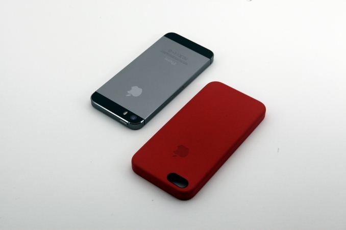
The hardware is ultimately the foundation that software rests upon, so it’s a good place to start. While it’s easy to appreciate industrial and material design by just holding or looking at the phone, everything else requires some real hands-on time. One of the first things I noticed was that the feel of the buttons. Normally, I expect buttons to have a bit of slack before they actuate. In all of the buttons on the iPhone 5s, this doesn’t happen at all. Instead, the button only depresses when triggered. In the case of the volume and power buttons, the activation gives a clean click. On most smartphones I’ve used, the feel and sound of this activation tends to be a bit more mushy and subdued. The home button is the one exception here, which has a noticeably longer travel and less distinctive actuation/mushier feel but I suspect that TouchID is the reason for this difference.
The other difference that I noticed was the size. For a long time now I’ve had the opinion that this generation of Android smartphones have simply gotten too big to be comfortably used with one hand. I still think that the limit for flagship smartphones (not phablets) is around a five inch display, and no larger than the smartphones that we saw in 2013. This includes devices like the Nexus 5, HTC One (M7), and Samsung Galaxy S4, which are all comfortable in the hand and relatively easy to manipulate. As a result, using the iPhone 5s is a significant departure. Reaching the top left corner of the display is relatively simple compared to some of the smartphones on the market today. While physical size is a matter of preference, I suspect that total device width shouldn't exceed 70-71mm, and height is probably shouldn't exceed 140-141mm, although there's a great deal of leeway as the shape of the phone can make a phone seem larger or smaller than it really is. In the case of the iPhone 5s, although the physical size is easy to handle I definitely notice the effect of the smaller display when trying to browse desktop websites, view photos, and watch videos. Anyone coming from Android at this point in time will probably miss the large displays that Android OEMs tend to integrate.
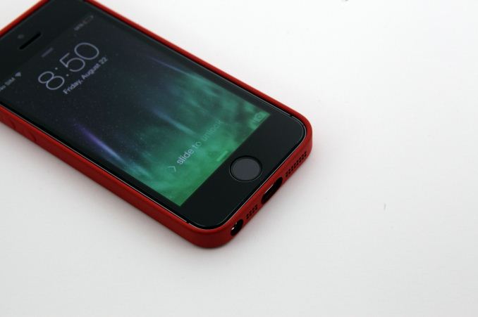
Of course, display is one of the biggest aspects of the smartphone experience, and is more than just a matter of size. In many measures, the iPhone 5s display is great. There’s no overly wide gamut, noticeable saturation compression, odd green tints in grayscale, or excessively high contrast/gamma. However, the resolution itself is noticeably lower than the 1080p and 1440p displays I’ve gotten used to. This doesn’t seem to affect usability much, but some elements of the UI like the rotation lock symbol are noticeably aliased. I find that around 400 to 500 DPI is generally acceptable to avoid obvious aliasing, but there’s value to going to 500-600 DPI for those that want to use a display for VR or are strongly sensitive to even minor aliasing at 4-6 inches viewing distance. Anyone coming from a phone like the Galaxy S4, G2, or One (M7) will probably notice the fuzzier display but it's probably not bad enough to grate on the eyes.
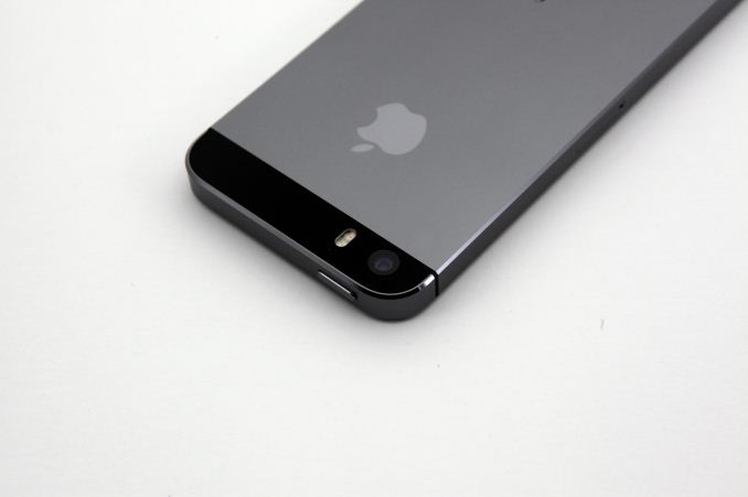
The camera is another major surprise for me. While I’m no optical engineer, it’s clear to me that the camera output is relatively free of smudging from aggressive luminance noise reduction, and the low light performance is much better as a result. I also don’t seem any odd color casts in low light, or noticeable color/chroma noise. Issues like sharpening kernels, halos from unsharp masks, and other artifacts from poor post-processing just aren’t present. In general, Apple has managed to ship a well-tuned camera that seems to be a step above. While I'd like to see a move to larger sensor sizes, it's likely that the thickness of the phone is a gating factor.
Finally, TouchID, the fingerprint sensor on the home button of the iPhone 5s, was a revelation. For reference, I’ve tried the fingerprint sensor on the One max, Galaxy S5 LTE-A, and Galaxy S5 T-Mobile USA. In practice, I would rank them in that order as well, with the One max’s almost 100% reliability to the Galaxy S5’s hit or miss reliability. In general, I’ve found that swipe-based fingerprint sensors can have a good experience on a smartphone, but in cases like both Galaxy S5 variants the ergonomics of swiping on a home button are less than ideal.
While I understood that TouchID was a better solution because of its press and hold nature, the truly compelling aspect of Apple’s implementation has more to do with software than anything. With the systems I’ve used before, enrollment was absolutely critical. Poor data during enrollment would basically make it impossible to actually use the fingerprint sensor. This isn’t true at all with TouchID. While I mapped the center of my fingers relatively well in initial enrollment, I left the extreme edges unmapped. This was easily resolved by slowly edging towards the very edges of my finger to get it to unlock based upon a partial match. In short, it has only gotten better and faster with time. There’s no deliberate effort needed to unlock the device normally at this point, especially because it’s as simple as pressing down the home button and unlock is almost instant for full matches.
In short, the attention to detail on the hardware side is one of the best I’ve seen in this industry. While I would like a larger display and higher pixel density, even now I find very little fundamentally wrong with the iPhone 5s. Of course, it’s not possible to ignore the software side of things. After all, installing Android on an iPhone 5s isn’t realistically possible. While iOS 7 has already been reviewed, for the most part such experiences have been evaluated from the perspective of people that have used iOS extensively through the years.


197 Comments
View All Comments
demol3 - Sunday, August 24, 2014 - link
I cant seem to use the TouchID when my hand is wet (from sweat) and the iPhone screen is quite dark when I am out and about in sunny day. I have been using iPhone for a few years already (also own nexus 7 2013) but personally screen size does matter, 4" seem to be inconvenienced in some scenarios.stucktrader - Monday, September 1, 2014 - link
The screen space is pretty much one of two main reasons(other being price) why many left the iPhone to begin with...craighamilton - Saturday, December 6, 2014 - link
One reason why I choose Android phones over iPhones and there's a lot to choose from (see http://www.topreport.org/phones/ for example...)distinctively - Sunday, August 24, 2014 - link
This article seems to reflect much of the iPhone experience that I perceive myself. That is, until we hit the "Final Words". Reading the user experiences here would indicate a tedious, frustrating experience with an iPhone. That's exactly the impression Apple has left me with. However, for some strange reason, the author can't seem to condemn the iPhone. Polish is just not a word I would use to describe the iPhone. Exasperation would seem to be a better adjective.retrospooty - Sunday, August 24, 2014 - link
"However, for some strange reason, the author can't seem to condemn the iPhone."Anandtech has become very iCentric over the years. I recall the day the iPhone 5 came out they did 14 articles on it. So we are clear, that is not a typo - 14 articles. Any other phone gets 0 to 2 articles at the most.
I agree with the article here though "iOS is designed with average users in mind. As a result, there’s a strong emphasis on making things “just work” and hiding information that would simply confuse and frustrate people that don’t care about the underlying hardware and software. Android at its core is targeted at those that want to have the full PC experience on their phone, and as a result there’s much more information and low level functionality for those that want it. "
iwod - Sunday, August 24, 2014 - link
I have always put it this way, Android is for people who wanted a PC with Phone function added, iPhone users would wanted a Phone with some Computer function added.Personally I think the Anandtech articles are pretty much well balanced. But if you want purely iOS bashing site then may be you should look else where.
Spoony - Sunday, August 24, 2014 - link
I think I know what you are trying to say, but I think those words are not the right ones to express it. I look at that and find myself vaguely insulted. I am a standard nerd, I sit here some nights hacking integrated chipsets and video card firmware for entertainment. I have a Mac laptop and custom built PC desktop. Maybe I'm not the traditional market for the iPhone.I want a computer, not a phone. I never use the phone app willingly. However, I want a computer I don't have to worry about. I don't have to disable GPS on the iPhone whenever I am not using it, I don't have to turn off wifi when I leave the house, nor do I have to be sure background apps are quit lest they eat my battery when I'm not looking. I put the iPhone in my pocket and every time I pull it out everything is as expected. Then I put it back in my pocket again.
Perhaps a better way of saying this is... people who enjoy fiddling with technology like Android. People who would rather not fiddle with that particular thing like iOS.
Iconoclysm - Sunday, August 24, 2014 - link
Here's a better way of saying your last line: People who enjoy fiddling with technology and want to fiddle with their phone like Android. People who would rather not fiddle WITH THEIR PHONE like iOS, whether they fiddle with technology or not.I know a great many developers and engineers who, when they leave their job at the end of the day, are done fiddling with technology. Work/life balance is one reason, the other is that sometimes it is more important to be able to communicate effectively than it is to play with animated widgets on the home screen or hack some native functionality into the OS that can usually just be done with an app anyway. In my view, fiddling with my phone is a complete waste of time, and really puts that whole "the iPhone is a toy" nonsense in a different perspective.
Spoony - Sunday, August 24, 2014 - link
Agree with your correction. By "that particular thing" I meant phone... but that was hideously unclear on my part.RoninX - Monday, August 25, 2014 - link
It's like the debate between people who like to build their own gaming desktops and those who buy pre-made gaming desktops from boutique shops. Some people like the ability to customize their system with the specific components they want, while others just want a system that works and don't want to worry about what motherboard to buy or the difference between SATA and IDE.