Samsung Galaxy Note 2 Review (T-Mobile) - The Phablet Returns
by Brian Klug on October 24, 2012 9:00 AM ESTSo I have a confession to make. What seems like an eternity ago, I received a Galaxy Note review unit for AT&T, but never quite finished my review. While the reasons for that were no fault of the device and rather the result of some other personal failings, I spent a lot of time with the original Note really trying to size up the experience of using the world’s first smartphone that crossed over into tablet territory — a so-called “phablet.” If anything, the original Galaxy Note drove home for me just how dangerous it can be to make conclusions about a handset or mobile device before you’ve held it in your hands.
There’s this constant tug of war in the tech space between making a quick conclusion based on what evidence and data is laid out before you, and waiting a week, a few weeks, or even a month and then writing in hindsight looking back how the whole experience turned out. In the smartphone space, the pace is even more rapid with week long review cycles or shorter, and thus we see many trying to draw conclusions based on form factor, display size, and lots of speculation. For me, the original Galaxy Note roughly defined an upper bound for mobile devices that are still ultimately pocketable, and I was surprised just how easy it was to grow accustomed to. The original S Pen showed up right around the height of the draw something app craze, and the result was a ton of attention to a device that many initially criticized for its size and inclusion of stylus.
The story today however is about the Galaxy Note 2, which I’ve been using for one solid week now. Subtract out the time spent battery life testing, and it’s really only a few days, but my experiences and thoughts about the Note 2 really mirror those that solidified with the original Note and the Note 2’s smaller sibling, the Galaxy S 3. It’s an upper bound for smartphone size, but ultimately the right one, if your pockets can handle it.
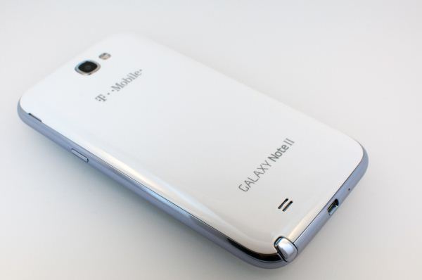
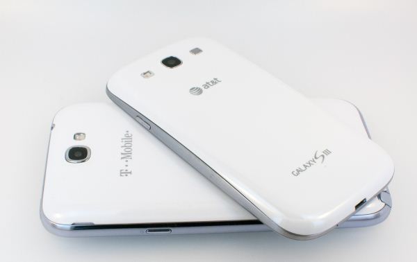
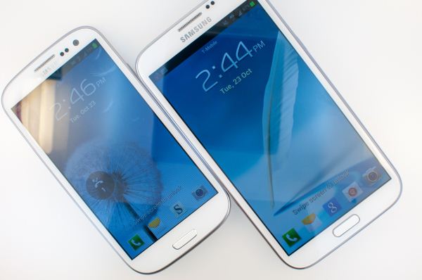
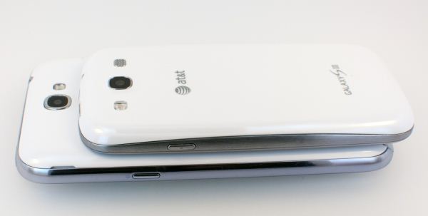
I like to start reviews with aesthetics since first impressions are critical, and here the Galaxy Note 2 unsurprisingly shares industrial design language very closely with the Samsung Galaxy S 3. Compared to the original Note, the Note 2 has even larger radii rounded edges, and the same water droplet slash polished river stone shape of the Galaxy S 3.
Like the Galaxy S 3, Samsung has managed to get the hardware home button and three-button layout in general on US devices. I was sampled a T-Mobile Galaxy Note 2, but this appears to be the case across the board for the Note 2. On the front it’s easy to see the similarities between those two devices — they share the same front facing camera, ambient light sensor, and notification LED positions, and at the bottom the same three-button organization with a physical home button. Display size has also increased from 5.3-inches diagonal to 5.5 inches diagonal with the Note 2, and resolution is now 1280x720, more on that in a moment in the display section however.
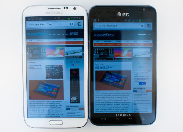
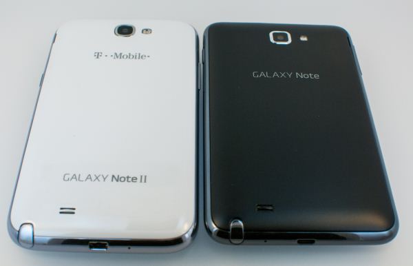
Galaxy Note 2 (left), Galaxy Note (right)
The outer lip of the Galaxy Note 2 is the only real departure from the industrial design set by the Galaxy S 3, as this isn’t the somewhat faux-brushed looking plastic material with a varnish layer on top, but instead a scratchy chrome. I know there are big cultural differences associated with the appeal of this chrome ring, but I really wish the Note 2 had done away with it or at least made it less tacky like the Galaxy S 3 managed.
Samsung continues locating the microUSB port at the bottom, and to the right of that is the larger improved S-Pen which we’ll talk about in a moment. The rest of the buttons I don’t really even need to talk about, they’re standard Samsung fare in both placement and feel, which is great.
Side by side with the original Note not too much has changed at a high level, except the Note 2 is slightly taller, narrower, and thinner. The original Note felt very square to me, the Note 2 feels much more like a blown up Galaxy S 3.
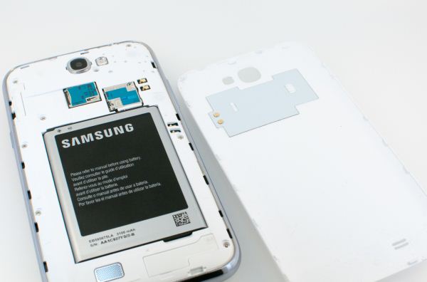
Samsung continues to be one of the last remaining OEMs stalwart about including a removable battery door which covers the battery, microSIM, and microSD card. The microSD support goes to SDXC standard, which means up to 64 GB cards are accepted in the Note 2. Battery also gets a significant boost, with both cell chemistry going from 3.7 to 3.8V, and overall capacity in mAh from 2500 to 3100 mAh. The result is an effective capacity boost from 9.25 watt-hours to 11.78 watt-hours, almost 30 percent larger.
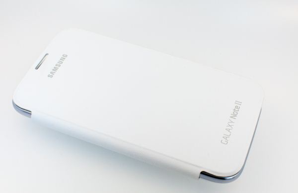
The Note 2 likewise comes with a lineup of flip covers that replace the battery door completely and have a soft lint-free felt material that cleans and protects the display, and a pleather top side. I grew accustomed to using Galaxy S 3 this way, and seeing it continue to the Note 2 is definitely welcome. Samsung gets the value of having a consolidated accessory lineup, and the Note 2 continues that by making the flip covers compatible with all the Note 2s the same way the flip covers were interchangeable between international and USA variants of the Galaxy S 3.
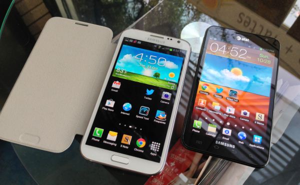
Galaxy Note 2 with flip cover open (left), Galaxy Note (right)
There are a total of seven flip cover colors to choose from this time around. In addition Samsung also has started making a first party protective cover with rubber around the edge that is designed to protect against impacts and drops. I wasn’t sampled one but did get a chance to play with one, and it looked decently beefy.
The Galaxy Note 2 I was sampled was the Marble White variant, though there’s also a Titanium Gray model. In addition Samsung is banking on users to buy flip covers to change the primary exterior color of their device if they so choose.




131 Comments
View All Comments
jigglywiggly - Wednesday, October 24, 2012 - link
is samsung in a contest to creating the ugliest looking soap bars?They had it right with the GS2, then they just decided to fuck it with the GS3
Skiddywinks - Wednesday, October 24, 2012 - link
That's because the SGS2 was basically an iPhone 4/4S, and they aren't allowed to make similar shapes, it would seem.Don't blame Samsung, they want to give you what you want, they just aren't allowed. I do agree though, I do prefer the SGS2/iP4 shape.
Samus - Wednesday, October 24, 2012 - link
Yeah its amazing how much my wife's GSII is mistaken for an iPhone in the line at ****bucks.I know what you mean, though, and its sad Samsung is basically banned from making "attractive" looking phones. Because appearantly, Apple invented attractive looking phones?
aegisofrime - Thursday, October 25, 2012 - link
I'm sorry, but anyone who can mistake the GS2 for an iPhone is an idiot.I mean, the size difference alone should be a dead giveaway. How about the rectangular home button vs the round home button on the iPhone? How about that big Samsung logo plastered on top of the GS2?
The only resemblance the two have is the shape. I simply cannot see how anyone can confuse the two.
sleepeeg3 - Friday, October 26, 2012 - link
They confuse the two, because the average consumer doesn't know anything beyond iPhone. They think all phones are iPhones. When someone owns one of the more popular alternatives, the question I always get asked, "is that an iPhone?"Death666Angel - Wednesday, October 31, 2012 - link
When I had the SGS2 a lot of people around me asked if that was the new iPhone. But most of them thought that iPhone was a generic term like "PC" or "Console".I now have a Galaxy Nexus and find it and the new Samsung phones to be just as attractive.
CeriseCogburn - Friday, February 1, 2013 - link
I am amazed by the constant artsy fartsy droning on how a device looks, and how all people are expected to agree, with of course, the iPhone as the "beautiful one".Of course it's brainwashing, just like all the lemmings want their computer parts and cases black - a thousand websites all have the drones exclaiming the same thing - black black black.
So, anything BUT the sad sorry rectangle of the iPhone is great by me. It's a freaking rectangle - and worse yet, the stupid public pubes in charge of the PC worshipping of a rectangle always claim thinner is also better.
Thinner is not better, especially when gripping. It's better in their lemming brainwashed gourds and not IRL, but their estrogen doused public opinion persona would have them believing anything peer pressure desired them to, so of course we have that thin to win crazed insanity everywhere as well.
It's a freakin rectangle. That's super, superior styling to these god for saken morons - it's amazing they can even drool.
medi01 - Thursday, October 25, 2012 - link
I'm sorry, but anyone who can mistake the GS2 (and GS1 for that matter) for an iPhone is an idiot.PeteH - Thursday, October 25, 2012 - link
Depends. I can understand it at a glance, but not upon close inspection.n13L5 - Wednesday, November 7, 2012 - link
I agree on the weird soapy curve of the S3, but the Note 2 looks more like a large SII, which is fine by me.By the way, in Boost mode, the Galaxy Note II works extremely well as a portable guitar amp. You just get a toggle for gain, rather than a knob for fine adjustment of the level of distortion :D