Nokia Lumia 900 Review - Windows Phone with LTE
by Brian Klug on April 3, 2012 9:00 PM ESTIt goes without saying that for Nokia, the Lumia 900 launch is quite possibly one of the most important launches, ever. The Lumia 900 marks Nokia’s first serious foray back into the competitive American market, and with it the first high-end fruit to come out of its new strategic partnership with Microsoft. Just how well the Lumia 900 does in the USA will be a reflection on both Nokia’s industrial design, and Microsoft’s still somewhat fledgling Windows Phone 7 smartphone platform.
First a bit of recapitulation - the Lumia 900 is not the Finnish handset maker’s first smartphone for the USA, that illustrious title belongs to the Lumia 710 on T-Mobile which we reviewed a while ago. Nor is the Lumia 900 Nokia’s first Windows Phone device, as that title belongs to the Lumia 800. Following the naming scheme, it’s easy to see where the Lumia 900 is positioned relative to the 800, 710, and upcoming 610, namely at the very top of Nokia’s new Lumia Windows Phone product line. This is Nokia’s AAA smartphone aimed straight at the jugular of both the best Android smartphones and the iPhone 4S.
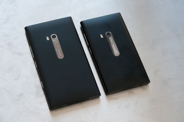
Nokia Lumia 900 (left), Nokia N9 (right)
It’s always easiest to start one of these reviews out simply by talking about the superficial physical aspects of the phone. In this case, the Lumia 900 design is an obvious descendant of the Nokia N9 and Lumia 800, keeping the same semi-cylindrical shape shape but increasing the display size from 3.7“ to a much more US-friendly 4.3”. In the process, the Lumia 900 does lose the Lumia 800/Nokia N9’s curved glass front face. Instead, the 900’s front visage is one planar piece of glass.
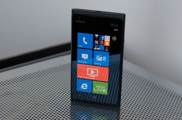
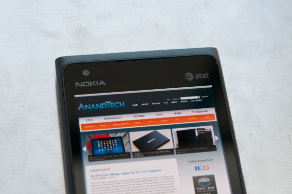
Just above the Nokia logo on the front is the 900’s 720p front facing camera, and unlike the 800 the primary earpiece is placed right where the front glass meets the body. There’s a small raised lip around the front glass which ostensibly holds the display in place (and glass under compression) which also guarantees you can lay the phone flat on its face on a flat surface and not put sleeks (scratches) into the display.
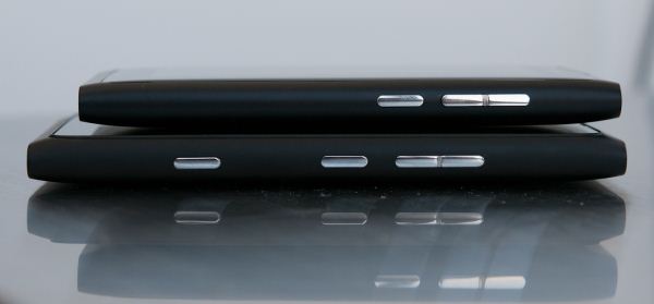
Nokia Lumia 900 (bottom), Nokia N9 (top)
That’s really the only major physical change however. Like the 800, the 900’s body is still unibody polycarbonate, with the same volume rocker, power/standby, and camera button (from top to bottom) arrangement on the right side. The texture of the 900’s case somehow feels different and slightly rougher than the 800, which is something of an improvement - the result is a device which feels even less slick with greasy or sweaty palms. Side by side with an N9, you can tell the plastic surface is textured differently under the right lighting, but it isn't an immediately obvious thing. It’s still amazing how Nokia is able to craft a device entirely out of plastic, and yet avoid the same pitfalls that continue to make Samsung devices feel, well, plasticky. Clearly not all polymer is the same here.
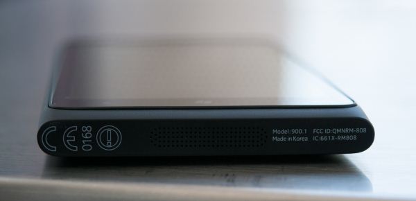
The rest of the exterior is again very much a throwback to the 800, with some welcome changes. At the bottom, dead center is the speakerphone grille and primary microphone. The regulatory markings, model, and FCC ID are printed here instead of in the microSIM tray.
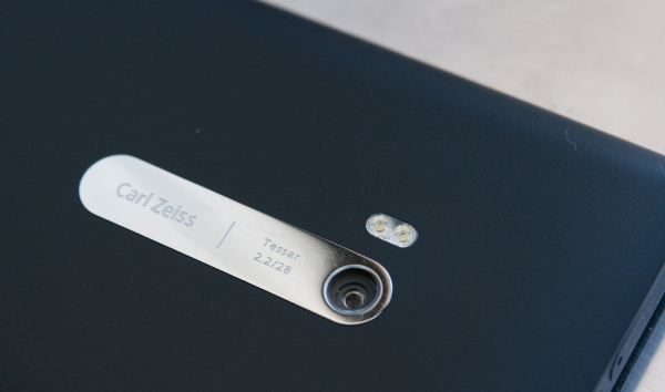
On the back, the 900 goes with an offset flash position that resembles the N9. There’s also the same shiny chrome badge bearing Carl Zeiss branding and F/2.2, 28mm markings for the 8 MP camera module. Like the 800, this is perhaps the only design aspect of the 900 I find puzzling, since this chrome badge and camera region is coplanar with the surface the smartphone is set down on, and the result is that it instantly picks up scratches. You can even see them here in a gallery image, and I'm super paranoid about loaner devices - it's not like I have steel wool in my pocket either. Unlike the 800 there’s no cutout just above the flash for a noise canceling microphone, that’s moved up to the top of the 900.
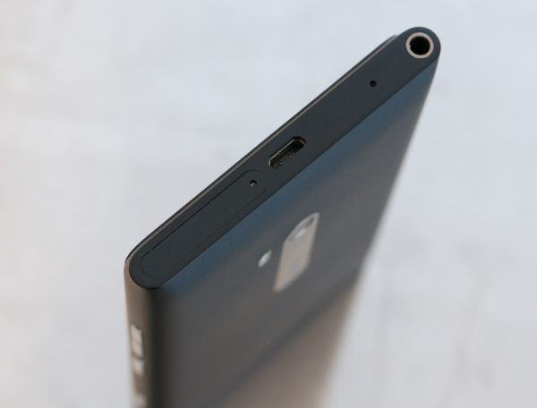
At the top we see some of the other (possibly AT&T-influenced?) changes to the 800 design. Gone is the magnetic swing-open door for microUSB, instead the port is simply dead center. At far left is the standard headphone jack, followed by the noise cancelation secondary microphone, microUSB, and the microSIM tray’s eject hole. Nokia accommodates this microSIM tray with a bundled SIM ejector tool in the box. It’s interesting how so many designs are now going this route, admittedly I doubt most US customers do much SIM swapping outside their carrier store.
The Lumia 900 feels like a larger (in x and y), thinner Lumia 800. It literally ends up being exactly like what you’d expect if you were to take an 800 and pull at the top and bottom, increasing the areal size of the device and making it thinner at the same time. I realize that doesn’t help prospective buyers in the US who have never seen a Lumia 800 (or an N9) but for Europeans who have been holding out for Nokia’s high-end flagship, know that it’s like an even better 800 on the outside.
The same design caveats also apply here - specifically, there’s no removable battery (it’s sealed inside) and no external storage in the form of a microSD card slot. The former is a design tradeoff which lets Nokia craft hardware that’s thin, solid, and attractive, the latter is more of a Windows Phone 7 software architecture thing. At this point high-end devices shipping with sealed internal batteries seems to be the norm, and the mitigation is to ship an external battery which charges the device over microUSB.
Smartphones, like cars, also seem to be getting bigger, and the Lumia 900 is no exception. I think it’s an interesting thing to note that the AAA smartphone Nokia has targeted for launch in the US has a 4.3“ display (which I guess is almost small by today’s standards). Obviously there’s a certain level of specsmanship which OEMs have to contend with, and somewhere between 4.3” and 4.65" is starting to emerge as a practical upper bound for display size.
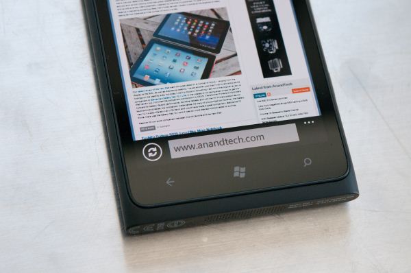
At the bottom of the display are the three Windows Phone buttons, which are capacitive and backlit. I find the backlighting to be a bit on the weaker side, and unfortunately at some brightness levels you can see a bit of light leakage from them into the display - it isn’t a lot however. The positioning near the bottom lip of the display isn’t too close to be a problem though, and the buttons are responsive.
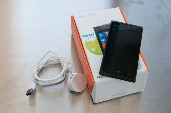
The Lumia 900 we’re reviewing today is the AT&T LTE bound model 900.1, and thus came in the standard AT&T themed packaging I’m used to seeing. Inside is the device itself, a SIM ejector tool, microUSB cable, and a 5V 1A USB charger. What’s absent is a rubberized case tailored to the 900’s shape like what we saw with the 800, but that’s a comparatively small thing to gripe about
Next up is our comparison table, and the real difference here ends up being SoC. What’s unique about the Lumia 900 is inclusion of a 1.4 GHz Qualcomm APQ8055 instead of MSM8255. Both are 45nm, single core Qualcomm snapdragon with Adreno 205 graphics. If you’ve been following our SoC coverage, you probably already know the difference between these two parts is all cellular - APQ connotes a part with no cellular baseband, MSM (mobile station modem) means the part does have a cellular baseband enabled, 2 for 3GPP, 6 for 3GPP and 3GPP2 compliance.
| Physical Comparison | ||||||
| Samsung Focus S | Nokia Lumia 800 | Nokia Lumia 710 | Nokia Lumia 900 | |||
| Height | 126.1 mm (4.96") | 116.5 mm (4.59") | 119.0 mm (4.69") | 127.8 mm (5.03") | ||
| Width | 66.8 mm (2.63") | 61.2 mm (2.41") | 62.4 mm (2.46") | 68.5 mm (2.7") | ||
| Depth | 8.5 mm (0.33") | 12.1 mm (0.48") | 12.5 mm (0.49") | 11.5 mm (0.45") | ||
| Weight | 111 g (3.9 oz) | 142 g (5.0 oz) | 125.5 g (4.4 oz) | 160 g (5.6 oz) | ||
| CPU | 1.4 GHz Single Core Snapdragon MSM8255 | 1.4 GHz Single Core Snapdragon MSM8255 | 1.4 GHz Single Core Snapdragon MSM8255 | 1.4 GHz Single Core Snapdragon APQ8055 | ||
| GPU | Adreno 205 | Adreno 205 | Adreno 205 | Adreno 205 | ||
| RAM | 512 MB LPDDR2 | 512 MB LPDDR2 | 512 MB LPDDR2 | 512 MB LPDDR2 | ||
| NAND | 16 GB NAND (no external microSD) | 16 GB NAND (no external microSD) | 8 GB NAND (no external microSD) | 16 GB NAND (no external microSD) | ||
| Camera | 8 MP AF/LED, 1.3 MP front facing | 8 MP AF/Dual LED Flash, 720p Video Rec. | 5 MP AF/LED Flash, 720p Video Rec. | 8 MP AF/LED Flash, 720p Video Rec., 1.0 MP front facing | ||
| Screen | 4.3" 800 x 480 SAMOLED+ | 3.7" 800 x 480 SAMOLED w/ClearBlack | 3.7" 800 x4 80 TFT LCD w/ClearBlack | 4.3" 800 x 480 SAMOLED+ w/ClearBlack | ||
| Battery | Removable 6.1 Whr | Internal 5.37 Whr | Removable 4.81 Whr | Internal 6.77 Whr | ||
Windows Phone continues to be a Qualcomm-only platform, and we’ve talked before about how shipping a voice-enabled LTE phone at this point with Qualcomm requires a voice-enabled through SoC fusion platform. In this case, the platform is this combination of baseband-less APQ8055 and Qualcomm’s MDM9200 baseband for all cellular WCDMA and LTE. The rest of the specs are what you’d expect given the Windows Phone 7 chassis specification - 512 MB of LPDDR2, 16 GB of NAND (of which 13.61 GiB are available to the user), 8 MP rear camera and 1 MP front facing camera.
The context for the US AT&T Lumia 900 launch really is a story of both positioning, and price point - at $99 on two year contract with AT&T the Lumia 900 has been made impossible to ignore. Competition is good, and clearly some of AT&T’s self-positioning as the “premiere” Windows Phone 7 carrier platform is finally coming to the surface now with pricing that undercuts other AT&T herophones. Initial launch price aside, the Lumia 900 definitely does not make sacrifices to industrial design or build quality in any way, this is exactly what people were alluding to when they talked about Nokia building a Windows Phone. Winning at the high end is something that Windows Phone has arguably yet to do, and the Lumia 900 finally is a device that’s positioned the same way as some of the latest and greatest Android devices as well.




128 Comments
View All Comments
Denithor - Tuesday, April 3, 2012 - link
Kinda sucks. You put in three Nokia models? Why not a comparison to other phones US buyers are likely to be considering? I know the specs are available but it makes for a much quicker reference.Brian Klug - Tuesday, April 3, 2012 - link
That's a valid point, and honestly picking the phones for the comparison table is always a bit of a struggle, I just wanted to show how the other Nokia WP7 devices line up in comparison with the flagship. Perhaps another one with Galaxy Nexus GSM/UMTS and iPhone 4S? I mean we've shown those in tables many, many times.-Brian
Operandi - Wednesday, April 4, 2012 - link
Uhh.. yeah I would say so. This is the only WP7 I would ever consider, the others migh as well not exist frankly.abhaxus - Wednesday, April 4, 2012 - link
What he said. This phone is sexy, I'd like to see it's size compared to other sexy handsets. Most WP7 handsets are... plain.niva - Thursday, April 5, 2012 - link
Performance wise it's not much different from the 710 or the 800, which are both phones worth considering. I think the 800 is better than the 900, but I prefer smaller phones. I think I might just bite the bullet and settle on the 710.geddarkstorm - Wednesday, April 4, 2012 - link
Why is no one mentioning the absolutely abysmal battery life of this phone? It's at the very bottom of the tethering chart for instance. I don't see this phone rising above the lower half of the tests in anything other than 4G. And who really wants a phone with sharp corners and no sense of hand ergonomics?Can't wait for Windows 8, and good hardware.
seanleeforever - Wednesday, April 4, 2012 - link
that and this phone is actually slower than it looks on the chart.great review, but the chart is seriously outdated.
take my HTC sensation for example, i just run the sun spider 0.91 and i get 1935ms and browsermark of 77138 with andriod STOCK browser. my phone does have ICS and ARHD rom, but if you honestly think a mod rom would somehow increase the phone performance by 94% faster (39768 on your chart vs 77138 i get), or by 221% faster(6217.4ms vs 1935 ms), you must be drunk.
this is with ICS stock browser, i think if you updated your chart, you will find windows phone will looks even worse (a lot worse) than it is now.
dtolios - Friday, April 6, 2012 - link
"who really wants a phone with sharp corners and no sense of hand ergonomics?"- It has hard corners - where you DON'T hold the phone from...iPhone 4 series has sharper edges - where you do hold the phone from...If that's not an issue - and marketing wise clearly it's not - then the 900 is fine. Afaik most ppl really like the design, and so do I.
UltraTech79 - Saturday, April 7, 2012 - link
Yeah iPhone 4 has sharp edges, if it weren't for all the rounded edges. And who are you to tell us how to hold a phone? Never played any games on a phone have you?Its badly designed.
Spunjji - Wednesday, April 11, 2012 - link
Who are *you* to tell us how to hold a phone?See how easy that was? Try a better argument. You had a valid point (worse gaming ergonomics) until you made yourself sound like an idiot (opinion as fact, referring to meaningless notions of sales figures).