Anand's Google Nexus One Review
by Anand Lal Shimpi on April 3, 2010 3:40 AM EST- Posted in
- Smartphones
- Mobile
The Home Bar
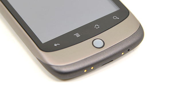
The Nexus One has three physical buttons: a power/lock button at the top, volume rocker on the left side and a trackball/button on the face.

The trackball is mostly useless. The Nexus One has a 3.7” multitouch screen for a reason, and it’s way quicker to use the screen than to use the trackpad for scrolling. There are some limited situations where the trackball can be useful, for example while playing games. The iPhone has no useful physical buttons for gaming, the Nexus One’s trackball is better for moving a character around than a virtual d-pad.
Above the trackball there are four touch buttons with fixed functions: back, menu, home and search. By default all provide haptic feedback when activated. In other words, they vibrate a bit when you touch them. It’s a fine feature but it’s nowhere near the feedback you get from physical buttons if that sort of thing matters to you. The buttons also give you the same feedback regardless of whether or not their operation is permitted in the current mode (e.g. hitting the contextual menu button when no such menu exists).
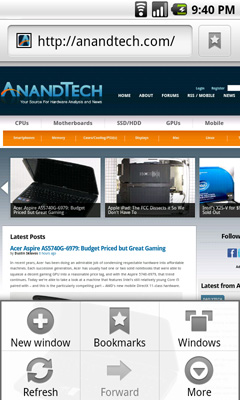
The back button is useful and works as intended, it goes back a screen. The menu button takes some getting used to. The best way I can describe it is like a right click. You get a contextual menu depending on what app you’re running. At the home screen it lets you pop into Android’s settings, add application shortcuts, change wallpaper, view notifications and search. In the email app the contextual menu lets you refresh your inbox, switch to a different folder, change settings, etc...

The contextual menu in Android's Browser app
This is where Android’s more PC-side comes out to play. Apple and Palm for the most part try to keep these sorts of menus away from you. Apps are purposefully not very deep and settings are all controlled through the settings screen, not from within an app. Functionality is driven by the UI. Android takes a more application centric approach. Neither is right or wrong, but both approaches have their pros and cons. I’d argue that Apple/Palm’s approach is better suited for something that’s going to be used as a passive device. Something you’re quickly scanning emails or text messages on. Google’s take is more PC-like. Give the users the options they want, where they want them, even at the risk of UI simplicity.
The Apple method runs the risk of limiting functionality, while Google’s risks turning the UI into a cumbersome mess. Neither is there today, but left unchecked that’s where they’d end up.
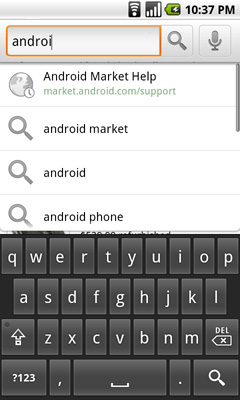
Moving on, the home button works as expected, it takes you to your home screen. The search button is particularly interesting because it is one Android feature that Microsoft copied in Windows Phone 7. Hitting the search button brings up an autocomplete enabled Google search box. Hitting go, launches the web browser (very quickly thanks to Mr. Snapdragon) and displays your search results.

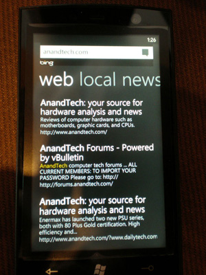
What MS is proposing for WP7 are contextual search results that are formatted for the smartphone. Akin to a search app if you will. Search for GeForce GTX 480 and get a normal listing of websites. Search for dentists and get a smartphone formatted list of dentists in your area. Granted MS’ proposal is just that, a proposal, while Android is shipping today. Enabling similar functionality though shouldn’t be hard for Google. I’d love to be able to search, pull results from the web, but have the results presented as more of an app.

Windows Phone 7 Search
The search function will autocomplete things like address book entries, but it won’t automatically search your email for you. While the iPhone’s search function is more focused on searching your device, Android is more interested in helping you search the web. Google has a search engine, Apple doesn’t, the distinction makes sense.


95 Comments
View All Comments
KaarlisK - Saturday, April 3, 2010 - link
´´The graph below shows the rough costs of simply keeping up with fab technology every two years:´´Can´t seem to find it.
deputc26 - Saturday, April 3, 2010 - link
Thanks Anand, Great Review!windywoo - Sunday, April 4, 2010 - link
Taken out of context like that, the quote sounds like it is describing a graph of smartphone prices, laptops, e-readers :) Fab tech.Nihility - Saturday, April 3, 2010 - link
I just know that after experiencing any responsiveness issues, that within a few months I'll get really frustrated with the device.I still have an iPhone 2G and I hate it. Takes forever to launch apps, browsing the web is a miserable experience and the battery life sucks. I'm definitely in the market for a better phone but I think I'll just wait for something smoother.
One of my main gripes is that my navigation app for the iPhone takes ages to load and if I get a call mid-work I'll have to restart it. Hate that.
Like Anand said, on paper the N1 is perferct but I'll let them smooth out the rough parts before I get one.
Exelius - Saturday, April 3, 2010 - link
I had the same complaint of my iPhone 3G. I bought a 3GS the day it came out and it is a huge improvement over both the 2G and 3G in responsiveness. My girlfriend has a regular 3G and much prefers using my 3GS over her own phone when browsing the web or using the Maps application.If responsiveness is a problem on the iPhone platform, get a 3GS before ditching the iPhone completely. The hardware on the 3GS is roughly equivalent to the Nexus One.
Nihility - Saturday, April 3, 2010 - link
No way. Fool me once, shame on you. Fool me twice...No more iPhones for me.
My main concern was all my apps, but most of them are available for the Android so there's nothing holding me back. I'll be glad to get rid of iTunes.
solipsism - Saturday, April 3, 2010 - link
You're comparing a phone from 2007 with an ARMv6 @400MHz w/ 128MB RAM and discounting the model that came two years later with ARMv7 @ 600MHz w/ 256MB RAM. Makes perfect sense¡KaarlisK - Saturday, April 3, 2010 - link
I love both the attention to detail and depth you have :)And I have to say that Android, not WinMo7, is the replacement for Windows Mobile 6.5 in my eyes. WinMo7 just isn´t WinMo :D
LuxZg - Sunday, April 4, 2010 - link
I agree, great review, I think I've never read anything that long about a phone :)And I agree with Android being a true Windows Mobile successor.. I don't have money for stuff like this, but if I did - I'd want all the freedom of my PC on my mobile as well. In that regard, Android seems to be the only option at the moment.
There is one thing that will clearly make lives of some people miserable.. Data rates in some countries are horrible, and smartphones all rely on mobile data connection heavily, but Nexus One is a data-hog champion by the looks of it. Hopefully, by the time I'll be able to afford phones like this one, this will be solved :)
macs - Saturday, April 3, 2010 - link
Thank you Anand, the review is great and as an owner of the Nexus One I agree with your thoughts.Android world is so wide that it's really hard to have a complete review and I think what is really missing here is something about the community around Android, XDA forum, CyanogenMOD , USB Tethering, WIFI Tethering,...