AnandTech Guide to Better Photos: Composition
by Stephen Caston on November 19, 2004 12:05 AM EST- Posted in
- Digital Camera
Balance and Space
Now, we are going to take a look at balancing different elements in your composition. It is important to be aware of the "weight" that objects have in a picture. By "weight", we are referring to the attention that each object receives from the viewer. Weight can be affected by the color, size, tone, etc. of the elements in your pictures. For example, in a picture with all black and white objects, a red strawberry will receive the most attention. When you take a picture with several elements, you should be aware of the balance created by the weight of these elements. In general, people prefer pictures that appear to have some sort of balance to them. Additionally, quite often the most obvious balancing methods are also the most boring.
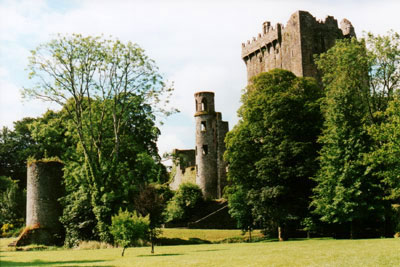
In the image above, the larger (and mostly hidden) castle on the right is balanced with the smaller structure on the left side. The size difference in this balanced image creates an interesting dynamic. If you think of the middle castle as the fulcrum, you can see how the smaller subject on the left is able to balance the large castle on the right by being positioned further from the center.
We also want to talk about the effects of using space as a balancing element. Using space in pictures is often a welcomed change from the "fill the frame" approach.

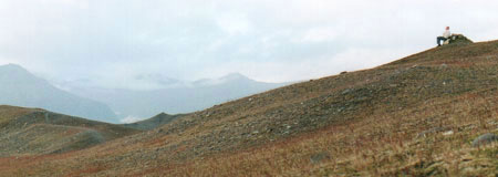
In the image above, we have offset the subject sitting on a rock at the upper-right with the open space of mountains on the left. Notice how this arrangement can create an atmosphere of contemplation or isolation. In general, space can be used to evoke the imagination of the viewer. For example, "leading" space can be used to give the impression of movement. This is done by leaving extra space in the direction that a subject is facing.

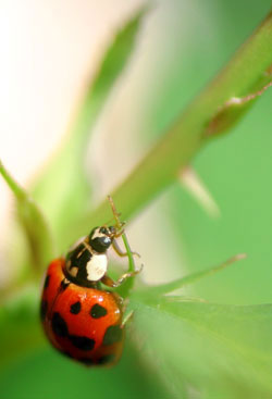
By positioning this ladybug at the lower left of the frame, we were able to give the viewer the impression of movement. Also, notice that by selecting a large aperture opening, we were able to blur the distracting background elements. "Leading" space is a common-sense concept that is also used by movie directors to give the audience an idea of where a character is headed. A good example of the importance of leading space can be seen in horror films. You know something bad is going to happen when a character is backing up, yet there is no leading space to show where he/she is going. In this sense, the inclusion of leading space in the frame can be a comfort to the audience.

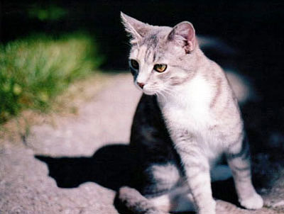
Here, we chose to leave some empty space in the frame opposite the cat. If the space on the left were cropped out or simply not included in the shot, the picture would have a very awkward appearance. By allowing for some empty space in the direction of the cat's gaze, we were able to provide a better balance and a far more intriguing picture. As you can see, balance can play a very important role in the effectiveness of pictures. We really want to stress that although space is commonly neglected as a compositional tool, it can be very powerful.


25 Comments
View All Comments
SKC - Saturday, November 27, 2004 - link
Great article. #5, thanks for the reminder that this shouldn't be the end-all book on photography, but it did renew/pique my interest. I also totally support the photography forum idea.rrezende - Monday, November 22, 2004 - link
Great article! Very nice pics.CmdrFly - Monday, November 22, 2004 - link
I agree with the thought of adding a Photography forum. AT has always been the first place I would turn to for on-the-line fair reviews of hardware (unlike some biased ____hardwareguide .com's), plus the people are knowledgeable and for the most part friendly about their critique of your articles.A place where we could discuss ideas, examples, and experiences with photography would be an excellent source of info.
kcma - Friday, November 19, 2004 - link
#21I went to art school. You learn basic techniques, and then you have non-stop crits. You get feedbacks on what works and what doesnt work, you get crits on how 1 color looks and feels next to another, you get feedbacks on cropping, etc. But you never ever learn how to take better pictures or how to compose better, that you do on your own.
And yes, I am aware that's not how all art school work, there are art classes that teachs common techniques and themes in composition, etc. But that's such a bad bandaid solotion. It makes you feel a bit better and not care to try new things out. Many of you guys are gamers, and I will use an analogy that you all understand. I'm sure many of you know ppl who exploit bugs and flaws and unbalances to win in multiplayer games. well, that works, until they patch it right? How about overclocking your computer? Do you want to be informed on how each CPU, chipset, MB, RAM work with each other? or would you like to be told to buy CPU A, MB B, RAM C, and put it together without any understanding of why you just bought what you did?
Anyway, I'm not going to argue with you guys. You can't teach ppl who dont want to learn, and I think all the "idiot's guide" books, and watered down shortcut guides eventually do more disservice than they are helpful. same can be applied to cooking, working on cars, etc, etc, etc... If you care enough to learn something, learn it right.
drwho9437 - Friday, November 19, 2004 - link
#5While you are correct that creativity cannot be taught, why do people take art classes, are not compositional techniquies taught in such classes. Many "fine artists" go to school not all are self taught. There are no rules of composition, but there are themes, some common composition discussed any by me that's fine.
kcma - Friday, November 19, 2004 - link
I'll be happy to write up a guide for how aperature/shutter speed/iso/depth of field/filmsize (sensor area)/etc all work together. Things you learn in basic photo. It's a good place to start a journy of learning photography and the very basic tool to allow you to experiement and be creative on your own.I think these basics are more useful than composition because once you learned it, you can constructively criticize yourself and try new things out. Taking cuse from lines, etc, might help you get a few good pictures but it doesn't inform you how to get there as much. And composition is one of those things that as you make more photographs, you will develop your distinct style that give your photos personality (give it time, it'll come).
seems like there are enough of you interested in photography, start a new forum? :)
stephencaston - Friday, November 19, 2004 - link
Jeff, thanks for the suggestions. We'll keep those ideas in mind. For a bit of information on F-stops and Shutter speeds, check out our glossary in the Digital Camera Review Guide.http://www.anandtech.com/digitalcameras/showdoc.as...
Also, be sure to read the part about Depth-of-Field. Hope that helps to clear up some things. Thanks again for the ideas!
Jeff7181 - Friday, November 19, 2004 - link
Stephen... I'd like to see more detailed explanations of how to shoot in "manual mode." For example... people have tried to explain it to me before, but I still don't know what f stops are, or when to change that setting and what to change it to. Also maybe some tips for editing photos once they're taken and transferred to a computer. Maybe some tips for using the flash effectively too.stephencaston - Friday, November 19, 2004 - link
Thanks for all the great comments! Please let us know if there is anything in particular you would like us to cover in future additions to the guide ;-)Clay1039 - Friday, November 19, 2004 - link
Just want to say that I really liked this artice. Sure it is just touching on a lot of the basics, some of which I have read before elsewhere, but I benefit from being reminded of these things, and from hearing them presented in a new way, as I am a beginning photographer. I am looking forward to the rest of the articles in this series and will enjoy reading them. Keep them coming!