The Xiaomi Mi MIX 2S Review: Fantastic Overall Value
by Andrei Frumusanu on June 29, 2018 8:00 AM EST- Posted in
- Mobile
- Smartphones
- Xiaomi
- MI MIX 2S
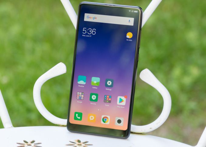
Xiaomi has been a vendor we’ve been working with for a few years now, but never got to the point where we really wrote an in-depth article on. Today as the company is eyeing on going public with an IPO in Hong Kong and an ever increasing advance on European markets, it’s the best time to actually shine a light on one of the company’s latest flagships – the Mi MIX 2S.
The Mi MIX 2S is actually a successor to last year’s Mi MIX 2, which in turn was a successor to the original Mi MIX which was a pioneer design in terms of bezel-less smartphones and ahead of the curve in terms of screen-to-body ratio metrics. The original Mi MIX was meant to show off the company’s design prowess – but it actually evolved into a mass product with the MIX 2S. This year’s new Mi MIX 2S iterates on the design and updates the internals to the latest hardware.
| Xiaomi Mi MIX 2S | |
| SoC | Qualcomm Snapdragon 845 4x Kryo 385 Gold @ up to 2.80 GHz 4x Kryo 385 Silver @ up to 1.77 GHz Adreno 630 @ up to 710 MHz |
| Display | 5.99-inch 2160x1080 (18:9) IPS LCD |
| Dimensions | 150.9 x 74.9 x 8.1 mm 191 grams |
| RAM | 6GB / 8GB LPDDR4x |
| NAND | 64GB / 128GB / 256GB |
| Battery | 3400 mAh Qualcomm Quick Charge 3.0 Qi Wireless Charging |
| Front Camera | 5MP, 1.12µm pixels, f/2.0 |
| Primary Rear Camera | 12MP, 1.4µm pixels, f/1.8 Sony IMX363 |
| Secondary Rear Camera | 12MP, 1.0µm pixels, f/2.4 2x Zoom Samsung S5K3M3 |
| SIM Size | 2x NanoSIM |
| Connectivity | 43 global bands (8GB+256GB model only), 4x4 MIMO, 2.4/5G WiFi, WiFi Direct, WiFi Display, NFC |
| Interfaces | USB 2.0 Type-C; no 3.5mm |
| Launch OS | Android O (8.0) with MIUI 9 |
| MSRP Launch Price |
6GB/64GB: ¥3299 / $449 / €423 6GB/128GB: ¥3599 / $490 / €462 8GB/256GB: ¥3999 / $544 / €513 |
Digging into the hardware, that’s where we see the biggest changes compared to the Mi MIX 2. The 2S sports a latest generation Snapdragon 845 SoC with 4x Kryo385 Gold/A75 at 2.8GHz paired with 4x Kryo385 Silver/A55 at 1.77GHz. I was impressed with the overall performance of the S845 in our Galaxy S9 review so I’m expecting the MIX 2S to perform no worse.
The phone comes in 64, 128 and 256GB NAND storage variants, with 8GB RAM configuration reserved for the 256GB SKU, while the smaller ones come with 6GB standard.
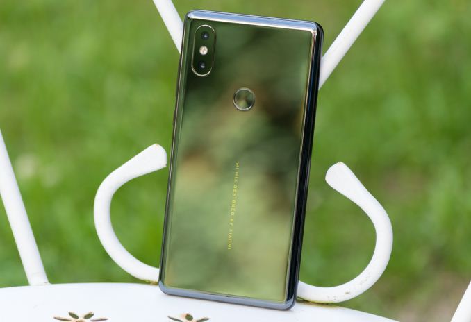
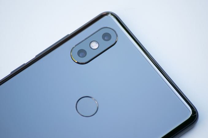
The Mi MIX 2S sports a 3400mAh battery which is covered by a ceramic back on which we find the fingerprint sensor as well as a very iPhone X inspired camera housing – one of the major design changes compared to the MIX 2.
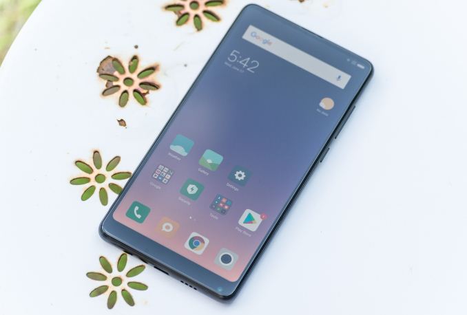
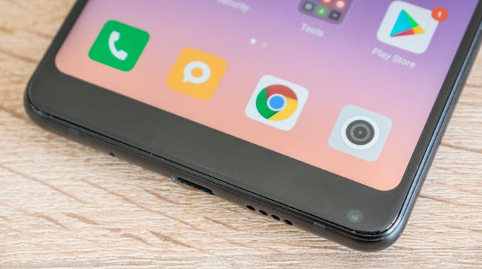
Obviously the display is the defining feature of the MIX series and here we see a 5.99”, 18:9 aspect ratio IPS LCD screen with a resolution of 2160x1080. Xiaomi was indeed one of the pioneers in bringing out this type of small bezel designs out to market. Way the company achieved this is by shifting all front sensors and camera to the bottom of the phone.
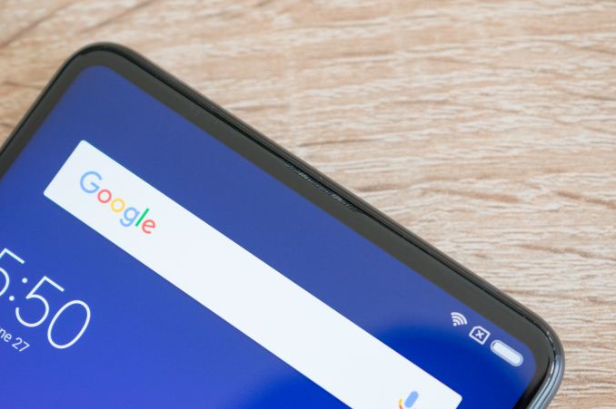
The top of the phone hides a very narrow speaker grill for the ear-piece. It’s not the greatest earpiece but it does serve its purpose well, and actually acts as a second stereo speaker alongside the bottom main unit. For this review I’m trying to reintroduce audio quality evaluation, starting with speaker measurements in a section later in the article.
While the front camera positioning is generally functional, it has the large drawback that front-camera operation becomes quite cumbersome in portrait mode as most of the time it’s looking “up” to you and for right-handed people taking a selfie means sometimes covering up the camera with your thumb, an issue that can be solved by alternatively using the fingerprint sensor as the shutter button. In landscape mode (with the camera on the upper right side) this is less of an issue. In general as I think there’s vastly more right-handed people and most front-camera operation happens in portrait mode, the camera should have been put in the left corner of the bottom of the phone.
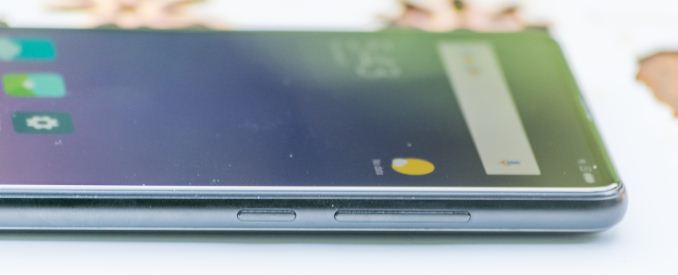
On the right side of the phone we find the volume rocker and the power button underneath.
As we mentioned earlier, one of the larger design changes compared to the Mi MIX 2 is the camera setup. The 12MP f/2.0 shooter has been replaced with a newer sensor from Sony; the IMX363 increases the pixel pitch from 1.25µm to 1.4µm and the lens also has a larger aperture at f/1.8. In addition to the main sensor we see a new secondary module with a 12MP Samsung S5K3M3 sensor with 1µm pixel pitches and an f/2.4 aperture lens with a 2x optical zoom.
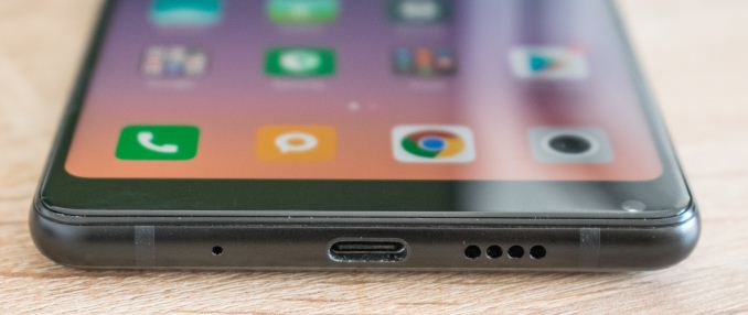
At the bottom of the phone we find the USB-C port alongside a microphone and the main speaker grill. The main speaker seems to be very much downward firing, but otherwise performs adequately. There’s no headphone jack here, which is a great disappointment and what I think is a misstep for the industry as a trend.




61 Comments
View All Comments
nathanddrews - Friday, June 29, 2018 - link
Definitely seems like a great value, but I know I couldn't buy it without an OLED screen. How close to a stock experience does MIUI 9 provide? It doesn't look very intrusive at all, I like it.Andrei Frumusanu - Friday, June 29, 2018 - link
I'll be adding a software section in a short while - I've had zero issues with MIUI 9.5. Xiaomi also offers quite a novel gesture navigation method that works really well and gets rid of the navigation bar creating more screen real estate.Flunk - Friday, June 29, 2018 - link
It's not that novel, OnePlus offers a similar feature.close - Saturday, June 30, 2018 - link
Yeah, BlackBerry really used gestures a lot since the beginning of this decade, Apple took them and made them famous with the iPhone X, but now they are no longer novel because OnePlus/Android also copied them in 2018? :)arashi - Sunday, July 1, 2018 - link
You mean Nokia? With the N9?arashi - Sunday, July 1, 2018 - link
*that pioneered extensive gesture navigationSamus - Sunday, July 1, 2018 - link
Palm beat virtually everyone by a number of years to the gesture game. Give credit where credit is due. WebOS revolutionized mobile OS navigation and virtually every OS since had borrowed almost everything from multitasking cards to an information "hub" from WebOS.On top of all that, Palm beat Apple to wireless charging by an entire DECADE (unless you consider the Apple Watch, which by that means Palm beat them by 'just' 7 years.) Palm's wireless charging implementation was also significantly better than Qi from more efficient charging current (excluding Qualcomm high voltage fast charging) to magnetic alignment.
Lord of the Bored - Sunday, July 1, 2018 - link
But if we give credit where it is due, we can't give credit to Apple instead!piroroadkill - Monday, July 2, 2018 - link
It's actually kind of depressing to anyone who owned a Palm device with wireless charging how shoddy current wireless technologies are, and how few devices actually support it. The Pre and the Touchpad charged without any hassle whatsoever.hbsource - Monday, July 2, 2018 - link
Well, kind of.The little stand for the Pre was great but my screen always remained powered up while charging. The screen would be dark and blank but that was still more than enough to illuminate a dark bedroom.
The OS was very good but the hardware was definitely shonky. My keyboard rubber literally wore through to the metal below and I had a couple of incidents where I lost all the stored data and photos.
Could have been great but wasn't quite.