The iPhone 7 and iPhone 7 Plus Review: Iterating on a Flagship
by Joshua Ho & Brandon Chester on October 10, 2016 8:00 AM EST- Posted in
- Smartphones
- Apple
- Mobile
- iOS
- iOS 10
- iPhone 7
- iPhone 7 Plus
The iPhone 6 was a runaway success by any measure. The A8 SoC may have been built on a temperamental 20nm process – something that dogged all other phone vendors – but for Apple it didn’t matter. The iPhone 6 was the first iPhone generation with a phablet variant. By all metrics it was a resounding success as it capitalized on this pent-up demand for larger iPhones.
The iPhone 6s continued this success, and in a year of disappointing launches due to the weak showing of the widely used Snapdragon 808 and 810, the 6s and 6s Plus looked particularly good as the competition really couldn’t measure up. There were a lot of Android devices that performed better than the iPhone 6s/6s Plus in some particular area – a better camera or longer battery life, for example – but taken as a whole the iPhones 6s were just clearly superior devices. If nothing else, they hit that particular balance between features and performance that a lot of users were looking for.
Meanwhile, the addition of 3D Touch was the sort of refinement to the user experience that still remains exclusive to the iPhone. Other OEMs have implemented some form of force sensing, but the implementation is not really executed in a way to improve user experience in a noticeable way. Adoption remained weak as well, with no real widespread support in the ecosystem for such features.
That said, the iPhone doesn't exist in a vacuum on its own. Even in the high-end market segment Apple limits themselves to, they have a loyal opposition, and that opposition is of course Samsung. Looking at the state of affairs there, relative to the iPhone 6s the Galaxy S6 had a better camera for still images, but it was obvious that it couldn’t freeze motion as well. The phone itself felt like a brick despite its 6.8mm thickness due to the relatively enormous battery. Despite the larger battery, battery life on LTE just wasn’t where it needed to be. The Galaxy Note5 was in many ways a similar story, which isn't too surprising as the Note has moved closer and closer to being a phablet-version of the Galaxy S.
But, as the story goes, Apple's competition has improved and advanced. The Galaxy S6 gave way to the even better Galaxy S7, HTC finally found their groove with the HTC 10, and OnePlus's 3 is their best showing yet. The competition is getting better, and with the iPhone 7, Apple can no longer rely on weak competition or pent-up demand for some major feature. The iPhone 7 must stand by its merits against this increasingly stiff competition.
It’s interesting to write a review like this, because for better or worse, I didn't have serious exposure to the iPhone from the beginning. When the first iPhone launched in 2007, I was in school and still used a flip phone that spent most of its time functioning as an alarm and a timer and not much else. My first exposure to the iPhone was the 3GS a few years later, which left a fairly poor taste in my mouth as it just didn’t feel all that functional. The iPhone 4 was miles better, but even then it felt like the experience was constrained. Something as simple as turn by turn navigation which I took for a given on Android devices like the Galaxy S1/Captivate and the Desire HD/Inspire 4G were basically absent on iOS unless you were willing to pay a significant amount of money for a third party application. The default maps application didn’t offer that kind of functionality and Google Maps was completely absent, as was YouTube. For better or worse, for years after this initial brush with iOS I stuck with Android devices. It wasn’t until iOS 8 and the iPhone 5s that I really started doing any kind of examination of iOS devices again.
Reviews are normally no place to be discussing one's life story, because realistically no one reading this review really cares about the person writing this review. But the perspective here matters when considering the approach I've taken to this review. I’ve spent the past two years using the iPhone 6 as a secondary phone so I’m increasingly aware of how iOS works, but even as good as the iPhone 6/6s series were, Android devices remain my daily driver for familiarity reasons. It’s easy to overlook flaws in Android devices if you never actually have to use them as a daily driver, so this review attempts to avoid the common issue of a double standard for reviews between Android and iOS devices. With that said, we can move on to the basic specs.
| Apple iPhone 7 and 7 Plus | ||||
| Apple iPhone 7 | Apple iPhone 7 Plus | Apple iPhone 6s | Apple iPhone 6s Plus | |
| SoC | Apple A10 Fusion 2 x 2.3 GHz Hurricane 2x little cores |
Apple A9 2 x 1.85GHz Apple Twister |
||
| GPU | 6 Core PowerVR GPU | PowerVR GT7600 | ||
| Display | 4.7-inch 1334 x 750 IPS LCD, DCI-P3 | 5.5-inch 1920 x 1080 IPS LCD, DCI-P3 | 4.7-inch 1334 x 750 IPS LCD, sRGB | 5.5-inch 1920 x 1080 IPS LCD, sRGB |
| Size / Mass | 138.3 x 67.1 x 7.1 mm, 138 grams | 158.2 x 77.9 x 7.3 mm, 188 grams | 138.3 x 67.1 x 7.1 mm, 143 grams | 158.2 x 77.9 x 7.3mm, 192 grams |
| Battery | 1960 mAh (7.55Whr) |
2900 mAh (11.17Whr) |
1715 mAh (6.6Whr) |
2750 mAh (10.59Whr) |
| Rear Cameras | 12MP ƒ/1.8 OIS, Wide Color Gamut, Quad LED True Tone Flash |
12MP ƒ/1.8 wide angle, OIS, Wide Color Gamut, Quad LED True Tone Flash 12MP ƒ/2.8 telephoto, 2x optical zoom, Wide Color Gamut, Quad LED True Tone Flash |
12MP with 1.22µm pixels + True Tone Flash | 12MP with 1.22µm pixels + True Tone Flash + OIS |
| Front Camera | 7MP ƒ/2.2, Wide Color Gamut, Retina Flash | 7MP ƒ/2.2, Wide Color Gamut, Retina Flash | 5MP F/2.2 + Retina Flash |
5MP F/2.2 + Retina Flash |
| Storage | 32GB/128GB/256GB | 16GB/64GB/128GB (Launch) 32GB/128GB (Refresh) |
||
| I/O | Apple Lightning connector | Apple Lightning connector, 3.5mm headset | ||
| WiFi | 2.4/5GHz 2x2 802.11a/b/g/n/ac, BT 4.2, NFC | 2.4/5GHz 2x2 802.11a/b/g/n/ac, BT 4.2, NFC | ||
| Launch Price | $649/749/849 32/128/256GB | $769/869/969 32/128/256GB | $649/749/849 16/64/128GB | $749/849/949 16GB/64/128GB |
Looking at the basics, the iPhone 7 and 7 Plus bring at least a few new things to the table that we haven't seen from Apple before, such as their first SoC with heterogeneous CPU cores. The iPhone 7 Plus brings a second camera with a full-frame equivalent focal length of 56mm, which isn't really a unique idea but does represent a unique execution, as the G5's second camera has an even shorter focal length. There's some irony here as Corephotonics and Qualcomm have been demonstrating almost the same implementation as what we see in the iPhone 7 Plus, but Apple is the first to market here. IP67 means the iPhone is impervious to dust and is capable of sustaining 1 m of water depth for at least 30 minutes, but water damage is never covered by warranty so you shouldn't push your luck here. Other changes here are more subtle such as the quad LED flash with PWM compensation, stereo speakers, and doubling the storage for all models relative to the 6s last year.
Finally, on a quick housekeeping note before we get started, I want to mention that we’ve changed our review format a bit this year compared to past reviews. Because our analysis on a few deep-dive items is going to take a bit longer – both the new low power CPU cores of the A10 Fusion SoC and wide color gamut of the new cameras present us with some particularly interesting scenarios – rather than hold everything back we’ve split things up. Today’s review of the iPhone 7 is just that, a review of the phone. Meanwhile we’ll be publishing a deep dive article later this month on A10, Hurricane, A10’s GPU, wide color gamut photography, and the rest of those fine architectural details that we like to dig into.
Design
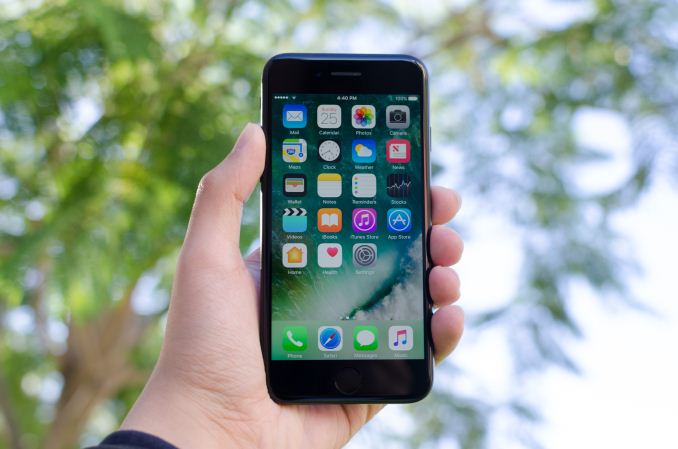
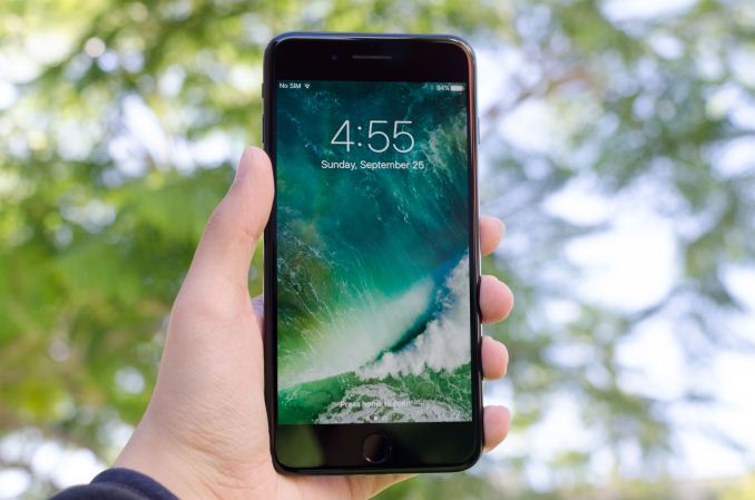
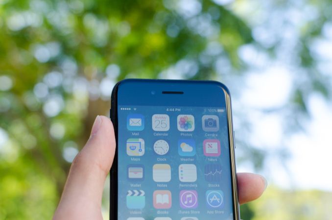
To start the examination of the iPhone 7 and 7 Plus beyond bullet points on a spec sheet, we can look at the design of the iPhone 7. It’s easy to take a potshot here and claim that the iPhone 7 and iPhone 6 have identical designs, but the design is different enough that you can identify either the iPhone 7 or 7 Plus from a distance if you can see the camera or back cover in general. However, if you can only see the front of the phone it’s not going to be easy to tell the iPhone 6 and 7 apart. Just about the only differentiating feature here is that the new earpiece is now slightly wider. We seem to receive requests for continued comparison of design details, and here the iPhone doesn’t have any obvious issues. The ambient light sensor appears to bisect the earpiece, while the front-facing camera is lined up with the earpiece.
What is noticeable if you use the phone is the new solid state home button. While there is a new Taptic Engine to enable this home button, it does take getting used to as the home button is not a one-to-one replica of a physical home button as far as the haptic sensation goes. The Taptic Engine manages to create a facsimile of what a home button should feel like but unlike a real button it doesn't actually depress so it isn't quite as accurate as something like the Macbook trackpad in replicating the feel of a real button.
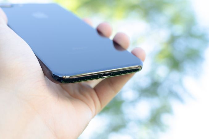
From there, the iPhone 7 and 7 Plus see some notable changes to the back and sides of the phone. While the buttons, downward firing speaker, and Lightning port remain in the same place, the 3.5mm jack has been removed. There’s been a lot of discussion here but after trying some pre-production AirPods I think it’s fairly safe to say that wireless is the future for any kind of mobile device, but the execution itself requires closer examination here that doesn’t necessarily fit into this part of the review. The one notable change here is to the SIM tray, which appears to have some kind of gasket to seal it against water and dust ingress.
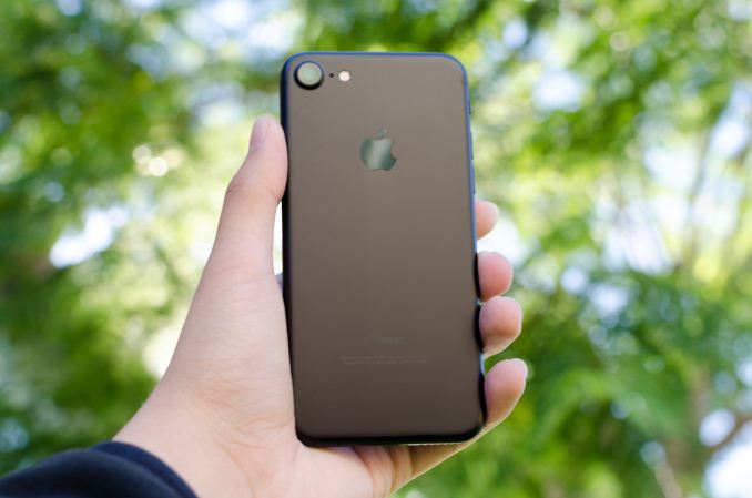
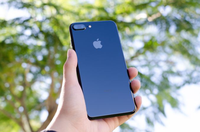
Looking at the back of the phone you really see most of the design changes. I’ve noticed a lot of people seem to believe that there's nothing notably different about this kind of back cover design, but it seems that a lot of this boils down to some similarities in shape and the use of aluminum. I would argue that aluminum alone doesn't define industrial design, as the One M7 and iPhone in all iterations don't really share much in common. Similarly, I would argue that the Honor 8 and Galaxy Note7 don't share a lot in industrial design just because both use tempered glass back covers along with an aluminum frame. Of course, if material changes are the only thing that matter then the jet black variant of both the iPhone 7 and 7 Plus have a notably different design for this color variant alone, which has a glossy anodized finish instead of a sand-blasted one.
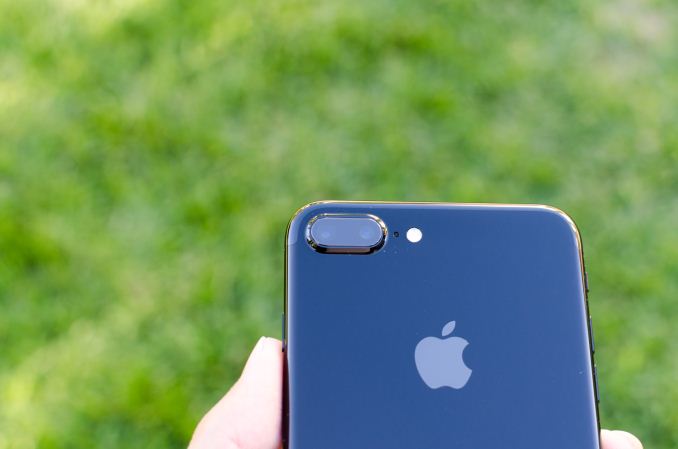
Putting aside discussions of materials, the iPhone 7 and 7 Plus both have distinctive changes to the antenna lines and the camera hump. While the iPhone 6 and 6s really tried to avoid showing a camera hump at all, the iPhone 7 and 7 Plus have distinct designs that highlight its presence even if the profile of the hump has been changed to make the difference in thickness less dramatic. The iPhone 7 also has a noticeably larger cover lens, but this isn't all that noticeable unless you have the iPhone 6 and 7 side by side. The iPhone 7 Plus on the other hand has a distinctly different camera design as the dual cameras are very obviously a point of differentiation compared to the iPhone 6 and 6s Plus.
The other noticeable difference is how the back cover integrates the external antennas. The use of parts of an aluminum unibody as an antenna isn't a new idea and dates as far back as the iPhone 4. However, the polycarbonate lines that help to separate the antenna from the rest of the back cover have been moved around to make them less noticeable. The jet black variant has especially close color and texture matching, which makes the antenna lines basically invisible. It's interesting to see how various OEMs have attempted to avoid or not avoid the issue of hiding these antenna lines, as Apple's approach here is fairly unique as far as I can tell. The jet black variant also helps to make the entire phone look like a monolith. The in-hand feel is distinguished in the sense that it's glossy all around instead of the traditional matte finish that is used in aluminum unibodies but really it almost just feels as if it's made of glass and is very smudge-prone even with the oleophobic coating and can easily scratch compared to something like glass.
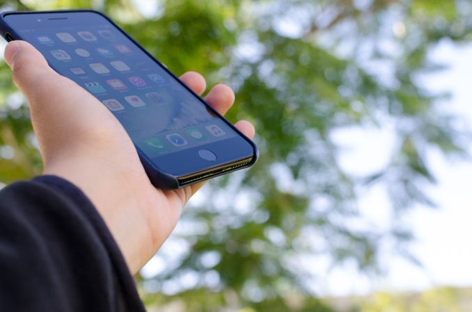
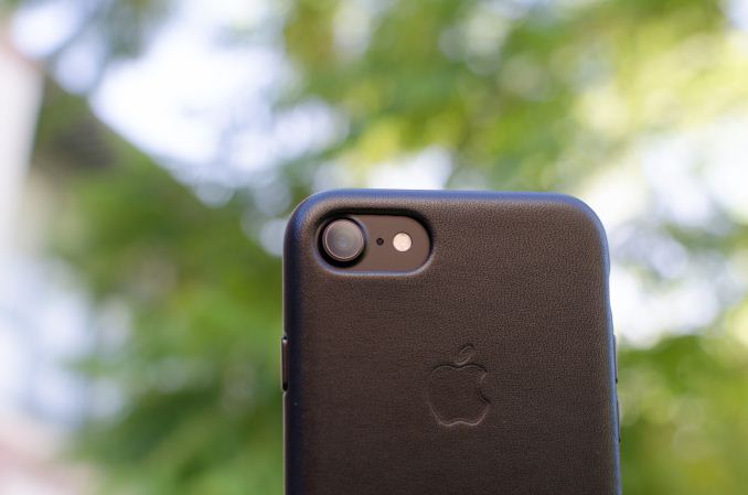
Apple has also made new leather cases to fit the iPhone 7 and 7 Plus. The general design and feel isn't changed significantly, but the buttons are now made out of aluminum which improves the feel of them significantly to the extent that I don't feel like I'm losing anything in feel relative to the naked phone. This helps to differentiate them relative to third party cases, particularly as the cost is generally much higher than the average case you might find on Amazon. In general the design is also well executed for a slim case as the camera hump isn't exposed and the display is recessed a bit to avoid direct contact in a drop.
Overall, the design of the iPhone 7 and 7 Plus is mostly an evolution of the iPhone 6's design, but it changes enough things that it doesn't necessarily feel like it's the same exact thing. I would say that it isn't quite as dramatic as the change from the One M9 to the HTC 10 but it is more noticeable than something like the change from the S6 edge+ to the Note7. The in-hand feel remains good and there are no noticeable problems there. I don't think that the design is especially notable at this point, but there are only so many ways to make a phone.




377 Comments
View All Comments
ddriver - Monday, October 10, 2016 - link
So much for long delayed reviews because of "details".willis936 - Monday, October 10, 2016 - link
It's been literally a month. What world are you living in?ddriver - Monday, October 10, 2016 - link
The world in which AT reviews take many many months apparently.londedoganet - Monday, October 10, 2016 - link
I, too, would like to base my buying decisions on quick impressions made in the week immediately after a product's launch. And Anandtech doesn't quite scratch that itch for me.solipsism - Monday, October 10, 2016 - link
If you want fast reviews of products there's innumerable websites and YouTube videos in which to choose. If your argument is, "sure, but it want it from AnandTech," and the reason is you want it from AT is because of their detail and thoroughness, then you have to wait for them to be detailed and thorough.Note that AT did give you a hands-on review from the event and an article of the teardown:
• http://www.anandtech.com/show/10657/hands-on-with-...
• http://www.anandtech.com/show/10687/early-iphone-7...
Cheesetogo - Monday, October 10, 2016 - link
Oh please, it doesn't require a month to write a review like this. Not sure if Purch doesn't fund the site enough or people just aren't motivated since Anand left, but there's been a very noticeable decline.Here's an AT review of the iPhone 3G, published *5 days* after the phone came out. It's also more detailed than this one.
http://www.anandtech.com/show/2571
dsumanik - Monday, October 10, 2016 - link
Everyone remember when i predicted this review, its content, the photos, and its outcome a few weeks back?Who's laughing now?
8)
solipsism - Monday, October 10, 2016 - link
You're compared they efforts they put into testing this phone's HW with how they tested the 2nd gen iPhone and also compiled a "more detailed" article because you're lumping in what would eventually be called iOS 2, which was demoed several months earlier? Geez man, I don't even know how to deal with someone who purposely posts such crap.Samus - Thursday, October 13, 2016 - link
Even Engadget writers live with the phone for a week or so before writing a review. A zero day review is useless for something like a smartphone.I like AT's style. They use the device for awhile, and don't even start writing a review until the first or second OTA update to reflect the realistic ownership scenario.
londedoganet - Monday, October 10, 2016 - link
I was actually being sarcastic.