Hands On with the iPhone 7 and 7 Plus
by Joshua Ho on September 7, 2016 7:30 PM EST- Posted in
- Smartphones
- Apple
- Mobile
- iPhone
- iOS
- A10
- iOS 10
- iPhone 7
- iPhone 7 Plus
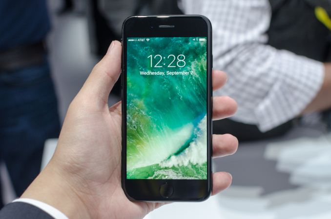
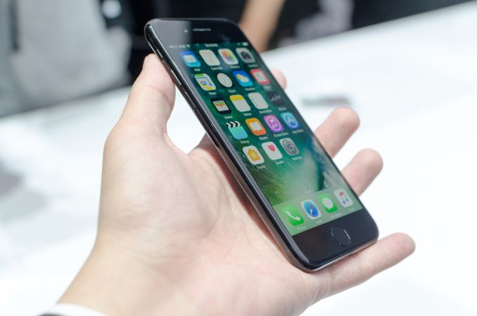
As the iPhone 6’s design turned 2 years old the iPhone 7 was launched to continue the two year cadence for their smartphone designs. As you might expect from a phone like this, rather than maintaining the same industrial design that we saw with the iPhone 6s instead we’re looking at a new, more refined design.
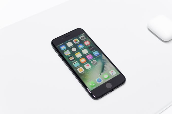
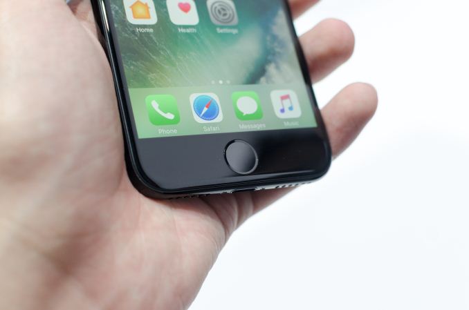
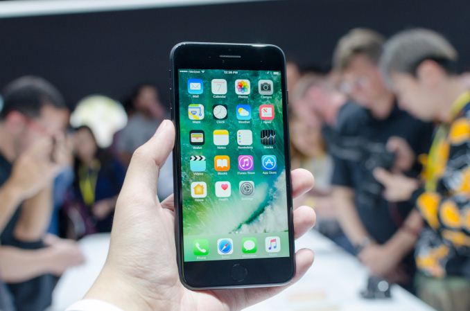
To get what I’m talking about, we can start with the iPhone 7 proper, which is the 4.7 inch variant. Broadly speaking if you were to only look at the shape of the phone there isn’t a ton that has changed, but if you look at all of the design elements together it’s clear that the design has changed in a fairly meaningful way. From the front, looking at the display you still get a familiar design as far as the earpiece, front-facing camera, and other sensors on the top, with a single home button on the bottom. However, unlike previous iPhones the button is solid state. I’ll have some more thoughts on this soon, but the home button still looks like previous iPhones because the fingerprint scanner isn’t placed underneath the cover glass. It also looks like the fingerprint scanner still uses different materials as the reflectance is clearly different, so this should still be a sapphire crystal.
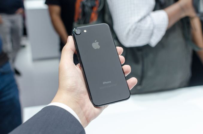
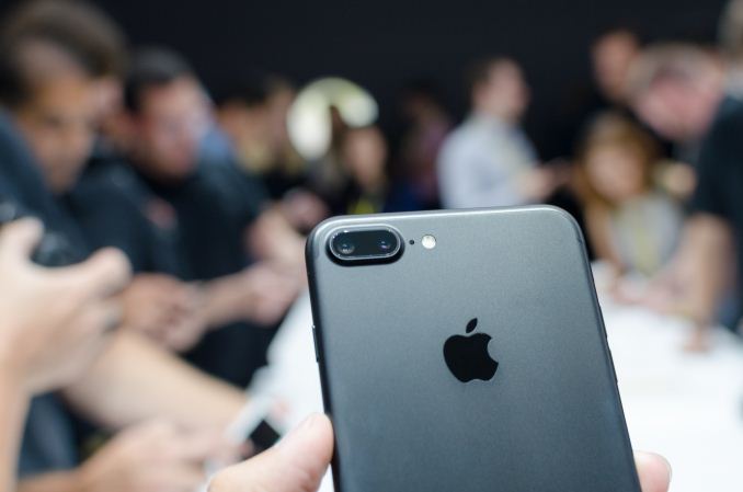
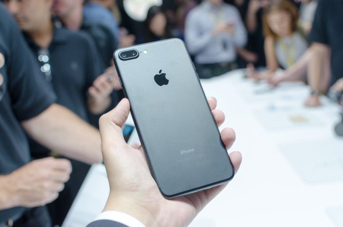
Moving on to the back cover of the phone the Jet Black version of the phone is clearly finished to a high gloss, despite using an aluminum back cover which usually have a sandblasted finish. This finish looks pretty nice for about the 3-4 seconds that it remains glossy, as unless you subject your hands to a bath of isopropyl alcohol I find it unlikely that you won’t immediately cover the phone in fingerprints. The high gloss finish honestly wouldn’t feel that different in the hand from hyperglaze in the Galaxy S3 other than the noticeably different heat conductivity of aluminum. Interestingly enough the new antenna demarcation lines are now running along the edges if you look at the phone from the back. When it comes to the jet black version, it’s much harder to notice the antenna lines because the color matching is fairly close and the plastic feels hard and glossy to the touch much like the aluminum itself. Of course, any other color is going to be more obvious in this regard but this phone is probably the closest Apple has gotten to replicating the monolith from 2001: A Space Odyssey.
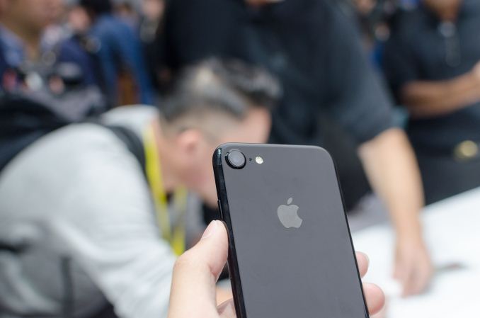
As far as design goes, it feels like Apple’s ID team has collectively gotten over the whole idea of trying to hide the camera hump. Rather than an extremely thin aluminum surround to hold the small cover glass of the camera, the lens has become larger and the hump itself is now integrated into the chassis itself. It’s much more obvious than the iPhone 6s, but I personally think this makes a lot more sense than continuing to pretend that phones don’t have camera humps, as this kind of design makes it less likely that the phone will rock around when it’s placed on a flat table.
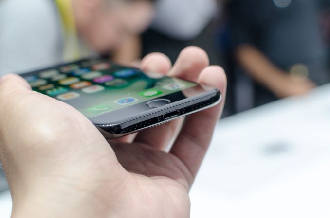
Along the left and right sides of the iPhone 7 we continue to have the same button layout, with power on the right and volume buttons on the left. The silent toggle switch remains identical to the one seen in previous iPhones. The main point of interest, and I suspect controversy is going to be along the bottom of the phone.
Along the bottom edge, there’s a set of speaker holes, a Lightning port, and another speaker port. I suspect at least some of these holes house a microphone rather than just being two speakers, but I guess this makes more sense as far as visual balance goes and helps distract from the space left by the missing 3.5mm headphone jack. There’s too much to be said here to just have a single sentence, so we’ll cover this later. As far as the design of the iPhone 7 Plus goes, it’s really just more of the same. However, the iPhone 7 Plus has a significantly changed camera housing to allow for dual cameras. I got to spend some time with the matte black version for the iPhone 7 Plus though, and I think this traditional sand-blasted finish is just clearly superior. The antenna lines are more obvious but the finish is less susceptible to scratches and doesn’t show fingerprints nearly as much.
As far as usability goes, it’s hard to make any snap judgments of performance, so I’m going to restrain from any commentary here until I actually get some time to sit and stare at two different phones side by side to give any thoughts here. I didn’t see any noticeable frame drops, but when you’re mostly using system applications it’s usually almost impossible to notice these things unless something is seriously wrong.
Things like the new solid-state home button are a huge step forward as far as feel and reliability goes, but in some sense knowing that this is ultimately a capacitive touch sensor with some force sensing was somewhat confusing at first because I touched the home button the way I would an HTC 10 and expected it to work off of almost no actuation pressure. If you treat this home button like a physical home button though it works just as expected, and feels just like a real button. Unlike a real button it’s unlikely that you’ll ever break this home button though, so with time I’ll probably see less people using on-screen buttons to compensate for broken home buttons.
In the case of the iPhone 7 Plus, the dual camera works well within the functionality implemented. At this time it looks like the only feature available is zooming, and it’s definitely possible to see much more detail from the zoom lens than with the wide angle lens, but I’m not really able to say much else at the time because without the ability to test the camera in a room with dim lighting or the ability to walk around with the phone at night with a tripod means that I can’t provide any meaningful commentary on the performance of the camera at this time. Similarly, things like the front-facing camera and IP67 resistance cannot be tested reasonably in the context of a hands-on lasting less than 20 minutes.
What is worth mentioning here is that the stereo speakers work quite well. Although the demo room was loud with the sound of multiple journalists trying to film and talk into a camera, it was actually possible to hear something from the speakers which is honestly quite impressive. I can’t tell whether the top speaker has a different frequency response than the bottom speaker, but I wouldn’t be surprised to know that the setup here is similar to the HTC 10’s design in that regard. The final point of interest here is going to be the 3.5mm jack, and for better or worse it’s been removed. I’m still trying to get details on the specifics of this implementation, but if you have earbuds that use the 3.5mm jack you’ll have to use an adapter that comes with the phone that plugs into the Lightning port.
Really though, it's obvious that Apple is trying to push people towards using wireless headphones of some shape or form, as there were quite a few AirPods available for demonstration.
Pairing of the AirPods was shown to just be done by holding them near the device and pressing the connect button whenever it popped up. Once paired the earbuds go into the ear, with automatic playback through the earbuds if the proximity sensor is tripped and pausing if it detects removal once playback starts. Double tapping the earbuds will cause it to activate Siri, and it looks like the microphones do some noise cancellation in order to enable better calls and voice commands. However I didn't really see any evidence that active noise isolation is active in these earbuds so they won't really isolate you from the environment.
Overall, the iPhone 7 and 7 Plus look to be interesting to say the least. There are a lot of things that a hands-on can't cover like the new SoC, whether the loss of a 3.5mm jack really matters, and whether the phone represents a major upgrade overall. Regardless, the iPhone 7 and 7 Plus go on pre-order on September 9th, and will be available for sale on the 16th and will be available in Jet Black, Black, Silver, Gold, and Rose Gold.




91 Comments
View All Comments
zeeBomb - Wednesday, September 7, 2016 - link
Now onto the review 🙌 Apple came thru nicely this year...but that price on the Air PodsByte - Thursday, September 8, 2016 - link
Hurry for Apple to have the courage to introduce "Piano Black" so that we can once again can look like we have iPhone 3Gs!zeeBomb - Saturday, September 10, 2016 - link
And be completely tolerable to scratches, subsequently forcing you to buy a case!dawheat - Wednesday, September 7, 2016 - link
I think the iPhone 7 is a fantastic phone but this did made me lol. The design has changed in a "meaningful way" as it goes into Year 3 because the antenna lines were moved and the headphone jack removed?I reference his Note 7 review as Samsung's glass and phone design enters Year 1.5 with actual physical and dimensional changes yet...
"The Galaxy S6 was a massive leap forward for Samsung, and as we approach the end of year two for this design I think it’s time for Samsung to move forward once again. There are only so many ways to make a slightly rounded rectangle, but something other than the same curved glass and aluminum frame with physical home button would go a very long way towards refreshing the design."
zeeBomb - Wednesday, September 7, 2016 - link
I wonder if Apple low-key implemented a Sapphire glass screen? Prob not.Geranium - Thursday, September 8, 2016 - link
Just regular Gorrila Glass with fancy name.lilmoe - Wednesday, September 7, 2016 - link
You gotta give the man some props. He skillfully transformed a carbon copy design into something completely new and "meaningful". Just, bravo.Kind of tells you what to expect in the future.
name99 - Thursday, September 8, 2016 - link
Do you not consider a wide-gamut screen change a "meaningful" change?It may not be an obvious aspect of the "design", but it IS a meaningful aspect of what the naive users see when they look at the device.
Likewise for stereo speakers.
Meteor2 - Thursday, September 8, 2016 - link
As you correctly state, that's not part of the ID, so not what's being discussed here.name99 - Thursday, September 8, 2016 - link
So, just to get this straight, it's the Android people who claim Apple is a "fashion" company who are upset about the "lack of change in design" while the actual BUYERS of the product seem perfectly happy with the FUNCTIONAL changes?And this is supposed to be an insult to the APPLE fans?