AnandTech Guide to Better Photos: Composition
by Stephen Caston on November 19, 2004 12:05 AM EST- Posted in
- Digital Camera
Balance and Space
Now, we are going to take a look at balancing different elements in your composition. It is important to be aware of the "weight" that objects have in a picture. By "weight", we are referring to the attention that each object receives from the viewer. Weight can be affected by the color, size, tone, etc. of the elements in your pictures. For example, in a picture with all black and white objects, a red strawberry will receive the most attention. When you take a picture with several elements, you should be aware of the balance created by the weight of these elements. In general, people prefer pictures that appear to have some sort of balance to them. Additionally, quite often the most obvious balancing methods are also the most boring.
In the image above, the larger (and mostly hidden) castle on the right is balanced with the smaller structure on the left side. The size difference in this balanced image creates an interesting dynamic. If you think of the middle castle as the fulcrum, you can see how the smaller subject on the left is able to balance the large castle on the right by being positioned further from the center.
We also want to talk about the effects of using space as a balancing element. Using space in pictures is often a welcomed change from the "fill the frame" approach.

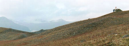
In the image above, we have offset the subject sitting on a rock at the upper-right with the open space of mountains on the left. Notice how this arrangement can create an atmosphere of contemplation or isolation. In general, space can be used to evoke the imagination of the viewer. For example, "leading" space can be used to give the impression of movement. This is done by leaving extra space in the direction that a subject is facing.

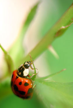
By positioning this ladybug at the lower left of the frame, we were able to give the viewer the impression of movement. Also, notice that by selecting a large aperture opening, we were able to blur the distracting background elements. "Leading" space is a common-sense concept that is also used by movie directors to give the audience an idea of where a character is headed. A good example of the importance of leading space can be seen in horror films. You know something bad is going to happen when a character is backing up, yet there is no leading space to show where he/she is going. In this sense, the inclusion of leading space in the frame can be a comfort to the audience.

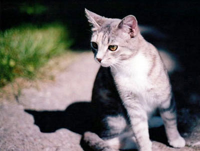
Here, we chose to leave some empty space in the frame opposite the cat. If the space on the left were cropped out or simply not included in the shot, the picture would have a very awkward appearance. By allowing for some empty space in the direction of the cat's gaze, we were able to provide a better balance and a far more intriguing picture. As you can see, balance can play a very important role in the effectiveness of pictures. We really want to stress that although space is commonly neglected as a compositional tool, it can be very powerful.


25 Comments
View All Comments
kcma - Friday, November 19, 2004 - link
i'm a photographer, and i think articles and books like these are just silly... it's like, guide to become creative!! or shortcuts to becoming smart!!you learn to compose by paying attention to your photos, and receive feedback from others. there are too many websites out there where you will get valid crits. follow a guide to compose creatively will only let you compose as creatively as the writer and everyone else who read it.
of course, no one will listen to me, and just think, "wow, bookmark the guide, my photo bible is here!!" have it your way, it's your photos, i'll do my job and you do yours :)
Dustswirl - Friday, November 19, 2004 - link
Very good article! now i see opportunities to take pics that were all around me all the time!I hope there will be hints on shadows/contrasts, their use and their problems in the next article!
Calin - Friday, November 19, 2004 - link
I can hardly wait for the second article in the series. I've sent this to some people I know, it's certainly worth readingCalin
Seemann - Friday, November 19, 2004 - link
Pretty good article. I'll remember when I take some photos.apriest - Friday, November 19, 2004 - link
Some VERY good pictures there Stephen! Good article too. I especially liked the three pictures on the last page. Great first article for this series.Aaron Priest
aaron@coastaltech.org
http://aaronpriest.smugmug.com/
http://www.coastaltech.org/photography.htm