The Huawei Mate 8 Review
by Andrei Frumusanu on January 5, 2016 1:00 PM EST- Posted in
- Mobile
- Smartphones
- Huawei
- Cortex A72
- Kirin 950
- Mate 8
- CES 2016
Software - EmotionUI 4.0
The Mate 8 is the first Huawei device to ship with Android 6.0 Marshmallow. As in the past, Huawei tries to improve and differentiate from stock Android by including a customized UI that tries to introduce some larger UI changes as well as functionality. The newest iteration of Huawei’s skin, called EmotionUI, reaches version 4.0 and is an evolution of EmotionUI 3.1 that we’ve seen on the P8 and Mate S.
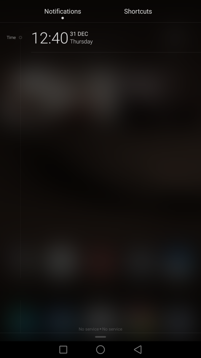
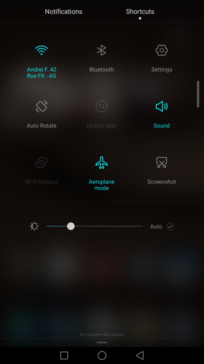
In terms of design we see a continuation of a frosted translucent black notification shade and quick-settings drop-down panels. Here we didn’t see much change compared to EmotionUI 3.1. I appreciated the look that was introduced on the P8 and as such don’t see much need to change what is otherwise a clean interface.
I did notice that Huawei changed the drop-down behaviour when swiping down the notification shade; in the past you’d have to swipe down with two fingers to get to the quick-settings view, while one finger swipe naturally opened up the notification view. The difference in behaviour now is that when you don’t have any notifications available, a one finger swipe will open up the quick settings panel instead of the notification shade, a change that made sense to me and I somehow appreciated with continuous usage.
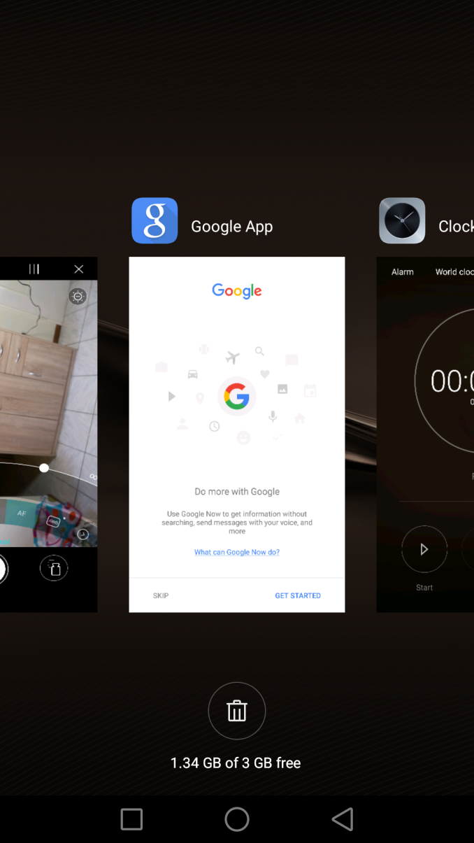
An extremely large improvement and change to a nagging UI choice in EmotionUI 3.x is the task switcher. Huawei has thankfully abandoned the 4-tile paginated preview UI in favour of a more stock-ish continuous scrolling linear layout. The difference here is that instead of having vertically stacked previews of the apps, we see full-screen previews that are arranged horizontally. This allows Huawei to still keep the gestures (swiping down on a preview) for “locking” an app from being killed by memory management. Swiping up will still kill the application.
The video above was recorded via the system built-in recording function. Beyond the already existing option to draw letters or figures with your knuckle and bind them to shortcuts to applications, Huawei introduced the option to take a screenshot with a double-tap with one knuckle, or to trigger video recording with a double-tap with two knuckles. The resulting video format is 720p at 18fps with a bitrate of 2.7Mbps, which is not quite of the best quality but at least serves its function and is storage friendly.
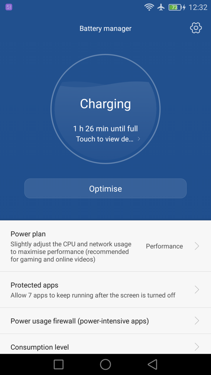
On past year’s devices I mentioned that the overzealous power manager’s (Power Usage Firewall) default settings resulted in a lot of warning notifications of power-hungry apps running in the background. On EmotionUI 4.0 I haven’t seen a single such warning as it seems Huawei has greatly toned down the default warning thresholds. Unless an application is “locked” or protected via the task manager interface, the system kills applications once the device is suspended, even if they acquire wake-locks. The feature that can be positive to disarm badly designed applications which might drain battery life in the background, but definitely needs to getting used to when coming from other Android implementations following the default memory management behaviour.
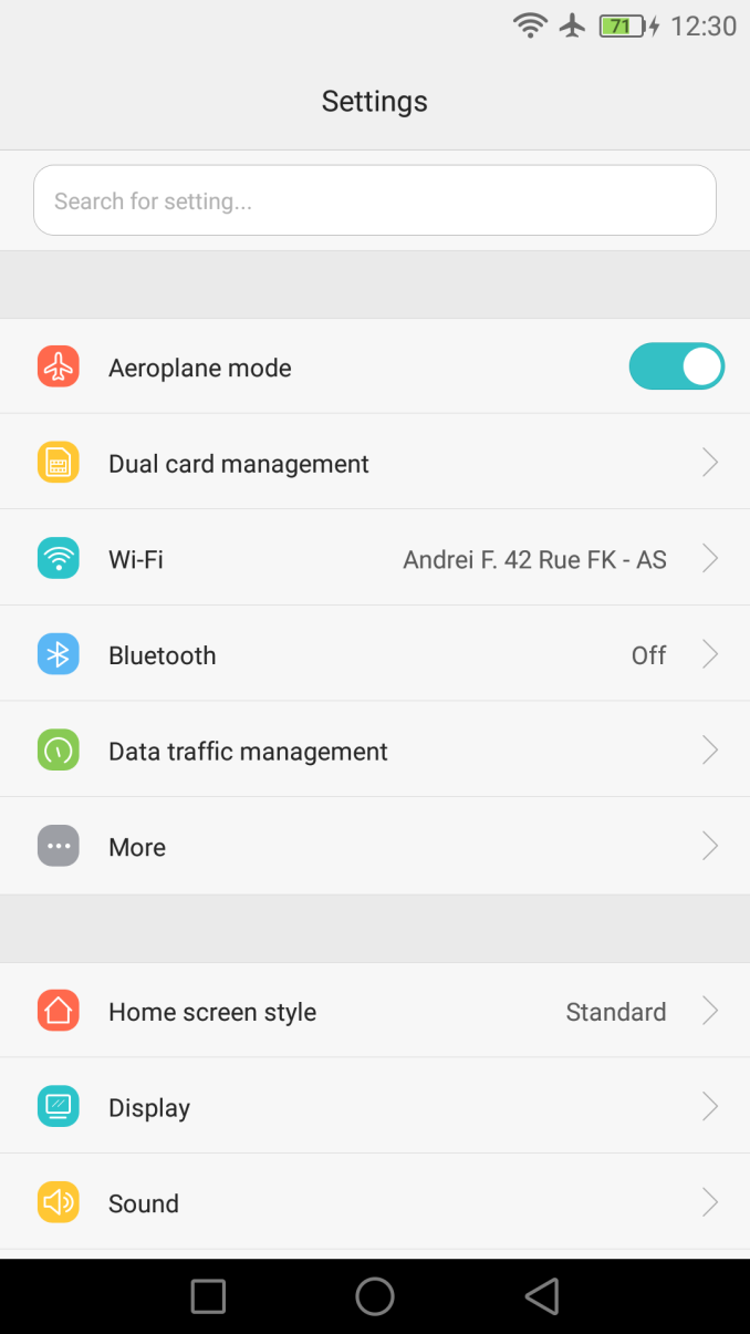
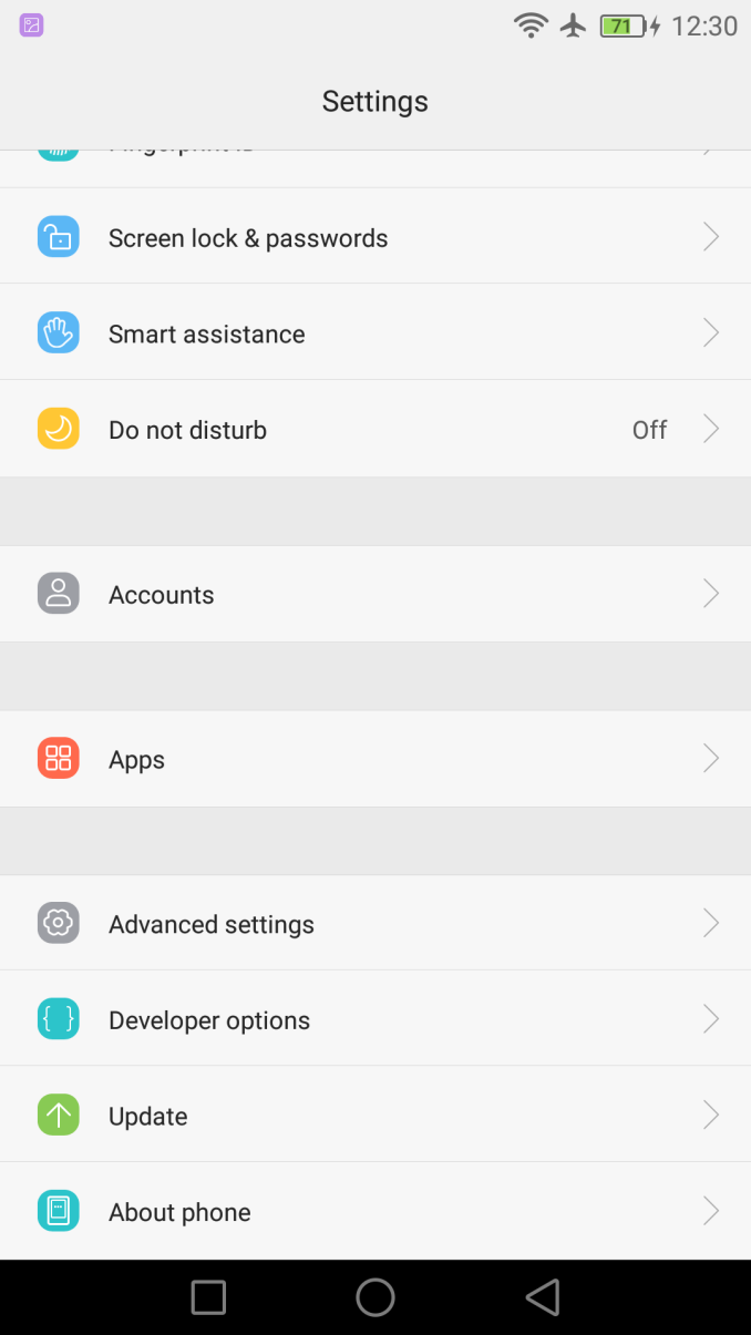
Further large UI changes can be found in the settings page where Huawei has drastically cut down on the amount of items in the main settings view, rearranging a lot of the usual configuration categories in sub-menus. The “Advanced settings” sub-menu has become a collection of the least accessed settings, which oddly enough also now includes the Battery Manager page which further also hides the classic “Consumption level” page in a further sub-menu. Android’s battery consumption statistics are just estimates than are often very inaccurate so I’m glad that Huawei buried the misleading numbers away from the average user, but I still would have liked to see at least a more accessible device battery lifetime and screen-on time statistic at higher level somewhere in the settings.
Because the Mate series and phablets in general come with such large displays I’m always disappointed to see manufacturers not actually take advantage of the screen estate and ship the devices with an appropriate UI density that allows for more content on a given screen area. This was a problem for the Mate 7 and something that I also immediately picked up on on the Mate 8.
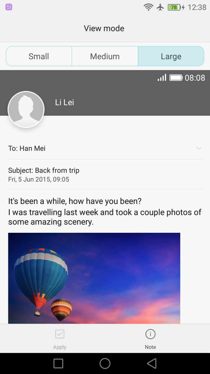
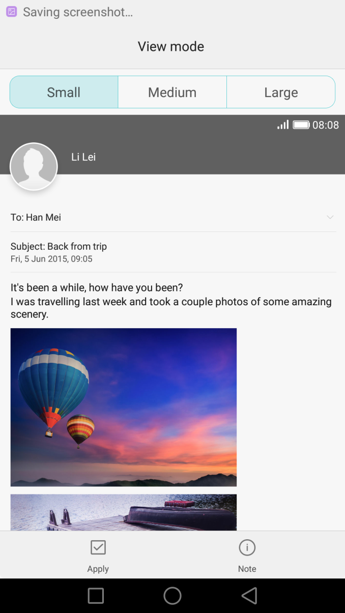
Thankfully a new feature of EmotionUI 4.0 is the ability to change the system’s global DPI settings. Found under the display settings, the “View mode” page allows to choose between three different density settings that scale all interface elements system-wide. Changing the setting requires a reboot for it to take effect. At the highest density the Mate 8’s UI elements are roughly the same size as found on the Nexus 6P, but with the advantage of having a larger screen area. Looking back at the Mate S I now realize that it’s something I didn’t pick up on while reviewing the phone, and Huawei’s past device would definitely benefit from higher density interfaces and inclusion of this new feature. I would more than welcome other vendors to include configurable DPI settings as it can greatly improve a device’s screen experience, which is by the way also something that isn’t solely limited to large screen devices.
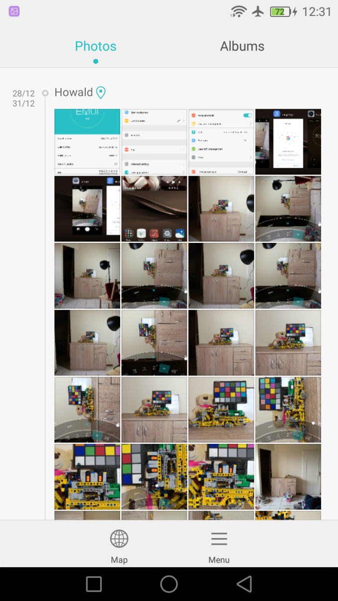
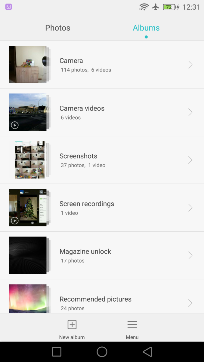
In terms of system applications there hasn’t been much change in EmotionUI 4.0. All default apps are very functional and work well. The Mate 8 hasn’t lost any of the additional features that were introduced with past devices and that’s not a negative thing either. Even though themes are available, they are just able to change icon packs and colour accents in applications. There is still a lot of white in the UI of the system apps, something we saw introduced in Huawei’s larger UI overhaul in EmotionUI 3.0. It may have been interesting to see a switch to the more modern navigation and button schemes that were introduced with Android 5.0.
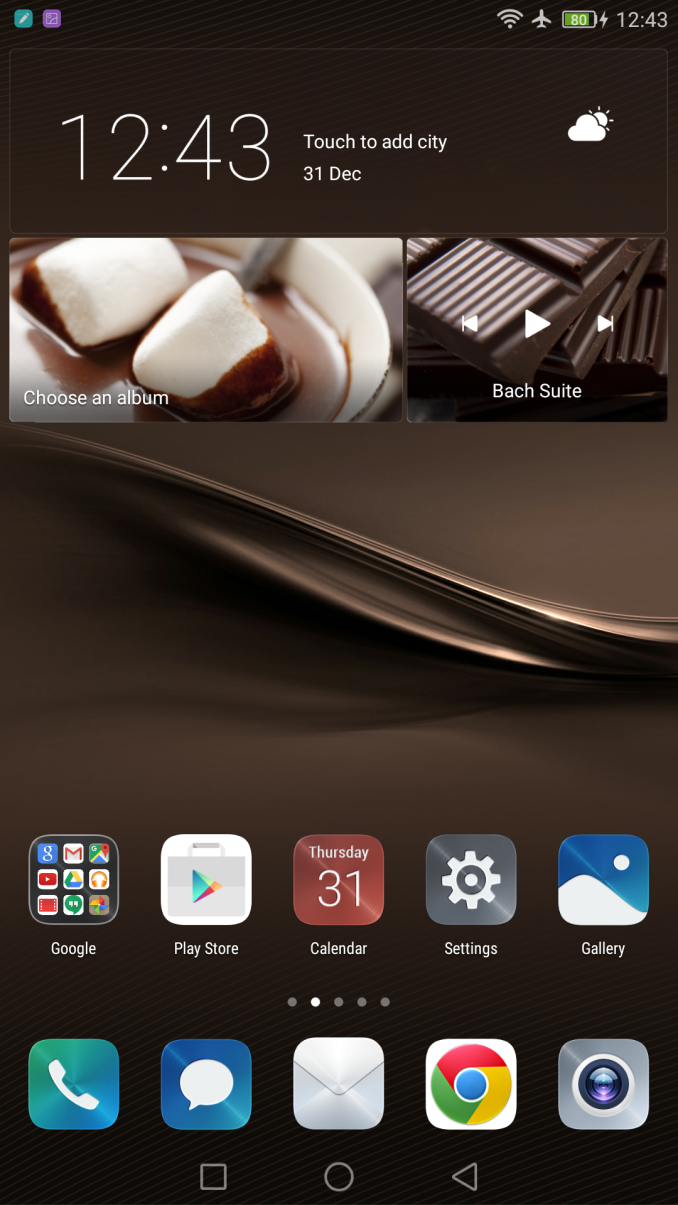
One particular design choice that still doesn’t go well with me personally is the default launcher and the normalized icon frames that try to mimic iOS’s style. This together with the fact that there is no application drawer inclines me to quickly drop the stock launcher in favour of a third-party one, which thankfully is an option and works without any issues.
I’ve liked EmotionUI in past reviews and the Mate 8 is able to make some evolutionary improvements that is able to fix some of the more outstanding critique points found in past devices. I’m definitely happy that Huawei finally changed the multi-tasking UI as it makes for much more fluid and ergonomic usage, something which was definitely a problem with last year’s Mate 7 and to a lesser extent smaller form-factor devices such as the P8.
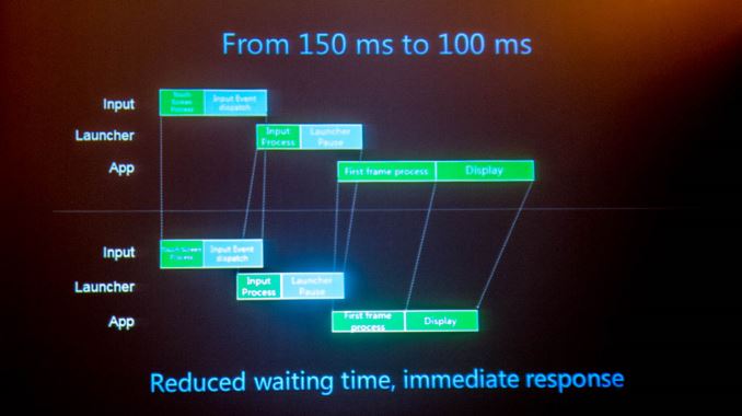
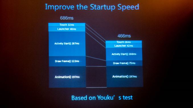
In terms of performance Huawei and particularly HiSilicon seem to have made very large improvement to the Android codebase. This was one of the talking points during HiSilicon’s presentation of the Kirin 950 and how the new BSP software improves on things such as touch latency and application launch time. This seems to have very visible and immediately noticeable results as the Mate 8 is by far the fastest Android device I’ve come to use to date. When turning off all system animations it becomes visible that when switching between applications the Mate 8 is able to respond much faster than for example the Nexus 6P or Galaxy Note 5.
All in all the Mate 8’s software is very good. Any subjective design elements such as the launcher are replaceable, while the rest of the UI is clean and attractive, although one can still fine some older design elements related to the system applications. It’s definitely in regards to performance that Huawei was able to impress as it’s something I didn’t expect at all and actually puts the performance of other Android devices in perspective, so I hope Google and other vendors are closely paying attention to the improvements made on the Mate 8.




116 Comments
View All Comments
syxbit - Tuesday, January 5, 2016 - link
Despite only using the MP4 variant of the Mali-T880, I wish Google had used this SoC in the Nexus 6P.The Snapdragon 810 is garbage, and the only bad thing about my phone. It gets very warm when simply browsing webpages.....
jjj - Tuesday, January 5, 2016 - link
Page 2 you do 810vs 820 FP comparison, wrong paste.tuxRoller - Tuesday, January 5, 2016 - link
Unless your browsing includes js/webgl heavy games, out benchmarks something is wrong with your phone.The only time I've noticed my gf's n6p getting noticeably warm was during benchmarks.
IanHagen - Wednesday, January 6, 2016 - link
Is your girlfriend using her phone outdoors in Winnipeg, by chance?tuxRoller - Wednesday, January 6, 2016 - link
Oymyakon. Why do you ask? Do you think that's significant?IanHagen - Thursday, January 7, 2016 - link
Well tell her to be careful! The ground might be slippery with all this ice and fish laying around, she might slip and drop her brand new phone. That would be a problem. Erm... what was it we were talking about again?tuxRoller - Tuesday, January 12, 2016 - link
Oh, don't worry! The fish aren't a problem any longer. It's really the roving superpacks of wolves you need to watch out for...also, her phone has a case:)Ethos Evoss - Wednesday, January 6, 2016 - link
Ppl never learn that ShtDragon is epic fail..Now SD 820 is going to be tested on LeTV on purpose in case of ignite..
LeTV not realising qualcom used them as experiment and others manufs. will be watching.. bcos nobody wants to implement SD anymore..
syxbit - Wednesday, January 6, 2016 - link
SD800 and SD801 were brilliant chips, and SD805 was pretty good, but came out when others were further along with 64-bit. People have hope that SD820 will bring them back on track. However, if SD820 is bad, QCOM will risk losing permanent trust with everyone. They really have to nail SD820. Even Google was rumoured to be so unhappy with QCOM after SD810 that they began looking into designing their own SoC designs.SD810 was so horrifically bad, that they really owe everyone an apology. SD810 singlehandedly caused most flagship 2015 devices to suck, overheat, and have bad battery life. Worse still, QCOM denied the problems, claiming that people were just just spreading FUD about overheating SD810.
Just look at QCOM's stock. They're at almost half their value from a year ago. All attributable to SD810. They need to apologize, and admit that SD810 was awful before people will believe their claims for SD820.
However, most people believe that QCOM's custom SoC were great, so there's hope for SD820.
extide - Thursday, January 7, 2016 - link
Well, the benches for the 820 are out ... and they look pretty good so I am pretty confident that the 820 will not be a disappointment.