The Google Nexus 6P Review
by Andrei Frumusanu on December 16, 2015 8:00 AM ESTSoftware UI
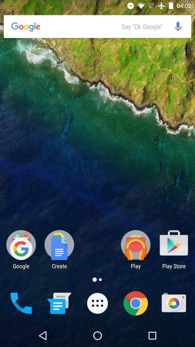
In terms of software the 6P is able to sport the latest Android 6.0 Marshmallow, courtesy of course of being a Nexus device. There’s not terribly much to say about the OS that hasn’t been said already by Brandon’s analysis in the review of the Nexus 5X. This is due to the fact that all Nexus devices come equipped with the same software experience, but also due to the fact that Android 6.0 offers very little front-facing changes.
I’ll openly admit that I’m not too much of a fan of the stock Android experience: Over the years Google’s stock Android has always been praised as the “pure” experience and how Android should be. I find this a bit unfortunate as I find there’s a lot of usability flaws in the stock. It’s the simple things that most other OEM skins add that I find the most lacking in stock Android, examples being the lack of an auto-brightness toggle in the quick settings or even having a brightness slider directly available in the notification shade itself which reduces the motions to get to the settings.
My biggest gripe however are the navigation buttons and Google’s lack of an option to reorder them. While I understand the design decision and logic behind having a back button on the left, it makes no sense in terms of usability for the majority of people that are right-handed. The back button is by far Android’s most used navigation button, so I found the Nexus 6P’s larger size to exacerbate the issue as I need to always change grip or stretch my thumb to able to reach it properly. Still having this huge ergonomics issue after this many years is basically inexcusable – the notion that it’s more intuitive to have it on the left is a poor rationale as “unintuitive” use-methods can be learned and taught, but my thumb stopped growing a long time ago and I imagine so did everybody else’s. Virtually all OEMs recognize this issue and either come by default with reversed navigation buttons or by at least offering the option to rearrange them. Here’s hoping that Google listens and adds this as a stock option for future Android releases, similarly how they did for many other past features that were pioneered by third-party vendors.
Ambient display is a great feature that takes advantage of the 6P's AMOLED screen. Every time you pick up the device it will show you a minimalistic greyed out view of your current notifications without having to press any buttons. The detection is a bit finicky and sometimes goes off too easily as I often saw ambient display trigger itself while the device was just laying steadily on my table, and also sometimes when you do want it to go off when you pick up the device it might decide not to. However when it does work it works well, and it also enables you to directly unlock the phone from there. I do wish the display period had been configurable as sometimes where you have a lot of notifications the screen will go back off before you can read all of them.
Other than some of the aforementioned annoyances, the stock Android experience is a good one. In terms of performance, there were some concerns that I’ll reiterate in the PCMark writing sub-test but otherwise the device is fluid as you’d expect it to be. I may be biased when saying this but I just don’t think stock Android is an “exciting” experience or a platform where we see lots of innovation. I’m aware that there are groups who vehemently adhere to Google’s design decisions, but for me personally it just doesn’t do it as it comes with too many daily usability regressions.
NAND Performance
In terms of NAND storage, the Nexus 6P uses a Samsung eMMC module. In fact, this is the same “BGND3R” variant as found in this year’s HTC One M9. For testing I also ran the NAND benchmarks on an unencrypted data partition to be able to analyze Android’s full disk encryption overhead that is now obligatory for all new devices shipping with 6.0 Marshmallow.
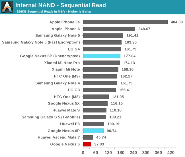
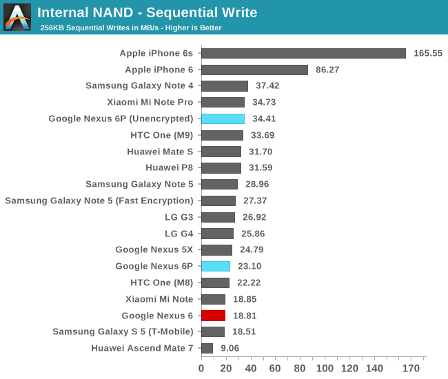
As we can see the unencrypted numbers perform as expected and within range of the HTC One M9’s performance. The encrypted numbers which come as default with the device are the more concerning ones as we see a decrease in read performance of up to 84% and write performance decreases by 43%.
The Nexus 6P uses software decryption, accelerated by ARMv8 cryptography instructions. Google claims that this method is actually faster than using Qualcomm’s Snapdragon built-in SoC dedicated hardware crypto unit, which points out to a possible severe lack of performance and readiness on the part Qualcomm's SoC. We were curious to determine if this was solely an issue for Qualcomm and re-did some encrypted and unencrypted runs on the Note 5 and found that the overhead of encryption on that platform is very minimal, pointing out to that the degradation seems to be limited to Qualcomm's SoCs. It would be interesting to see if the Snapdragon 820 will be able to offer improvements in this regard.
In the end, the Nexus 6P’s out-of-the-box performance on the encrypted data partition seems very lackluster and it may affect application speed. One has to remember that it’s only the data partition that is encrypted, as we see no degradation on the internal or system partitions as they remain unencrypted.
WiFi Performance
The Nexus 6P comes naturally with 802.11ac WiFi in 2x2 MIMO configuration, all powered by Broadcomm's BCM4358 WiFi SoC. This is the same chipset found in other devices such as the Galaxy S6, so hopefully performance will be similar.
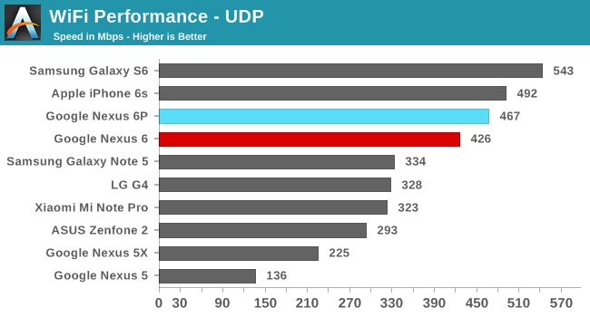
And indeed we see excellent WiFi performance from the 6P as we reach up to an average of 467Mbps, up there among one of the fastest WiFi implementations in today's smartphones.




219 Comments
View All Comments
Refuge - Wednesday, December 16, 2015 - link
Thank you! Finally! :DMuch appreciated.
Der2 - Wednesday, December 16, 2015 - link
I cry everytiem when I can't get first.nico_mach - Wednesday, December 16, 2015 - link
Did anyone else find the stock Android complaints puzzling? I switched straight from a tiny iphone 5 to a Nexus 6 and no problems, I think stock Android is a revelation, bright, responsive and with Marshmallow very smooth. I don't use a brightness slider - seems kind of picky. And the back button is, well, fine. It's not like IOS's 'back' button in the upper left is more accessible, right?Finally, there should be gripes about out-of-the-box battery life. Ambient display, Google Now and Location services are too costly in battery to have on by default. Apple ruined music and Google search ruin Android. Irony. At least those can be turned off. Why I have to be prompted about location services when I ask for directions is beyond me - YES turn it back on, I asked for directions!
I can't understand why Google is so keen on defaults that drive people away from Android. It's really very good otherwise. And hopefully they'll fix tablets the way they improved Nexus phones this year.
sleepycujo - Wednesday, December 16, 2015 - link
In fact this is a point most people avoid discussing. I feel it was time somebody brought this up. The stock android feel is exactly what its called. Plain vanilla. Doesnt feel premium and looks just like a 100$ motog(may be lesser). Moreover the simple things you can get used to using OEM skins like swipe to call, message or numerous other features are simply missing unless you root your phone and put in an AOSP Rom with the same look but additional features which is fine on a lower end phone, but shouldnt be necessary on a flagship. I personally think the OEM versions are all upto individual tastes and needs but necessary anyway. LG, Samsung, Huawei and even Mi flavors are what makes Android so loved(and hated!).grayson_carr - Wednesday, December 16, 2015 - link
Lol, swipe to call. I owned a Galaxy S6 earlier this year and hated that feature. I would accidentally activate it when trying to swipe between different tabs (a standard Android interaction) in the dialer app. Not to mention, in the stock Android dialer you just tap to call, which is easier than a swipe. And if you want to message someone, what are you doing in the dialer app? Funny you used that feature as an example because that is exactly the type of feature that annoys me about skins and makes me long for stock Android.lilmoe - Wednesday, December 16, 2015 - link
ExDialer. Never looked back.skavi - Thursday, December 17, 2015 - link
I do that all the time on my S6. God, I hate TouchWiz. Why ruin such an amazing phone with shitty software? Why include 3 fucking gigs of RAM if you don't allow the phone to use it? Just take the good parts (camera app/split screen) and put them on stock Android. Sometimes I feel like they change shit just to change it, even though Google's implementation is clearly better.gochichi - Saturday, February 27, 2016 - link
TouchWiz is clearly a disaster. Until it disappears, I cannot buy another Samsung. Keeping my Note 4 as a little tablet, but I'm just saying no to skins from here forward. Nexus, or iPhone for my phone going forward. It's a real shame. And the lag in updates is plain absurd. No android 6 on S5, S6, Note 4, Note 5... To get android 6 (which is damn old news at this point) get the S7??? Ummm, hell no... Show me some support first. Nexus 5 is smoother phone than Note 4 and when you look at the specs, the only possible explanation is the software is junked up and not even optimized.ACE76 - Wednesday, December 16, 2015 - link
Your implying that there's better availablke in terms of UI from other OEMS? Apple's interface is as boring and "stock" as it gets and doesn't even have a app drawer. Touchwiz is about as ugly and "in your face" as it gets.Devo2007 - Saturday, December 19, 2015 - link
You mean Apple doesn't have a desktop. It's all just an app drawer.....