Life with the Lenovo Yoga 2 Pro
by Brett Howse on July 30, 2014 2:00 PM EST- Posted in
- Notebooks
- Lenovo
- Windows 8.1
- Yoga
Design & Chassis
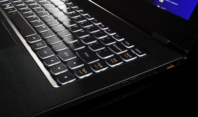
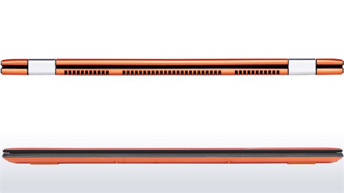
The Yoga 2 Pro continues with the design philosophy of other Lenovo Ultrabooks like the U300s. Rather than imitate a MacBook Air and taper to a thin edge, the styling when closed is more like that of a closed book. The shell of the device is entirely soft touch plastic, including on the bottom. The front lip has an edge with a rubberized coating, which is used as a grip to prevent the device from sliding around when opened up to extreme angles and used in tent mode. The soft touch plastic continues to the interior, where it surrounds the island style backlit keyboard.
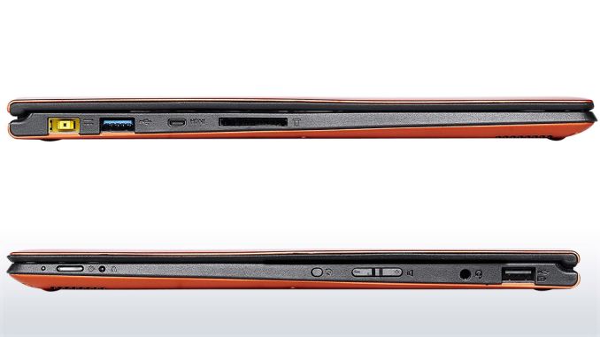
The chassis is solid, but the lid has some flex to it. The 0.61" (15.5 mm) frame feels thin but solid, and the 3.06 lb weight is suitable for carrying in a bag. There are only two USB ports, with only one of them being USB 3.0. The 2.0 port can be powered when the device is off to allow charging a smartphone or other device. Lenovo has offered the Yoga 2 Pro in both grey and a vibrant “Clementine Orange”.
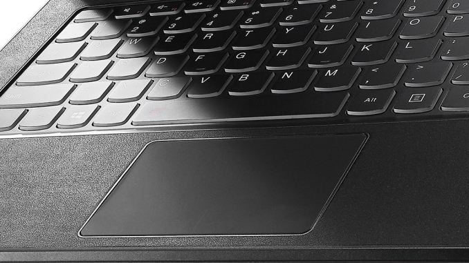
Moving from the Alienware, using the Yoga 2 Pro as a laptop is an experience. The keyboard has good travel for a thin device, and the keys have an aural indicator (which I like). The trackpad measures 3.5” x 2.25” (90mm x 57mm) and comes across as quite smooth. As seems to be the standard these days, the trackpad is a clickpad, with no discrete left and right click buttons. While I prefer dedicated left and right buttons on the trackpad, I do see the tradeoff of a clickpad to allow a larger area for the trackpad.
The trackpad supports all of the Windows 8 gestures for charms and app switching, among others. I found these to be a big distraction though, as often when I was typing my palm would brush the trackpad and I would switch to another app. The palm rejection could use some work, but if I disabled all of the gestures I was much happier. In my opinion, they are not really necessary. I have never been a huge fan of trackpads and due to my usage model, I have always preferred the track point available on the ThinkPad lines, or preferably, a real mouse.
The key point of the device is the hinge, which allows the screen to open a full 360° to make the device into a tablet. As I alluded to earlier, we bought this device first and foremost as a laptop. I did not really expect the hinge to be a big deal. I was wrong.
With a touchscreen and Windows 8.1, this device (as you should expect) is just as happy running desktop applications as it is in the modern world of Windows 8.1. For as much as Windows 8 has caused controversy in the computing world, a form factor like this is what I would imagine Microsoft's original plan migrated towards. You can easily switch from laptop to stand mode, and use it completely as a consumption device. If you need to send an email, switch it back, and you’ve got a full keyboard. It is funny how something so simple as being able to open a laptop wider can completely change the way you use it, but that’s the case with the Yoga 2 Pro
Laptop Mode
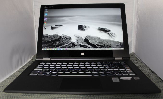
As a laptop, the Yoga is a device to get things done on the move. It feels as if there is no compromise, unlike some of the other two-in-one devices with a removable keyboard, which can be top heavy since the internals of the laptop are in the screen. Since the internals are still in the keyboard portion of the chassis, it feels and behaves like any other laptop.
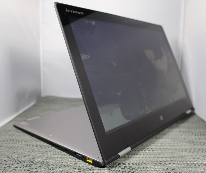
Tent Mode
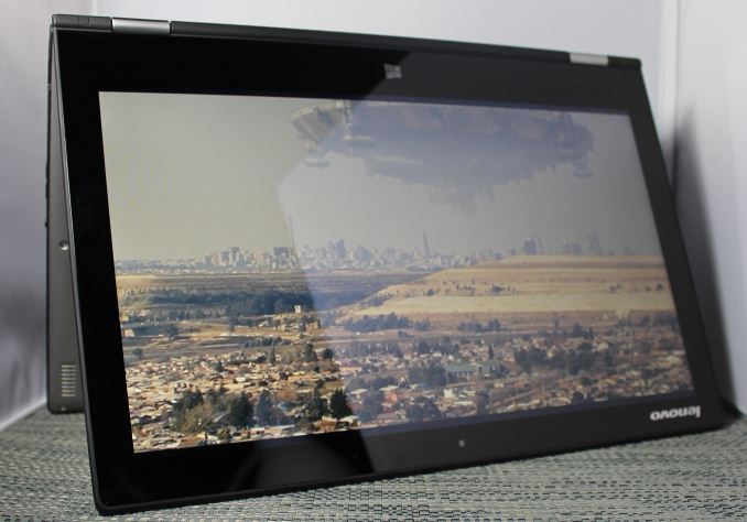
By folding the device like an upside down V, the user can implement tent mode. If the user wanted to do any sort of touch mode activities, tent mode is great because with the rubberized front edge and the V shape the device is extremely sturdy. Pecking at the screen in this mode has no bounce. If you have a flat surface and want to play a touch game, this mode is the best.
Tablet Mode
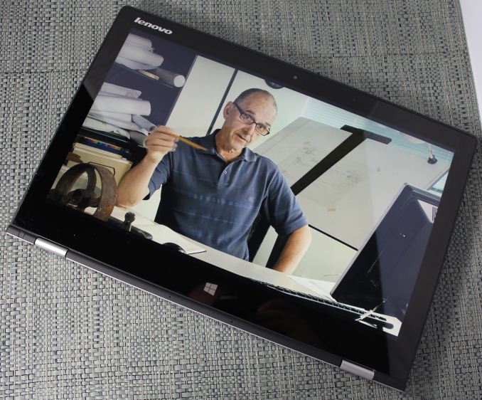
When I bought the Yoga 2 Pro, I thought it would be nice to be able to use the laptop as a tablet in a pinch, but, like most preconceptions, I was wrong. It can be used as a tablet like this, but the 13.3" screen and 3 lbs of weight can make it unwieldy. The Surface Pro 3 is almost half the weight as a comparison. Furthermore, in this mode the keyboard is tucked underneath, so it is not very comfortable to hold due to your fingers resting on the keys (which thankfully are deactivated when the screen pivots past a certain point). Unless the user is walking around carrying the Yoga, there is almost no reason to ever use it like this. There is one other potential usage scenario for this mode, in that some airlines are now allowing tablets to be used during take off and landing, allowing business travellers to continue working rather than having 20 minutes of downtime.
Stand Mode
For me, stand mode is actually the one mode that changes my paradigm for tablet use. The tablet world has been pushing for lighter devices with smaller screens in order to make it easier to hold them for long periods of time. However my experience has been that the Yoga 2 Pro in Stand Mode is much better for most of what I ever do with a tablet.
This mode makes media consumption great, moreso than a tablet with a cover that doubles as a stand. Folding the keyboard underneath makes for an extremely sturdy base, and the screen can be positioned at any angle that works best for the user. If you have ever tried to watch something in bed on a laptop, the keyboard sits between you and the screen, so it sits farther away. With a tablet, it needs to be held. The ingenious (but in hindsight obvious) solution of an extended range hinge means the user can keep the screen close, have a much larger screen, and not have to hold the device. Though I haven’t had the *cough* pleasure *cough* of flying with it yet, it seems like a good sized device for a cramped economy class seat. Stand Mode makes you rethink how to use a hybrid PC.
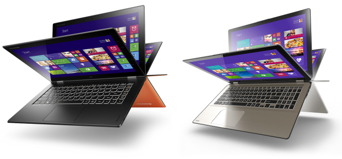 Yoga 2 Pro (left) versus Toshiba Satellite Radius (right)
For those not sold on the hinge, there is clearly a demand. Since the launch of the Yoga series, several other laptop OEMs have introduced a device with a similar hinge.




103 Comments
View All Comments
bullzz - Wednesday, July 30, 2014 - link
"advertised clock speed of 1.6 GHz with all four cores at 100% usage"isnt this a dual core CPU
JarredWalton - Wednesday, July 30, 2014 - link
There are two virtual cores as well, so this was tested with a 4-threaded load.mapesdhs - Wednesday, July 30, 2014 - link
Even so, it's not correct to refer to four cores, that could easily confuse people.Personally I don't know how Intel gets away with using the i7 label for these
CPUs when they're all just dual core.
Ian.
TiGr1982 - Wednesday, July 30, 2014 - link
1. Then one should refer to four threads (as Intel names it itself officially).2. Well.. AFAIU, "i7" is just a brand, meaning "the top notch among its device class", happens to have HT, and in general has nothing to do with the particular number of physical cores:
1) i7 has 2 cores in ULV class
BUT
2) i7 has 4 cores in medium/big laptop class
3) i7 has 4 cores in mainstream desktop class
BUT
4) i7 has 6 (soon to be 8) cores in extreme desktop class
So "i7" is just a brand, supposed to make the customer think "Wow, this thing is gonna be fast".
As Semiaccurate founder calls it "iSomethingmeaningless" from the point of purely tech specs per se.
Brett Howse - Wednesday, July 30, 2014 - link
Thanks for the comment you are of course correct, it's 2 physical cores and 4 threads. Looks like Jarred already edited that sorry for the confusion.Dug - Thursday, July 31, 2014 - link
Same with i5. My desktop i5 is quad core, but my laptop is dual core.TiGr1982 - Friday, August 1, 2014 - link
Indeed; only i3 is more or less consistent (2 cores, 4 threads, no Turbo).Besides, Pentium and Celeron (based on big cores) are also consistent (when one does take into account Atoms rebranded as Celeron and Pentium).
TiGr1982 - Friday, August 1, 2014 - link
I meant, "when one does NOT take into account Atoms rebranded as Celeron and Pentium".Alexey291 - Saturday, August 2, 2014 - link
Essentially Intel CPU branding is a sordid mess - after all is said and done :)wetwareinterface - Sunday, August 3, 2014 - link
actually the pentium branding is anything but consistent right now.there are pentium cpus out right now that are based on 3rd generation dual core i3's with half the cache
dual core low voltage i3 half cache and 1-200 Mhz lower clocks than u series i3
and dual core 4th generation cores with no quick sync and hd 4000
and quad core 4th gen with quick sync enabled and hd 4000