Samsung Galaxy Gear Review
by Brian Klug on October 1, 2013 9:00 AM EST- Posted in
- Wearables
- Smartphones
- Mobile
- Galaxy Gear
- galaxy note 3
- watches
Features and Functionality
Galaxy Gear runs a pretty basic touch driven interface – there’s a left to right menu with different options, and a main view with the watchface you’ve selected. Dragging down from the top of the display works like pressing back in Android, and gets you back to the watchface if you keep pressing it, and to the camera after the watchface.
Dragging up from the watchface gets you to the dialer to originate a call. Left and right gets through menus for logs, contacts, notifications, S-Voice, voice memo, gallery, media playback control, pedometer, settings, and apps.
Double tapping with two fingers brings up controls for volume and brightness, and the status of the battery and bluetooth. Long pressing with two fingers gets you to the multitasking interface which is straight out of what you get in Android 4.2.

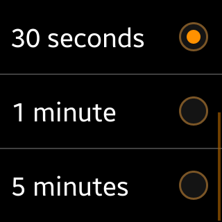
Gear is a watch unlike any other, and by unlike any other I mean it doesn’t show the watchface all the time. Rather, Gear only lights up the display and shows you your currently selected watchface (there are a few first party ones and a few more available through the Samsung market as downloads) upon activation either by pressing the power button or by bringing the watch up to face you. When it hasn’t detected that it’s in a face-up state, the display is off, and there’s a timeout period selectable in the menu under display between 7 seconds and 5 minutes.
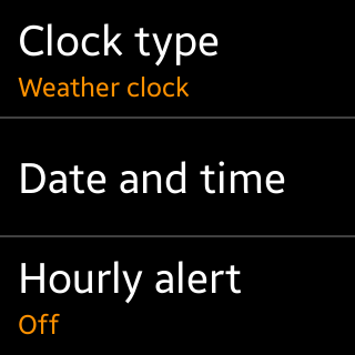
Gear uses the onboard gyro and accelerometer to detect when you’ve moved it to a face-up viewing position, and then hopefully lights up the display. In practice I find this disconcerting – often I want to just quickly glance at the time, but obviously Gear doesn’t have the watchface lit up all the time, so you have to move it to an over exaggerated bent-elbow, face up position, and then the display comes on. In addition I find that when I do this gesture, about 10 percent of the time the display doesn’t come on, and I’m left staring at a blank display. I’ve gotten used to the Pebble’s backlight activation gesture which consists of a turning wrist flick motion, and would prefer that on Gear. Instead the activation gesture for Gear isn’t really clear and doesn’t always work.
I guess what I find most confusing is how the display is AMOLED, yet there’s no persistent clock. Persistent clocks a layer above the lock screen seem almost ubiquitous in the smartphone space, so it’s really puzzling to get a watch where this kind of behavior would seem requisite, and not get a persistent watchface.
The call interface gives you a simple list of contacts which come down from the attached phone, or you can dial directly. Gear then works like any other bluetooth headset, and you can obviously swap between the Note 3 and gear for calls. In practice calling from the Gear is a bit of a weird experience – the speaker is at the bottom, but the microphones are up top, and you’re essentially always in speakerphone mode. The natural thing to do seems to be to bend your elbow and talk directly into the wrist, but Gear also seems to work held in other positions pretty well.

Call quality on the Gear is decent – it’s a bit hard to hear things sometimes because you’re always on speakerphone, but it’s passable. On the far end I was told calls sounded fine, I called from inside a car and on a busy street in New York City without much issue. I also ran a noise rejection test in front of a babble distractor track using the normal setup I use for testing handsets, and overall the two microphone system inside Gear did a pretty good job.
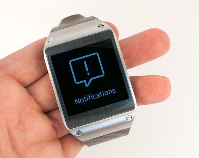
Gear also surfaces notifications from the attached handset, including SMS. What’s nice about the Gear versus my experiences on Pebble is that there’s the ability to reply from the watch via speech to text through S-Voice. The accuracy varies like you’d expect for a voice to speech engine, and confirming each message and waiting for the engine to give you responses takes a while, but it’s definitely less frustrating than being able to see an SMS but not be able to do anything about it like Pebble sometimes is.

S-Voice is also in the interface as one of the featured services, and has a subset of functionality. Since there's no keyboard, S-Voice is pretty much the only way to enter text, but you can send messages through it if you're patient enough.
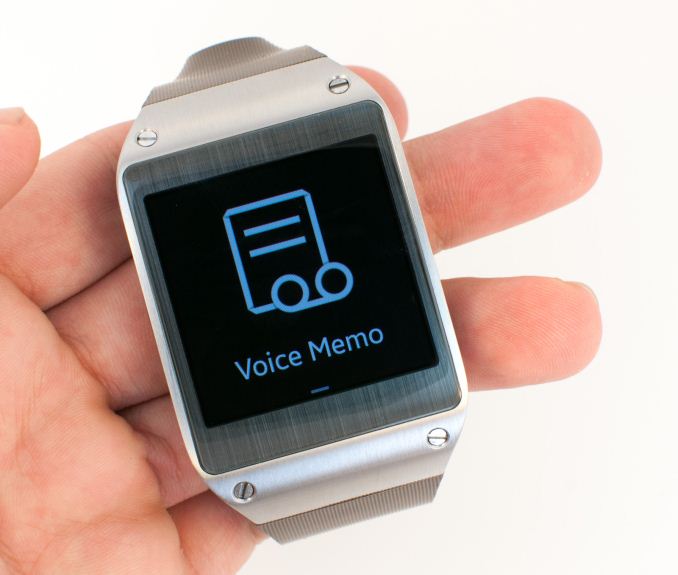
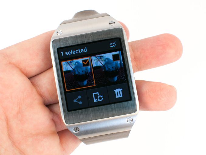
There’s a voice memo recorder which is pretty self explanatory, and gallery for looking at photos and video recorded using the camera. The gallery also does double duty for managing photos, which you have to explicitly transfer over to the attached phone to do stuff with.
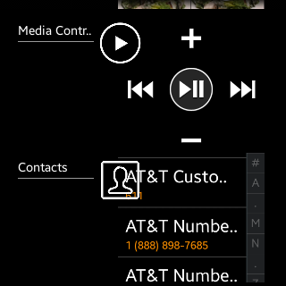
Media controller basically gives you playback controls for the attached phone. I find myself wishing that Gear had its own headphone jack so you could use it to listen to music and not need a phone, but that’d probably add dramatically to Gear’s size.
Pedometer is also in that main menu, and gives a step count, distance, and burned kcal estimation based on your height and weight which you set at first launch. This data can also get sent over to S-Health.
Next is the settings menu which is like a simplified Android settings app and contains controls over the watch face, sounds, volume, display, battery, bluetooth, a privacy lock option, reset, and info menu.
Last but not least is Apps, which really is like the launcher for this interface, everything in here is essentially an Android application. Through apps is how you can get to third party applications added from the smartphone companion application, and to things like timer and stopwatch which thankfully the Gear has.
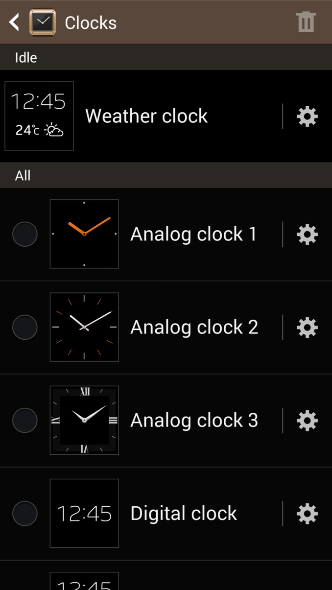
The first party apps on the Gear work and cover the bases, but there’s definitely a lot of Android that doesn’t seem at home on a watch, like popup dialogs that have text you have to scroll through, or oversized buttons. From a design perspective I wish that the supplied watchfaces were a bit more imaginative and varied, as most boil down to the same clock font face and some information below it (next appointment, weather, pedometer steps, shortcuts).
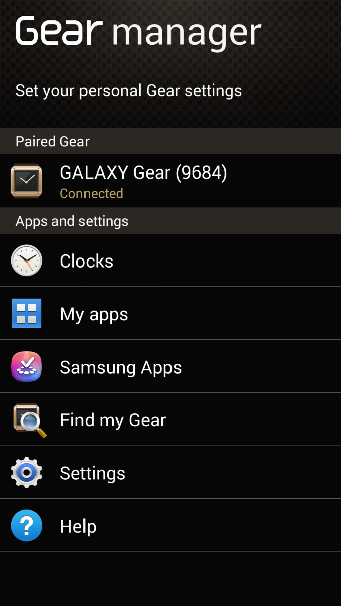
The companion app lets you install applications onto Gear, and there’s already a small number of them in Samsung’s market which work with their full size equivalents on the host device. For example, Snapchat on Gear interfaces transparently with the full size app on the host device. Gear manager also lets you switch through the watch faces on the device and, well, manage the device.
The reality is that the bulk of Gear really is just a custom Android interface with a bunch of home screens, and the rest of the interface consists of Android applications. It doesn’t take much digging to figure that out – the build number in About, the debugging menu under Info (which enables ADB and unknown source installation), and my favorite, the open source licenses page which tells you to pull a file over adb to see the licenses.

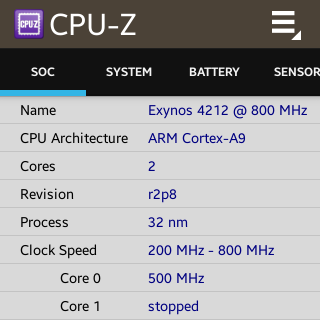
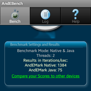
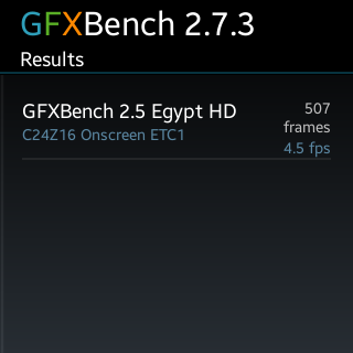
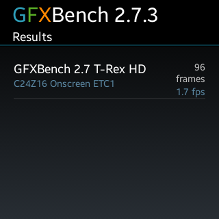
Interestingly enough it’s trivially easy to sideload any APK you want to the Gear just usig ADB after you’ve ticked debug. I present to you, CPU-Z and a few other benchmarks (presented in jest, of course) running on a watch. This now completes my benchmark circle, I’ve now run benchmarks successfully on a car (Tesla Model S and Parrot Asteroid Smart) and watch (Galaxy Gear).






70 Comments
View All Comments
et20 - Tuesday, October 1, 2013 - link
Don't worry.I'm sure they'll figure it out in mere minutes after Apple introduces their iWatch.
colonelclaw - Tuesday, October 1, 2013 - link
Indeed. The design of this watch screams 'pre-Apple'. It also screams 'We got to the market 1st!', even though it looks, frankly, ridiculous.In my opinion, something as visible as a watch (this goes for all watches) needs to be an object of beauty, something that when you see on someone else's wrist, you want to get one yourself. Nothing would persuade me to wear this huge plastic lump.
prophet001 - Tuesday, October 1, 2013 - link
I hate it when they give out free Kool-Aid. The swarming is always imminent.bji - Tuesday, October 1, 2013 - link
Those posts were interesting and insightful. Yours ... not so much.Fergy - Wednesday, October 2, 2013 - link
In what way were they interesting and insightful? The Samsung bashing? The Apple worshiping? Or the opinion that the watch isn't for him so nobody should like it?DaHarder - Wednesday, October 2, 2013 - link
Exactly... and those of us who truly love tech can easily see Samsung's effort here as solid and far ahead of the wearable technology game, whereas most other major brands are just sitting by waiting to leach off of the foundation Samsung is laying.steven75 - Wednesday, October 2, 2013 - link
Far ahead? Please. The *watch* display is mostly off. It's a watch that fails to do what every watch since the beginning of time (see what I did there?) has been able to do. Tell time easily!The "waiting to leach off the foundation Samesung is laying" is also comedy gold.
whyso - Tuesday, October 1, 2013 - link
Its so Apple can't sue them over something retarded.RadarTheKat - Thursday, October 3, 2013 - link
I see a lot of comments on these articles that show a lack of comprehension regarding patent law and how it applies. I thought I'd provide a bit of insight here for those who might not be conversant in the topic.Apple's assertion in its lawsuits is that Samsung has copied elements of the iPhone and iPad for which Apple holds several patents. These particular patents are known as design patents. It seems a lot of folks don't take these patents seriously and go as far as to suggest that they should not exist. There is a good reason why they do exist, but to explain this we have to begin with a bit of a side trip and requires that we speak about trademark law. Bear with me on this and hopefully I'll be able to clarify the purpose of design patents and provide some insights into the Apple versus Samsung trial.
Most people are familiar with the idea of a trademark. By way of example, Kellogg, the cereal maker, has a trademark on Tony the Tiger and fought a battle with Exxon over Kellogs' claim that the use of an unnamed tiger in Exxon's advertising violates Kellogg's trademark for Tony the Tiger. Why? For 30 years, Exxon used its tiger character exclusively to promote its gasoline blend, but then, in the 1990's began using it to sell food. Kellogg said consumers are confused by the similarity between the cartoon tigers and may conclude that Kellogg is somehow behind soda, coffee and other items for sale at Exxon's TigerMart stores. The case went back and forth for several years, with Exxon initially winning the case, but ultimately losing on appeal. This case would not seem extraordinary to most people as most folks understand the concept of protecting a unique trademark like Kellogg's Tony the Tiger character.
Now let's look at another case, one that comes closer to the Apple vs Samsung case, but still an application of trademark law. This case is Ferrari vs Robert's Replicas. Back in the 1980's Robert's Replica's was in the business of manufacturing fiberglass kits that replicated the exterior features of Ferrari's Daytona Spyder and Testarossa automobiles. Roberts' copies were called the Miami Spyder and the Miami Coupe, respectively. Ferrari brought suit against Roberts in March 1988 alleging trademark infringement.
Here's what this case was about: After Ferrari vehicles have been on the market for a number of years, the design of those vehicles acquires what's called "secondary meaning", a concept at the heart of trademark law. Secondary meaning refers to an association of a design, like the design of a Ferrari vehicle, with quality and craftsmanship or other positive attributes one might associate with the Ferrari brand. After a design has acquired secondary meaning, trademark law can be applied to protect the company from those who would copy its designs and use them to promote their own products. Robert's copying of Ferrari's iconic designs could confuse the public and dilute the strength of Ferrari's brand. Just the presence of large numbers of replicas would dilute Ferrari's image of exclusivity, causing financial harm to Ferrari. Trademark law, under the concept of secondary meaning, protected Ferrari. The courts ruled in favor of Ferrari in this case and enjoined Roberts from producing the Miami Spyder and the Miami Coupe.
But how does this relate to design patent law?
The problem with using trademark law to protect a company's designs (under trademark law a product design or package design is referred to as "trade dress") is that a product has to be on the market for a long time before its design acquires secondary meaning (i.e. before the design becomes iconic and is seen by consumers as representative of the company behind the product). When competitors come in immediately after a new product design is introduced and copy it, as is the assertion in the Apple vs Samsung case, the originator of the design doesn't have the luxury of time needed for its product design to acquire secondary meaning in the eyes of consumers. Consumers immediately see the same design from multiple companies and so don't grow to associate the design with the company that originated that design.
This is where design patents come in. Where trademark protection of an iconic product design has no expiration, it takes time for a new product to acquire that protection (as stated above). A design patent offers immediate protection of a new and novel design and for a period of 14 years thereafter, giving a company protection of its original designs until they acquire secondary meaning in the market and therefore protection under trademark law. So the design patent serves a valuable function for companies like Ferrari, and Apple.
Nathillien - Friday, October 4, 2013 - link
That's a lot of words to justify rounded corners design "patent" or some other dubious Apple patents like "swipe to do some action" or "bounce back feature".