Nexus 7 (2013) - Mini Review
by Brian Klug on July 27, 2013 12:54 AM EST- Posted in
- Tablets
- Snapdragon
- Qualcomm
- Android
- Mobile
- APQ8064
- Nexus 7
- Android 4.3
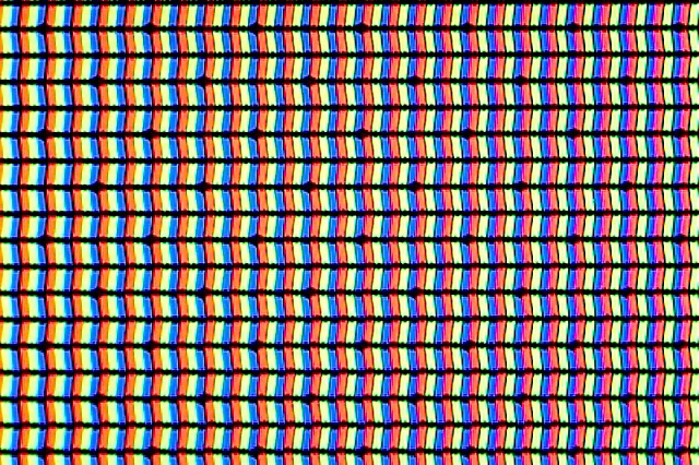
The real highlight of the new Nexus 7 is of course the much higher resolution display. At 1920x1200 the Nexus 7 is now the highest resolution 7-inch tablet. This new IPS panel is made by JDI (Japan Display Inc) and boasts better viewing angles, 30 percent more gamut than the previous one, and of course better dot pitch of 323 PPI. Alongside that the new Nexus 7 also doesn’t have the always-on dynamic brightness and contrast (NVIDIA Prism / smartdimmer) that many including myself found frustrating with the original Nexus 7. On the new version the equivalent functions are enabled only during full screen video playback. This is a huge improvement since with the feature enabled on the previous Nexus 7 I always felt that greens were undersaturated and some dynamic range clipped.
I did a lot of asking around about how Google calibrates its panels, and was told that in the case of the Nexus 7 there are two stages. The first is the calibration done by JDI on the panel at a high level, the second is an additional calibration at time of manufacture, per device. This sort of thing is relatively standard, but I’ve always been curious about what stages cost extra money – certainly it’s a baseline expectation for the panel supplier to supply a close-enough LUT, but getting Delta E even lower I’m told requires additional expenditure.
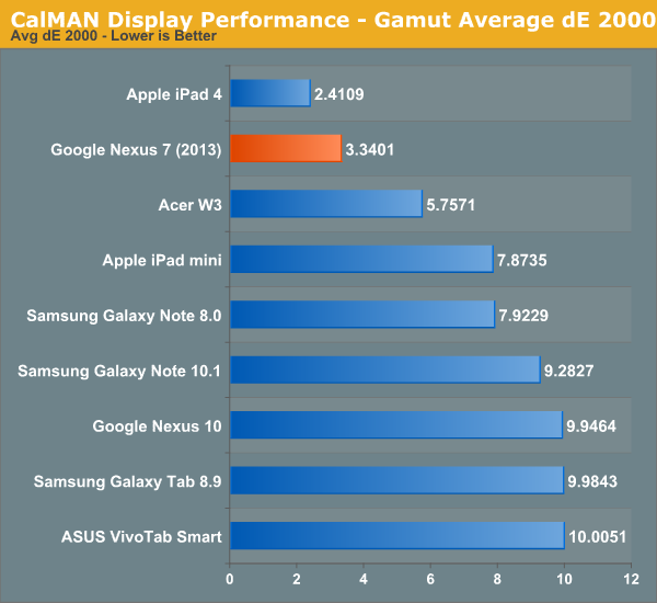
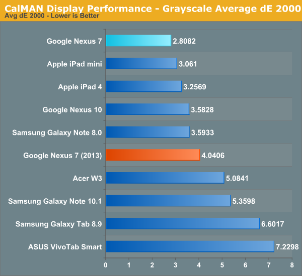
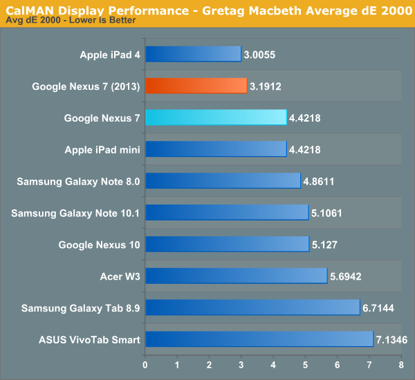
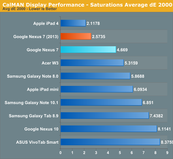
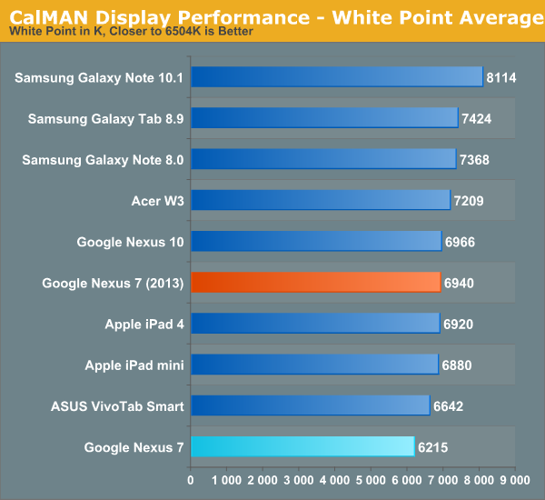
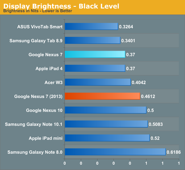
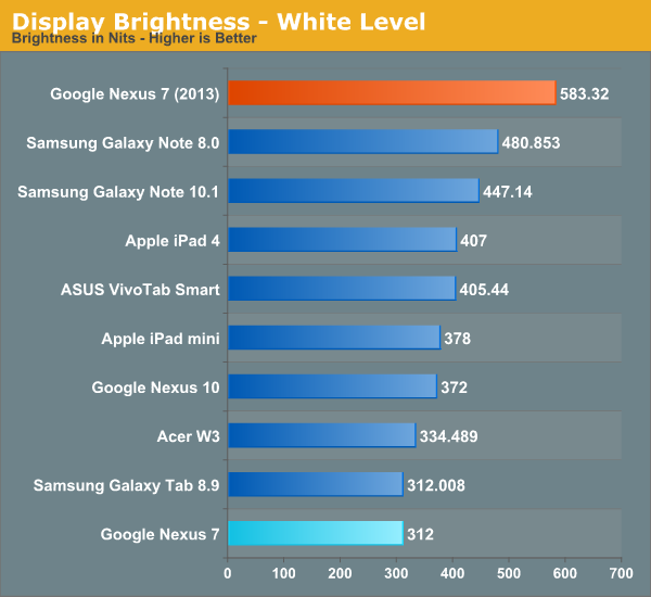
It turns out that the new Nexus 7 is actually very close to sRGB this time around, with overall gamut being just a bit bigger than the sRGB color space. In the GMB Delta-E and saturations Delta-E measures, arguably the two most relevant for color accuracy, the new Nexus 7 is second only to the iPad 4, and better than the iPad Mini in color accuracy, a significant step forwards from its predecessor.
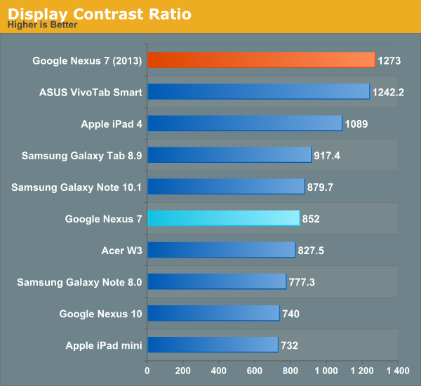
The new Nexus 7 also goes very bright, up to 583 nits, with excellent contrast of 1273. This is again not achieved using any dynamic contrast cheating since those functions are thoughtfully disabled.
On the display side of things I’m very pleased with how far the Nexus 7 has come, and it’s obvious that display quality was a big focus for the 2013 model.


252 Comments
View All Comments
ven - Saturday, July 27, 2013 - link
Screen position is off-centered, i don't know how it feels when it is in hands, but in the picture it is annoying to see that much space below the screen.old nexus 7 textured back finish was highly applauded, it's absence in the new one is slightly puzzling.mlj11 - Saturday, July 27, 2013 - link
What do you mean it's off-centre? Did you take into account the navigation bar with the 3 software buttons?Liquid_Static - Sunday, July 28, 2013 - link
I too am not sure what you mean...ven - Tuesday, July 30, 2013 - link
i didn't notice the software buttons at first.Tigeerguy - Saturday, July 27, 2013 - link
Excellent Article Brian as always. You fulfilled my wish so fast regarding the soc I asked on Twitter. It's great to see the new Nexus 7 is not using 200 as in Nexus 4. I was totally confused regarding the Snapdragon 600, which you explained in detail that this tablet comes with underclock one, glad it's clear now. I already have Nexus 7(2012) and wanted to update to the new model. Considering it will take sometime for Google to release the tablet in my country, I'll wait for September as Apple might release iPad mini that could change things if it comes with Retina display. Worth reading, and waiting for more in details by Anand. Thanks.Alpeshkh - Saturday, July 27, 2013 - link
Ditto.I usually don't comment here but had to comment after reading Brian's tweet regarding SoC!
I was bit disappointed after launch that they used S4 Pro and not S600. Not that it was a deal breaker but seeing One & S4 leapfrog N4 & Xperia Z's performance, I was almost sure Google would use S600 as it would be more future-proof and remember, new one has to power 1920*1200 display.
Read TheVerge's review and was disappointed that they didn't clarify about SoC. But seeing Brian's tweet that it basically is an under-clocked S600, made my decision to buy this one really easy.
Thanks Brian, appreciate the effort you & whole Anand Tech's team put in your reviews.
esterhasz - Saturday, July 27, 2013 - link
The Verge's review makes Brian's "mini review" read like an in-depth piece with academic aspirations. I'm really happy that a serious tech website does gadgets now.Impulses - Sunday, July 28, 2013 - link
Now? Anandtech's been doing the best smartphone/tablet reviews for like 2-3 years... Sometimes they lag behind (in time to publish) or don't cover every single permutation or model out there, but they've been at it even before the staff of The Verge left Engadget to form TIMN and eventually Verge.esterhasz - Sunday, July 28, 2013 - link
Yeah, true. Maybe it's just me who's been starting to read gadget reviews ,-)darkich - Sunday, July 28, 2013 - link
Check norebookcheck.net.Those are the best reviews out there imo