Samsung S23A750D 3D LCD Display
by Chris Heinonen on December 17, 2011 2:45 PM ESTSamsung S23A750D Color Uniformity and Color Gamut
Most TN panels that I have seen seem to have uniformity issues around the panel, but this is also probably that TN panels are usually found in less expensive monitors that use less expensive backlighting systems. The Samsung isn’t an inexpensive monitor and has much better uniformity than most panels out there.
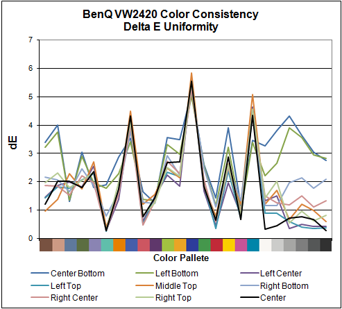
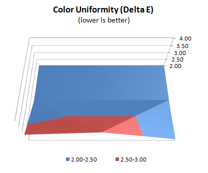
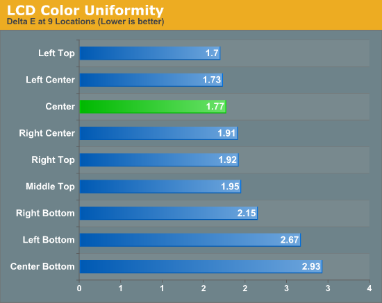
Other than the bottom of the display, the Samsung is as uniform a monitor as I have seen so far, and maintains its low dE across most of the screen. Samsung has done a much better job with their TN panel and color uniformity than most vendors out there. That darker lower-right corner doesn’t seem to cause much of a color shift at least, as an uneven backlighting system often can.
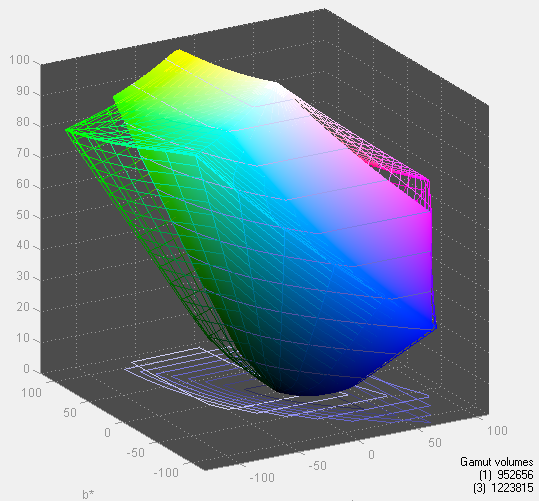
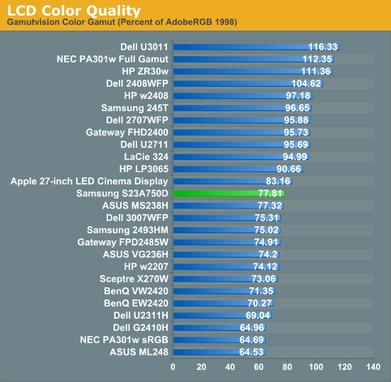
Despite only being listed as covering the sRGB gamut, which would mean 71% of the Adobe RGB gamut, the Samsung measured out to cover almost 78% of the Adobe RGB gamut. Compared to a normal sRGB monitor, most of that extra range seems to be in the additional blue colors that are available. As one of the samples used to calculate the dE value that is blue is typically outside of the sRGB gamut, the extra gamut can bring the Samsung closer to being able to display this color, which helps the overall dE.


80 Comments
View All Comments
DParadoxx - Saturday, December 17, 2011 - link
Chris, there is an OCZ 850 PS gallery on page one. I suspect this is unintentional.DParadoxx - Saturday, December 17, 2011 - link
Spoke too soon, I see it is.Iketh - Saturday, December 17, 2011 - link
Sorry to be a d**k, but I could only glance through the article. It felt like is was written by a 7th grader. Not AT worthy.MonkeyPaw - Saturday, December 17, 2011 - link
I'm sure your thoughtful and constructive comment will really be a force for change at AT.Kristian Vättö - Saturday, December 17, 2011 - link
It's really no use to criticize unless you can be more specific. What is wrong with it? The writing style or the knowledge of the writer? Or something else?Haters are always gonna hate. If you want things to change, the way is to provide feedback and tell WHAT IS WRONG.
Galcobar - Saturday, December 17, 2011 - link
The writing style is more juvenile, hyperbolic and chatty than I've come to expect from Anandtech. There are also some grammatical issues which obscure meaning. As a result the reader has to sift the article more carefully for the relevant information.Clear, concise writing which conveys the information precisely indicates a greatery mastery of the subject material. The author may have a complete grasp of the issue, but it is not presented in a manner which would lead the reader to trust the author's, erm, authority.
MonkeyPaw - Saturday, December 17, 2011 - link
That's a much better way to put it. Nice ironic twist in there too. :pReikon - Sunday, December 18, 2011 - link
Yep. I've been saying recently that AT is going down in quality. These new writers just aren't any good. Their writing style and content just isn't up to the old standards.I mean, look at those pictures of the OCZ PSU on the first page. Someone even thought they were included as an error. This isn't a blog. Don't write about how your computer couldn't handle 3D and then detail how you upgraded it to support it. This isn't a case or PSU review. We don't need to know the details of your PSU installation for a monitor review.
claytontullos - Sunday, December 18, 2011 - link
agreedjohnf1285 - Monday, December 19, 2011 - link
I agree with this too. I was thrown off when I was reading through the article, and glanced down to see a photogallery with pictures of a PSU.