Amazon Kindle Fire Review
by Anand Lal Shimpi & Vivek Gowri on November 29, 2011 3:31 AM EST- Posted in
- Tablets
- Mobile
- Amazon
- Kindle Fire
- Kindle
The Operating System
There are three reasons why the Kindle Fire is one of the most important tablet releases of the year: software, services, and shopping. The hardware, while nice, plays a definite secondary role here. The user experience, with tight-knit integration with Amazon's full suite of digital media services (Kindle, Appstore for Android, MP3 Cloud Player, and Prime Instant Video), is what makes the Kindle Fire the most formidable threat.
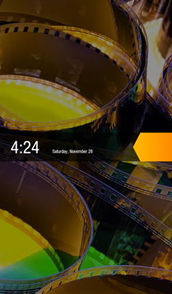
Amazon and Lab 126 have taken the same route as Barnes and Noble here and built the Kindle Fire operating system on top of Android 2.3. This is basically a skinned version of Gingerbread just as you'd find on an HTC Flyer or the old Galaxy Tab 7", but instead of augmenting the stock Android experience, the goal here is to hide it entirely. When you press the (stupidly located) lock button, you're treated to a simple lock screen, featuring a high resolution image of Amazon's choosing and an orange lock slider with the day, date, and time. Note that you cannot change the lockscreen image without rooting the device.
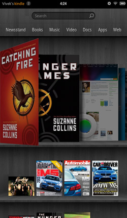
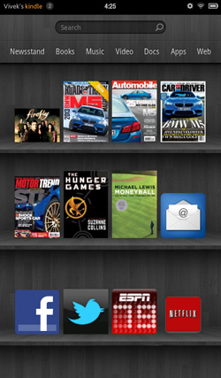
Slide the bar over to get to the homescreen, and you find yourself looking at a virtual bookshelf of apps. The top shelf is called the Carousel. It's a rotating, Cover Flow-style list of recently used files and applications that you can swipe through. It's nice, in that you can switch between your recent windows, but there's too many app windows that are stored. This leads to two problems: there can be some choppiness in the animation if you try to scroll through the entire list quickly, and overall it's a bit visually chaotic and disorganized. It's good, but it'd be better if they shortened the list to just the last 8-10 items. The shelves underneath are made up of items you deem "favorites". You can pin almost any content to the mainscreen - applications, magazines, newspapers, books, albums, playlists, videos, documents, websites; just hold down the icon/cover to add to favorites, then it'll show up on your homescreen. 4 icons per shelf, and the size of your bookshelf grows downwards as you add more content to it. However, as you add more content, scrolling through the bookshelf tends to get a bit choppy.
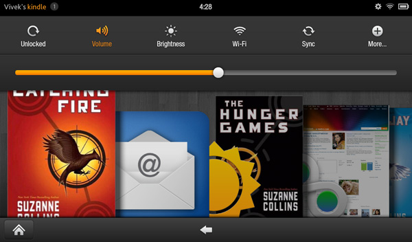
The notification bar from Android 2.x is still there, but the notification drawer is a push-button affair instead of a slide-down windowshade. The left side of the notification bar contains the battery and WiFi indicators as well as a small gear. Press it to bring down the quick setting options, and select "More..." to get to the full settings menu. The quick settings options are the rotation lock, volume and brightness controls, wireless settings, and a manual sync button. The main menu settings are relatively limited compared to normal Android, mostly account and security options, along with the standard device settings: sounds, display timeout, keyboard, network, date/time, and application permissions. The notification tone catalogue is basically lifted from Honeycomb, as are the keyboard touch sounds. The sounds are basically the only personalization options you've got. There's no real wallpaper to speak of other than the dark gray bookshelf, and as mentioned before, you can't touch the lockscreen images.
There are no hardware buttons, so the standard Android navigation buttons show up on a bottom navigation bar. The Home button and back button are always present, joined by the menu button and search when relevant. The menu bar disappears when you're viewing print or video content, necessitating a touch of the screen to bring up the navigation bar.
Above the Carousel is a list of the different content areas. You can access the web or one of the content libraries by hitting the corresponding name: Newsstand, Books, Music, Video, Docs, Apps, Web. Web takes you to the browser, Apps takes you to the main application launcher, and the rest of the content areas are mostly self-explanatory. It's the only way to access the browser, the launcher, and the music player, so you'll use those buttons often. Above the content libraries is a search box that searches through your books, magazines, documents, movies, music, and apps. We'll cover all of these systematically, starting with the browser, which Amazon says is "cloud-accelerated" using the computing back-end of Amazon Web Services. It's called Silk.




70 Comments
View All Comments
StormyParis - Tuesday, November 29, 2011 - link
The original Nook Color, at $200, was an heck of a deal. The current proprietary tablets (Nook Color 2 and Kindle Fire) are a lot less compelling due to the arrival of non-proprietary tablets at the same price point. Those are.. non-proprietary, and offer arguably better features.I'm still happy ith my original Nook Color. WHen it gets replaced, if it does, it probably will be by a true, un-walled-gardened, tablet.
Wierdo - Tuesday, November 29, 2011 - link
Ars had a good review of the Nook tablet here:http://arstechnica.com/gadgets/reviews/2011/11/lea...
"I have less doubt about the Nook Tablet as a capable product than I did about the Kindle Fire. The experience is not frustrating or jagged and doesn't feel as unfinished... However, I do have some doubts about the value of the Nook ecosystem. Amazon's selection in all categories seems a bit more diverse..."
rruscio - Tuesday, November 29, 2011 - link
I wanted an entry level tablet that was an eReader. Check. But ...1) I really miss having Skype on here. Really.
2) The lack of Google native apps results in my using the browser for gmail, Reader, et al. And then Google gives me links to all the other apps. Not the most comprehensible experience.
3) The single/double/drag tap issues are more annoying than they need to be.
4) wiFi isn't immediately available when the device wakes up. It takes some number of seconds to make the connection. The "wiFi not available" error is easily resolved by me tapping again. Why isn't is resolved by the app / OS waiting instead?
5) The entire software experience seems less than fully baked. Yeah, I get the Christmas rush thing, but I don't have experience with Amazon updating software. Hope isn't change.
6) The device feels familiar because I'm used to my Droid Inc. The speed is better, and the screen size is acreage versus postage stamp.
If there's ever a phone that just 1) phone calls 2) text messaging 3) wiFi hot spot 4) non-larcenous plan, I'd predict that, and a tablet in this form factor, will kill the smart phone business.
Great review.
genomecop - Thursday, December 1, 2011 - link
1. I dont miss it at all.2. Not true. It comes preloaded with an email app that has gmail setup.
3. Dont know what your talking about never have this issue
4. Dont have this issue and I use mine all day long.
5. Have no problem with the software at all. Everything works very smoothly.
Just want to add...I've had an Ipad since launch and I have since stopped carrying it around. This fits in my coat pocket for use at the gym while doing cardio. At work, on my desk for quick web browsing. RSS feed for all Tech related news. Gmail. Reading on the subway. Uses my phones hotspot in the cab for use. Quick download of movies. I think its a great device.
mcturkey - Tuesday, November 29, 2011 - link
In your conclusion, you state that $199 should be the entry level price point now. I'm anxiously awaiting your review of the Nook Tablet to see if that extra $50 is worth it (excluding my personal bias towards B&N for their willingness to fight back against Microsoft's ridiculous patent war against Android).tipoo - Tuesday, November 29, 2011 - link
Agreed, the new Nook looks interesting. I remember reading it has a larger battery than the Fire. Locking all but 1GB of its memory to B&N content sucks, but I'm sure someone will take that limitation off.Lucian Armasu - Tuesday, November 29, 2011 - link
Hardware wise, the extra 8GB of internal storage, extra 512 MB of RAM, and microSD slot, I think it;s worth it. Still I think the extra $50 would be worth it a lot more with the full Android experience. If the other Android manufacturers could put android 4.0 on an equivalent tablet to Kindle Fire, and price it at $250, I'd pick that one any day. You can still get all Amazon's services on the full Android, too, so no point limiting yourself for $50.nace186 - Tuesday, November 29, 2011 - link
I don't understand why you are comparing the Fire with all the tablet out there that's in a different class. What it should really be compare to is the Nook Color, and the Nook Tablet. Which either of them were included.Wierdo - Tuesday, November 29, 2011 - link
Yeah I read a review on Ars about it and they think the Nook tablet is a more capable product but Amazon has the edge in the ecosystem department, link posted on this thread somewhere if interested.VivekGowri - Tuesday, November 29, 2011 - link
We'll have a Nook Tablet review that touches on the comparisons to the Kindle Fire relatively soon :)