Anand's Google Nexus One Review
by Anand Lal Shimpi on April 3, 2010 3:40 AM EST- Posted in
- Smartphones
- Mobile
Notifications: Better than Apple, Worse than Palm
When Apple introduced its notification system on the iPhone, I was pleased. If you’re using your phone and you get a SMS, a little bubble appears on the screen and you get to read/dismiss the SMS:

That was three years ago. The iPhone can do a lot more now and the notification system is beginning to show its age. It’s annoying if you’re trying to do something else with your phone and you keep getting notifications. And it doesn’t scale well to getting tons of notifications, you’re just shown the most recent with no indication of what came before it.
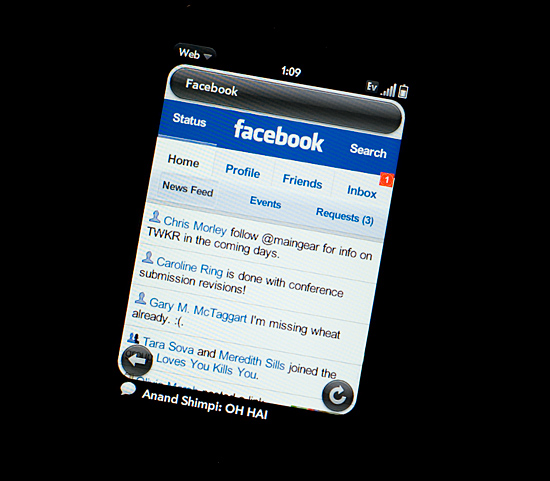
Palm improved on Apple’s system by claiming a line or two of screen real estate and displaying notifications at the bottom of the screen. It was far less intrusive than Apple’s method but still gave you the same functionality. If you wanted to see more, just tap the notification bar and you see more of the message. This works for IMs, text messages, etc...

Notifications on the Palm Pre at the Bottom
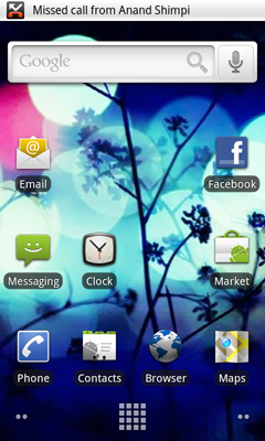
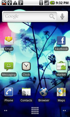
Google takes a similar approach to Palm, although you don’t lose any additional screen real estate. The upper left hand corner of the screen is reserved for notifications. It’s a part of the status bar so there’s no screen resizing at work. If you get a message, missed call, IM, or anything you get a preview in this corner. The entirety of any message is displayed here; if it can’t fit on a single line, the message appears piecemeal.

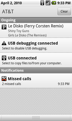
Notifications can build up over time. Here we have a missed call, USB connection message, debug mode message and Pandora running in the background all at the same time:

Kinda crowded, right? Here’s where it gets awkward. To see all of your notifications simply place your finger at the top of your screen and drag down. You’ll reveal all of your notifications in list form:

It feels awkward if you’re used to using any non-Android phone. It’s functional, it gets the job done, but it’s just a strange UI construct. In fact, Android is riddled with such things.


95 Comments
View All Comments
KaarlisK - Saturday, April 3, 2010 - link
´´The graph below shows the rough costs of simply keeping up with fab technology every two years:´´Can´t seem to find it.
deputc26 - Saturday, April 3, 2010 - link
Thanks Anand, Great Review!windywoo - Sunday, April 4, 2010 - link
Taken out of context like that, the quote sounds like it is describing a graph of smartphone prices, laptops, e-readers :) Fab tech.Nihility - Saturday, April 3, 2010 - link
I just know that after experiencing any responsiveness issues, that within a few months I'll get really frustrated with the device.I still have an iPhone 2G and I hate it. Takes forever to launch apps, browsing the web is a miserable experience and the battery life sucks. I'm definitely in the market for a better phone but I think I'll just wait for something smoother.
One of my main gripes is that my navigation app for the iPhone takes ages to load and if I get a call mid-work I'll have to restart it. Hate that.
Like Anand said, on paper the N1 is perferct but I'll let them smooth out the rough parts before I get one.
Exelius - Saturday, April 3, 2010 - link
I had the same complaint of my iPhone 3G. I bought a 3GS the day it came out and it is a huge improvement over both the 2G and 3G in responsiveness. My girlfriend has a regular 3G and much prefers using my 3GS over her own phone when browsing the web or using the Maps application.If responsiveness is a problem on the iPhone platform, get a 3GS before ditching the iPhone completely. The hardware on the 3GS is roughly equivalent to the Nexus One.
Nihility - Saturday, April 3, 2010 - link
No way. Fool me once, shame on you. Fool me twice...No more iPhones for me.
My main concern was all my apps, but most of them are available for the Android so there's nothing holding me back. I'll be glad to get rid of iTunes.
solipsism - Saturday, April 3, 2010 - link
You're comparing a phone from 2007 with an ARMv6 @400MHz w/ 128MB RAM and discounting the model that came two years later with ARMv7 @ 600MHz w/ 256MB RAM. Makes perfect sense¡KaarlisK - Saturday, April 3, 2010 - link
I love both the attention to detail and depth you have :)And I have to say that Android, not WinMo7, is the replacement for Windows Mobile 6.5 in my eyes. WinMo7 just isn´t WinMo :D
LuxZg - Sunday, April 4, 2010 - link
I agree, great review, I think I've never read anything that long about a phone :)And I agree with Android being a true Windows Mobile successor.. I don't have money for stuff like this, but if I did - I'd want all the freedom of my PC on my mobile as well. In that regard, Android seems to be the only option at the moment.
There is one thing that will clearly make lives of some people miserable.. Data rates in some countries are horrible, and smartphones all rely on mobile data connection heavily, but Nexus One is a data-hog champion by the looks of it. Hopefully, by the time I'll be able to afford phones like this one, this will be solved :)
macs - Saturday, April 3, 2010 - link
Thank you Anand, the review is great and as an owner of the Nexus One I agree with your thoughts.Android world is so wide that it's really hard to have a complete review and I think what is really missing here is something about the community around Android, XDA forum, CyanogenMOD , USB Tethering, WIFI Tethering,...