Anand's Google Nexus One Review
by Anand Lal Shimpi on April 3, 2010 3:40 AM EST- Posted in
- Smartphones
- Mobile
The Display, My Love, the Display
If there’s one aspect of the Nexus One that makes the iPhone 3GS feel really dated it’s the display. Let’s look at the basic specs:
| Google Nexus One vs. Apple iPhone | |||||
|
Apple iPhone 3GS (ARM Cortex A8)
|
Google Nexus One (Qualcomm Snapdragon QSD8250)
|
||||
| Screen Technology | LCD | Active Matrix OLED | |||
| Screen Diagonal | 3.5" | 3.7" | |||
| Resolution | 320 x 480 | 480 x 800 | |||
| Pixels per Inch | 163 ppi | 252 ppi | |||
For very similar screen sizes (the Nexus One is narrower but longer than the iPhone), Google offers a huge increase in resolution. It makes sense given that the iPhone 3GS is still using the same resolution panel as the first iPhone back in 2007.
Recently Luke Hutchison published an excellent article at Ars Technica explaining the subpixel makeup of the Nexus One’s display. Most display technologies we’re used to reproduce colors by using a combination of red, green and blue. Instead of evenly distributing RGB subpixels across the display, the Nexus One has a combination of RRG or GBB for each pixel. This optimization is put in place most likely to reduce manufacturing cost or increase lifespan of the display.
Either way, you’re not getting complete color data on a per pixel basis. Now I won’t get into the argument of whether or not Google should call it a 480 x 800 display. It technically has that many pixels, it’s just that their makeup is a bit odd.
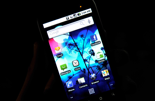
Google also does some pretty standard tricks to make the display look even more impressive. You get oversaturated colors and the usual trickery you can find in the TV section at Best Buy. Whites on the Nexus One aren't quite white but rather a cool blue and reds are often too red.
Compared to the iPhone, indoors, the Nexus One display is just incredible. If there are two things you could describe the Nexus One display as they would be: high contrast, and sharp. Indoors, and above 50% brightness, it’s honestly the best looking display I’ve ever seen on a smartphone. The colors are ridiculously vibrant and they pop because of the super deep blacks.
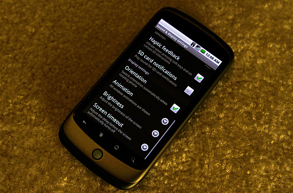
It really looks that contrasty.
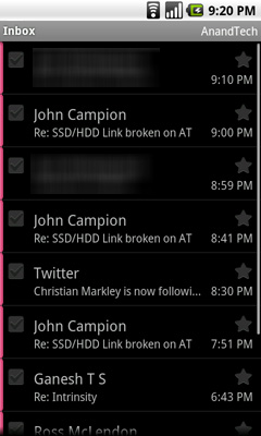
The AMOLED display has no backlight, and thus it’s far more power efficient to display lots of black than it is to display bright whites. For this reason many of the applications use black backgrounds. For example, here’s the email app in Android vs. the email app in iPhone OS:
|
Google Nexus One
|
Apple iPhone 3GS
|
 |
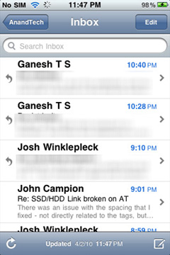 |
Given that Android is a fairly mainstream OS and not a pornsite, white text on a black background is generally unexpected. Unexpected, but not more difficult to read. The high resolution and incredibly contrasty AMOLED display make sure of that.
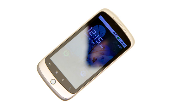
In direct sunlight, the lower part of the picture above is what the Nexus One looks like
Outdoors it’s another story entirely. In direct sunlight, the display is mostly useless at its default brightness settings. With the brightness cranked all the way up it’s still washed out but at least legible. Which brings me to my next point. The auto brightness control on the Nexus One is frustrating.
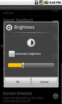
It automatically adjusts display brightness based on ambient light, but it generally picks a brightness that’s too low for my tastes. I just ended up disabling the automatic control and picked something that was around 50 - 100% brightness depending on what I was doing with the phone. I would like the option to have the auto brightness control pick settings that are a little less conservative.
Touch the Screen
Touchscreens have gotten much better over the past couple of years since the iPhone’s introduction. The Nexus One’s touchscreen is very close to as responsive as the iPhone’s but with some annoying issues. There are some situations where holding the Nexus One in one hand and swiping with my thumb won’t let me swipe between screens, and other similar accuracy issues. Getting the home bar buttons to recognize taps is also a pain at times. The touchscreen is definitely usable, just not as good as the iPhone's.


95 Comments
View All Comments
KaarlisK - Saturday, April 3, 2010 - link
´´The graph below shows the rough costs of simply keeping up with fab technology every two years:´´Can´t seem to find it.
deputc26 - Saturday, April 3, 2010 - link
Thanks Anand, Great Review!windywoo - Sunday, April 4, 2010 - link
Taken out of context like that, the quote sounds like it is describing a graph of smartphone prices, laptops, e-readers :) Fab tech.Nihility - Saturday, April 3, 2010 - link
I just know that after experiencing any responsiveness issues, that within a few months I'll get really frustrated with the device.I still have an iPhone 2G and I hate it. Takes forever to launch apps, browsing the web is a miserable experience and the battery life sucks. I'm definitely in the market for a better phone but I think I'll just wait for something smoother.
One of my main gripes is that my navigation app for the iPhone takes ages to load and if I get a call mid-work I'll have to restart it. Hate that.
Like Anand said, on paper the N1 is perferct but I'll let them smooth out the rough parts before I get one.
Exelius - Saturday, April 3, 2010 - link
I had the same complaint of my iPhone 3G. I bought a 3GS the day it came out and it is a huge improvement over both the 2G and 3G in responsiveness. My girlfriend has a regular 3G and much prefers using my 3GS over her own phone when browsing the web or using the Maps application.If responsiveness is a problem on the iPhone platform, get a 3GS before ditching the iPhone completely. The hardware on the 3GS is roughly equivalent to the Nexus One.
Nihility - Saturday, April 3, 2010 - link
No way. Fool me once, shame on you. Fool me twice...No more iPhones for me.
My main concern was all my apps, but most of them are available for the Android so there's nothing holding me back. I'll be glad to get rid of iTunes.
solipsism - Saturday, April 3, 2010 - link
You're comparing a phone from 2007 with an ARMv6 @400MHz w/ 128MB RAM and discounting the model that came two years later with ARMv7 @ 600MHz w/ 256MB RAM. Makes perfect sense¡KaarlisK - Saturday, April 3, 2010 - link
I love both the attention to detail and depth you have :)And I have to say that Android, not WinMo7, is the replacement for Windows Mobile 6.5 in my eyes. WinMo7 just isn´t WinMo :D
LuxZg - Sunday, April 4, 2010 - link
I agree, great review, I think I've never read anything that long about a phone :)And I agree with Android being a true Windows Mobile successor.. I don't have money for stuff like this, but if I did - I'd want all the freedom of my PC on my mobile as well. In that regard, Android seems to be the only option at the moment.
There is one thing that will clearly make lives of some people miserable.. Data rates in some countries are horrible, and smartphones all rely on mobile data connection heavily, but Nexus One is a data-hog champion by the looks of it. Hopefully, by the time I'll be able to afford phones like this one, this will be solved :)
macs - Saturday, April 3, 2010 - link
Thank you Anand, the review is great and as an owner of the Nexus One I agree with your thoughts.Android world is so wide that it's really hard to have a complete review and I think what is really missing here is something about the community around Android, XDA forum, CyanogenMOD , USB Tethering, WIFI Tethering,...