The Apple Watch Series 2 Review: Building Towards Maturity
by Brandon Chester on December 20, 2016 8:00 AM EST- Posted in
- Wearables
- Apple
- Apple Watch
- Apple Watch Series 2
Design
A watch is deeply personal in a way that smartphones generally are not. A smartphone goes into your pocket, while a watch is always visible on your wrist. Because of this, smartwatches end up being closer to clothing and jewelery than technology from a design perspective, and this makes getting the design right absolutely essential. That being said, smartwatches are not just digital watches that do some extra things, and simply copying the design of traditional watches can end up missing the opportunity to re-think how watches are made when designing a smartwatch.
The rectangular design of the Apple Watch will definitely be a point of contention for some people. Generally traditional analog watches have used a circular face because the clock is made up of vertical poles that are fixed at one point and rotate around it. While mimicking this would be a great way to make the Apple Watch look exactly like a traditional watch, it would also cripple the information density on a canvas where space is already severely limited. On a round display, any application that displays text is effectively limited to the space of a rectangle drawn within the circle, which means approximately 30% of the area is wasted in the best case. Round displays also preclude the use of table view interfaces, which are of immense importance when designing apps for space-constrained devices. Given these issues, it’s not surprising that Apple went forward with a rectangular design for the Apple Watch and its display, even if it puts the Apple Watch out of sync with many regular watches.
The one other area where the Apple Watch departs from the standards of traditional watches is its thickness. To be honest, this hasn’t posed an issue for me in general use, but several people I know have commented on the watch being significantly thicker than their regular watches. In the case of Apple Watch Series 2, the thickness has actually increased from that of the first generation, but I haven’t been able to notice this in practice despite moving from the first generation model to Series 2. As someone who wasn’t used to wearing a watch, getting used to having something on my wrist required a great deal of adjustment on its own, and at some point I simply got used to it being there and didn’t have to concern myself with its mass or thickness.
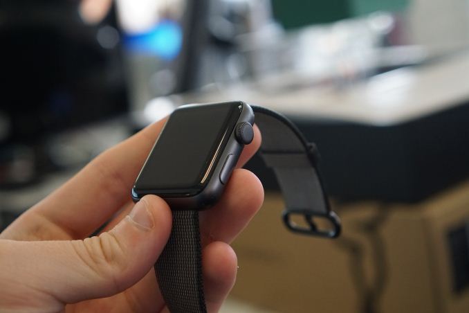
While there are some physical changes like the increased thickness, the overall aesthetics of the Apple Watch Series 2 are the same as the first generation. Although Apple has changed the functionality of the controls in watchOS 3, the watch retains the Digital Crown and action button on its right side. The Digital Crown is Apple’s solution to the problem of touch input on a smartwatch covering up all the content on the screen. It can be used to scroll vertically or horizontally through screens and individual menus, as well as to zoom when contextually relevant. In the context of a rectangular watch this is definitely the best solution I’ve seen so far, but Samsung’s Gear S3 definitely deserves a mention for applying a similar concept to their round watch where the bezel around the screen can be rotated to navigate through the UI. For users who have never had a chance to interact with the Apple Watch, it’s worth mentioning that the Digital Crown isn’t controlled like a knob by pinching it with two fingers and rotating. It has just the right amount of friction to allow rotation by rolling your finger across the top of it, without also running into problems with it being accidentally triggered.
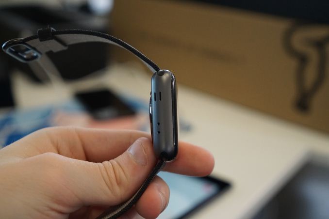
The left side of the chassis has a pair of vertical slits, as well as two drilled holes. Like the first Apple Watch, the slits are for the watch’s internal speaker, which provides much better audio quality than you’d expect from such a tiny device. As for the two drilled holes, the second hole did not exist on the original Apple Watch and was something of a mystery when Series 2 first launched. The original Apple Watch generally did a good job of capturing the user’s voice, but there’s always room for improvement and so I originally assumed that it was for a second noise-cancelling microphone. However, the hole is actually a barometric vent to allow accurate measurements of altitude even with the Series 2’s more waterproof design. Apple does not explicitly advertise that the Series 2 comes with a barometer, but teardowns of the watch have confirmed that it includes one.
Like the original Apple Watch, the casing of the Apple Watch Series 2 comes in three different materials. Unlike the original, these are only segmented into two product lines rather than three. With the first Apple Watch, the aluminum models were the Apple Watch Sport, the steel model were just called Apple Watch, and the gold models were Apple Watch Edition. For Series 2, Apple has consolidated the aluminum and steel models under the Apple Watch title, and the Apple Watch Edition is now a white ceramic model priced at $1249 for 38mm and $1299 for 42mm. $1249 is still quite a bit more than the entry-level aluminum Series 2 model which is $369, but it’s substantially less than the $10,000 starting price of the gold Edition model.
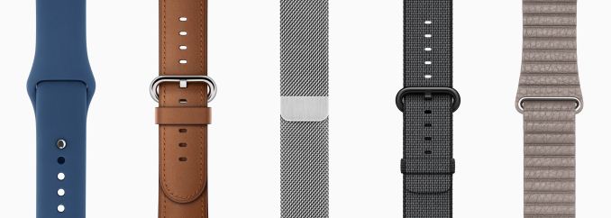
From left to right: Sport, Classic Buckle, Milanese Loop, Woven Nylon, Leather Loop
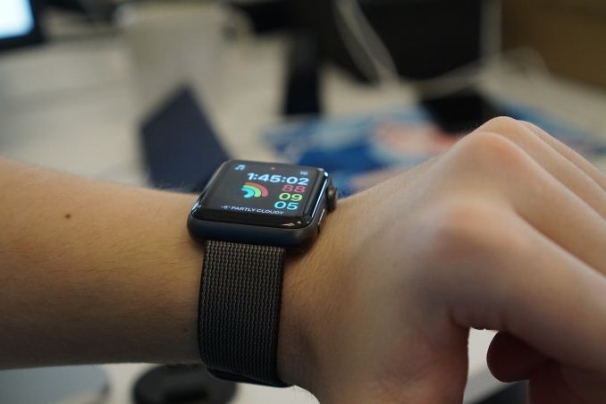
While the case provides one half of the Apple Watch’s design, the watch bands provide the other. The Apple Watch launched with a large selection of bands, and that selection has grown over time. Our original Apple Watch review was based on the 42mm steel Apple Watch with the silver Milanese Loop band. For this review the watch I was given came with the black Woven Nylon band, which is a newer band that didn’t exist at the time the original model was launched.
To be quite honest, I’m not a huge fan of the Woven Nylon band for the Apple Watch. My original Apple Watch that I bought for investigating app development and familiarizing myself with the operating system was a first generation Apple Watch Sport with a black Sport Band. At a visual level, there’s nothing that’s really wrong with the nylon band, and it’s not uncomfortable to wear. What I dislike about it is the fact that it doesn’t go well with Apple Watch Series 2’s improved waterproofing, because it absorbs water, which makes it unsuitable for activities where the watch will be submerged as the band will be unpleasantly damp for a long period afterward. The sport band didn’t absorb water, and in fact, any water on its surface would drop off within a matter of seconds.
The Woven Nylon band also isn’t holding up as well as my Sport Band did, with the stitching becoming worn at the edges as well as where the plastic pin passes through the holes in the band to complete the loop. I would suggest opting for the model with the Sport Band when purchasing the Apple Watch, and if you’re looking into additional bands, I think the Classic Buckle, Leather Loop, and Milanese Loop bands are nice steps up from the Sport Band without breaking the bank. Series 2 is also completely compatible with existing bands, so if you’re upgrading from the previous model you don’t need to buy new bands unless you're also changing the size of the case.
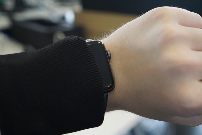
Smartwatches are not compatible with winter clothing
Apple Watch Series 2 carries on the same design as the original model. If you’re not a fan of wearing a watch, or you didn’t like the original Apple Watch’s design, Apple Watch Series 2 isn’t going to do anything to change your mind. If you’re a fan of Apple’s design direction with the Apple Watch, then Series 2 will keep you happy. Based on Apple’s history I don’t think it will be surprising to see them aggressively drive down the thickness of the case in a later version, but right now the battery life constraints of a smartwatch mean that this sort of form-factor and case size won’t be going away in the near future.




126 Comments
View All Comments
negusp - Tuesday, December 20, 2016 - link
IMO, I think the wearable craze for premium wearables has/is fading quickly. Full-fledged smartwatches are simply not attractive to the normal consumer.When you can spend $50 for an entry level wearable that lasts for a few days, reports the time, measures fitness activity, why purchase a $400 Apple Watch that only has the benefits of a screen and GPS (which your phone is for)?
Ironchef3500 - Tuesday, December 20, 2016 - link
+1GodHatesFAQs - Tuesday, December 20, 2016 - link
I was never interested in any wearables, but now almost everyone in my family is. This Christmas most people bought Apple Watches. Not sure what the appeal is.Lolimaster - Tuesday, December 20, 2016 - link
Let the doctor tell them about the problem with their necks, fad gone.tipoo - Tuesday, December 20, 2016 - link
I havn't followed this segment much at all - what are the 50 dollar wearables that do all that? That would be far more in impulse buy territory, I think they have some utility, but not 350+USD utility.
ianmills - Tuesday, December 20, 2016 - link
xiaomi mi band 2 is $40 is a possibility https://www.cnet.com/products/xiaomi-mi-band-2/rev...name99 - Tuesday, December 20, 2016 - link
That's not even a fitness tracker, it's basically a digital pedometer.Does it provide notifications? Voice control? Phone call support? Remote control of a phone camera? etc etc?
You're pointing to a bicycle and claiming it does the same thing as a Harley Davidson.
Cygni - Tuesday, December 20, 2016 - link
Good analogy, but remember that the vast majority of people already have a car (smartphone) that does everything a Harley can do but better. Ergo most people dont want to fork out big bucks Harleys. They do, however, want cheap bikes.heffeque - Wednesday, December 21, 2016 - link
This. Simply this.easp - Tuesday, January 3, 2017 - link
Yes, and most people had a computer that did everything a smartphone did, better, except fit in their pocket.