The Meizu PRO 6 Review
by Matt Humrick on August 26, 2016 8:00 AM EST- Posted in
- Smartphones
- Mobile
- MediaTek
- Meizu
- PRO 6
Display
The PRO 6, like its predecessor the PRO 5, uses an SAMOLED display made by Samsung, which means a diamond PenTile subpixel layout; however, this is less of a problem for the PRO 6’s smaller 5.2-inch (versus 5.7-inch) FHD (1920x1080) display. Text looks a bit sharper on the PRO 6’s display compared to the PRO 5, although its effective resolution is still lower than 5.5-inch 1080p LCD panels. Still, most people should not be bothered by the PRO 6’s PenTile layout.
The PRO 5’s display is definitely its weakest link. Besides the resolution deficit, it suffers from a cool white point and lacks a proper sRGB mode. Fortunately, the newer version of Meizu’s Flyme OS installed on the PRO 6 adds several display presets that are analogous to the ones Samsung includes with its Galaxy phones. The “Standard” preset is a proper sRGB mode, while “Colorful” and “Photo” take advantage of the OLED display’s wider gamut to display more saturated colors. Meizu still includes a color temperature slider for fine tuning the white point too.
To see how each of these modes perform, we’ll use an X-Rite i1Pro 2 spectrophotometer for color measurements and an i1Display Pro colorimeter for brightness and contrast measurements. SpectraCal's CalMAN 5 software will crunch the data and generate graphs.
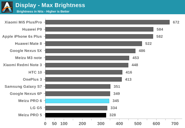
Most of the phones with AMOLED displays, including the PRO 6, reach a peak brightness of about 350 nits at 100% APL when using the manual brightness mode. Only the OnePlus 3 clears 400 nits, which is still significantly less than what LCDs are capable of. With an APL of 50%, the PRO 6 reaches 397 nits, which again is fairly typical. Brightness drops all the way down to just 3 nits at the slider’s minimum position.
The PRO 6 includes a boost feature for auto-brightness mode, which the PRO 5 lacks, that increases peak brightness to 436 nits at 100% APL and 512 nits at 50% APL in bright conditions. This is a welcome addition that improves outdoor visibility; however, the PRO 6’s boosted brightness falls short of other phones with this feature, including the Motorola Moto Z (504 nits) and Samsung’s Galaxy S7 (532 nits) and Galaxy Note5 (566 nits), all at 100% APL. It’s not clear if this is a hardware limitation or if Meizu is just being conservative.
Like all phones with AMOLED panels, which have the ability to completely turn off individual pixels, the PRO 6 has a black level equal to zero and a mathematically infinite contrast ratio.
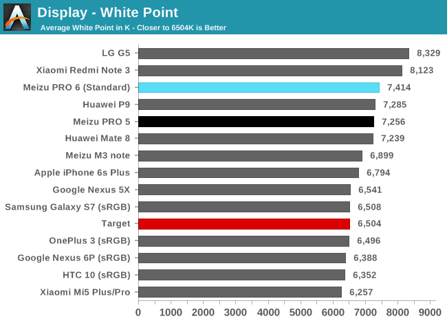
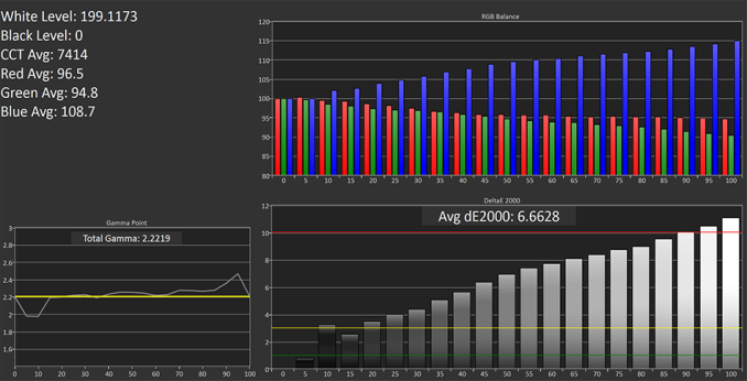
The PRO 6 adopts a cool white point just like the PRO 5 and other phones aimed at the Asian market, with all three modes—Standard, Colorful, and Photo—falling right around 7,400 K. The excess blue output combined with slightly more red than green gives the PRO 6’s screen a purplish tint that’s most noticeable when viewing shades of gray and an all-white background.
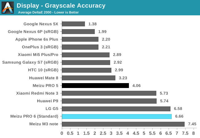
The PRO 6’s grayscale accuracy suffers from this RGB imbalance, placing it next to the LG G5 in the chart above. Its average ΔE2000 error is also worse than the PRO 5’s and 2x to 3x higher than the sRGB modes of other flagship phones, with error levels remaining above the threshold value of 3, where error is noticeable but considered acceptable, over almost the full luminance range, finally peaking at a value around 11 at 100% luminance.
The PRO 6’s default grayscale performance is disappointing. It does have a slider control for adjusting the white point, however, that shifts its average color temperature to 8,268 K at the slider’s coldest setting, resulting in a similar average ΔE2000 error of 6.53, and to 6,229 K at the warmest setting, which drastically improves its average grayscale error to 1.82.
Adjusting the slider until the display closely matches the D65 white point target of 6,504 K improves grayscale performance dramatically (click the button labeled “Standard (Calibrated)” above). Its average grayscale ΔE2000 error drops to 2.15 and only exceeds a value of 3 above 90% luminance. There’s still a small deficit in the green primary, though, so white backgrounds still show a hint of purple.
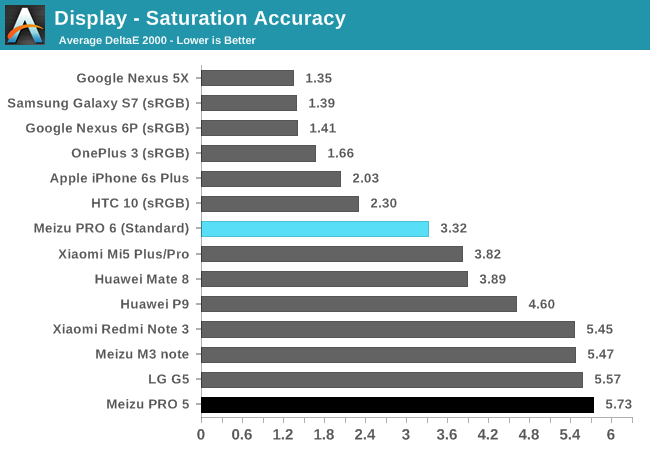
The PRO 6’s Standard display mode does a good job covering the sRGB color space. Shades of red are a little undersaturated and the cool white point pulls shades of cyan towards blue at lower saturation levels. The largest ΔE2000 errors for all colors occur at saturation levels below 50%, but the average error of 3.32 is pretty good.
Red, green, and yellow shades show improvement when using the custom white point slider position in Standard mode. Blues are less saturated, however, and the cyan and magenta secondary colors show a larger hue shift, but the average ΔE2000 saturation error drops to only 2.57, with only cyan exhibiting significant errors above the target threshold of 3.
The Colorful mode displays the widest color gamut and the most richly saturated colors, with all three primaries generally falling 10% to 20% above the sRGB target boxes. Average ΔE2000 saturation error increases to 5.96 because of the wider gamut and different primary color targets. Error levels hover between 5 to 8 for most colors with 100% red peaking to more than 12, although this matters little if you just prefer more vivid colors which this mode delivers.
The Photo mode matches up pretty well with the Adobe RGB color space. Because only the green primary target extends beyond sRGB, the Photo mode ends up being a compromise between Standard and Colorful, producing highly saturated greens and cyans like the Colorful mode, but accurate reds and blues like the Standard mode. You can see how the PRO 6’s Photo mode performs relative to both sRGB and Adobe RGB above; however, adherence to Adobe RGB is moot because of Android’s lack of color management.
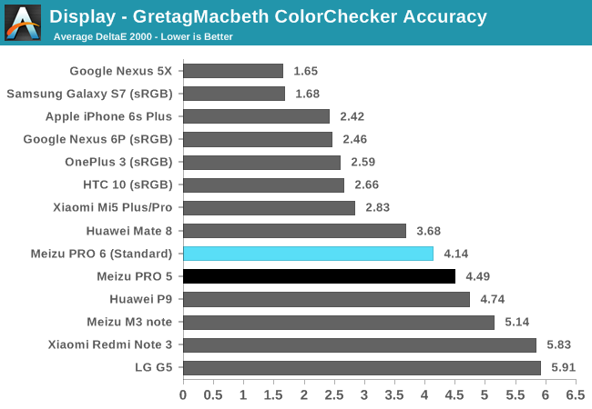
The PRO 6’s Standard sRGB mode fails to deliver the same color accuracy as other flagship phones. Its overly cool white point is partially to blame. Adjusting the white point slider to the “calibrated” position reduces average ΔE2000 error from 4.14 to a respectable 2.70, which is similar to the HTC 10.
Meizu is heading in the right direction by including multiple display modes that cater to varying tastes; however, the PRO 6’s display still falls short of other flagship phones. The default settings and calibration result in a cool white point that reduces color accuracy and gives the screen an obvious purple tint. Fortunately, Meizu also includes a slider for adjusting the white point, which corrects some but not all of the display’s deficiencies. When adjusted properly, the PRO 6’s display looks pretty good and is a definite improvement over the PRO 5, but we’d like to see Meizu put more effort into calibrating the RGB balance and improving screen brightness.




48 Comments
View All Comments
osxandwindows - Friday, August 26, 2016 - link
Where is the HTC10 review?arsjum - Friday, August 26, 2016 - link
All some of you guys do is complain. What is it about HTC 10 that you don't know yet? This to me is a much more interesting review, a different product.Besides, why don't you use Joshua's Twitter account to ask for an update instead of hijacking a different product's review section?
MrSpadge - Friday, August 26, 2016 - link
+1I'm really getting tired of all those guys asking (demanding?) a review of some other product. As if the current one was not worth talking about.
theduckofdeath - Monday, August 29, 2016 - link
I think it's fair to question a former great review site's inability to produce reviews lately. They do after all have comment sections to hear from the few readers they have left.Arnulf - Friday, August 26, 2016 - link
Hey, stop complaining!Notmyusualid - Saturday, August 27, 2016 - link
Hold on to your internet ladies!The guy is likely asking for the review, as Anandtech is THE place for smartphone reviews, and he is obviously interested in making said purchase.
Not too difficult to understand, no?
jtang97 - Sunday, August 28, 2016 - link
It's a valid question.The phone has been out for several months and still no review. Other newer phones have been released and reviewed and yet the HTC 10 review is still pending.
How are people supposed to make in informed choice on which phone to get when Anandtech doesn't release one of the better phones of 2016.
You've got all the benchmarks and photo/video comparisons and yet you still withhold releasing the review. Some people might start to think that you are paid to deliberately delay the review so that people will buy other phones instead of the HTC 10.
So. it is perfectly reasonable to ask about the HTC 10 review each time a newer phone is reviewed. There should be no reason the HTC 10 review is delayed by 3 months and counting.
Dennis Travis - Tuesday, August 30, 2016 - link
Where is the iPhone 3GS review? :D Grin I have been waiting for years for it! hahahahhahafanofanand - Wednesday, August 31, 2016 - link
Don't be silly, all Apple product reviews are copy and paste jobs from the last review. "Best ever, no reason to buy anything else" etc. ad nauseam.Fidelator - Wednesday, September 14, 2016 - link
I agree completely, I seriously feel they got paid off, the 10 is quite honestly a far more important and relevant product than say, this(no offense to Meizu). And quite possibly one of very best phones released this year and here we are waiting for their review.Now just wait for the review talking about how great was Apple's choice on killing the 3.5mm jack