The Meizu M3 Note vs. Xiaomi Redmi Note 3 Review: Comparing Notes
by Matt Humrick on July 12, 2016 8:00 AM EST- Posted in
- Smartphones
- Mobile
- Xiaomi
- Meizu
- Redmi
Design
It’s increasingly difficult to find phones made entirely from plastic anymore. Aluminum unibody construction, once reserved for only the most expensive flagships, is almost as common as fingerprint sensors now, with even lower-priced phones readily adopting the technique. The M3 note, Redmi Note 3, and the Honor 5X we previously reviewed are all examples of this trend.
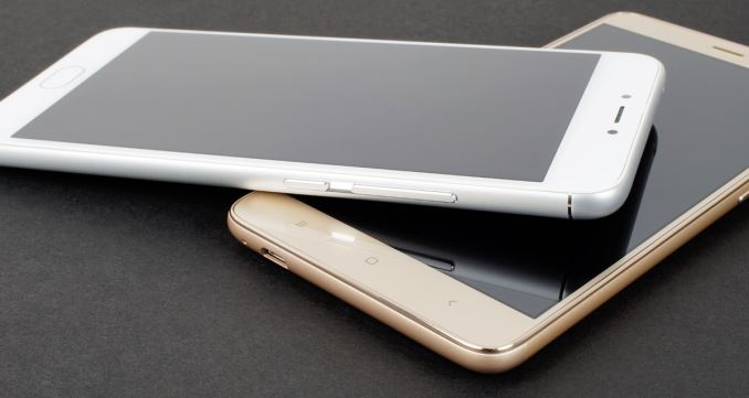
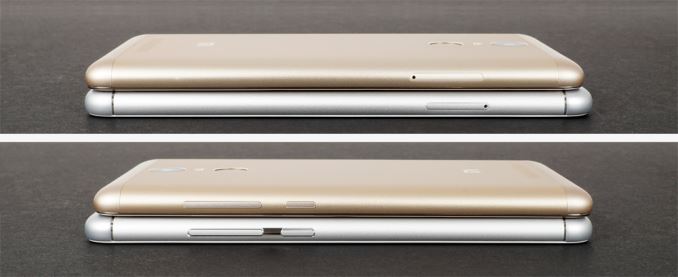
The M3 note follows the same design language as the more expensive MX5 and PRO 5. It’s aluminum chassis has a smooth, sandblasted texture with curved edges on the back and generously radiused corners that make it comfortable to hold. The Redmi Note 3 follows the same formula, giving it a similar in-hand feel. It does not feel quite as sturdy as the M3 note, however. Its chassis flexes just a little more and there’s an occasional creak, although it’s not enough to be a real concern.
The front of each phone is covered in edge-to-edge glass. The Redmi Note 3 has a shiny plastic lip around the perimeter that’s raised above the glass. This helps protect the screen when the phone is sitting face down on a table, but it reduces the smoothness of edge swipes and feels scratchy when placed against the ear during a phone call. The M3 note avoids these issues by blending the front glass into the sides with a small radius.
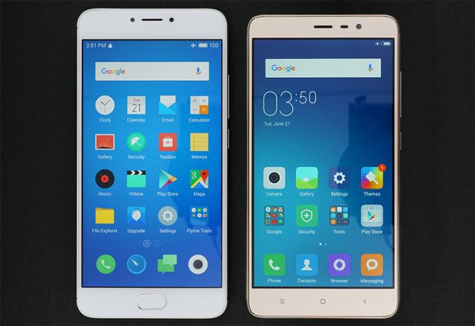
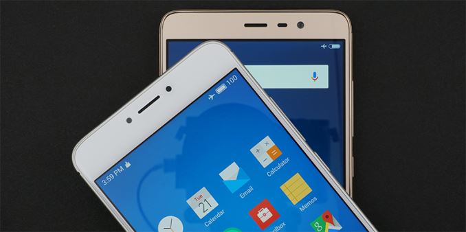
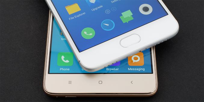
Both phones are similar in width and have reasonably narrow side bezels, but while the M3 note shows only a very thin black border around the screen, the Redmi Note 3’s black border is noticeably thicker—thick enough to be distracting during normal use. The Redmi Note 3 (150.0 mm) is distinctly shorter than the M3 note (153.6 mm), and even the Honor 5X (151.3 mm), because of its smaller upper bezel, although this does nothing to improve one-handed use as its lower bezel is about the same size as the others.
Both phones have relatively small earpieces centered above the screen, making it difficult to hear phone conversations if the earpiece is not perfectly aligned with the ear. The M3 note’s earpiece is flanked by its front-facing camera on the left and a combined ambient light/proximity sensor on the right, creating a nicely-aligned, symmetrical layout. A white notification LED is hidden below the front fascia to the right of the ambient light sensor. Xiaomi scorns symmetry and places the Redmi Note 3’s sensors, front-facing camera, and hidden multi-colored notification/charging LED all to the right of the earpiece.
These two phones handle UI navigation differently, which the button layout below the screen reflects. The M3 note has a pill-shaped home button that also functions as a fingerprint sensor and capacitive button. There’s no free play, and it still works when pressed off center with a positive click. Unlike many other phones with a physical home button, the M3 note does not place capacitive buttons to either side, which we’ll discuss more in the software section. In comparison, the Redmi Note 3’s lower bezel is more traditional. From left to right, there’s capacitive buttons for recent apps, home, and back. The buttons are backlit, but are not very bright, and the order cannot be changed.
Both phones place the sleep/wake button and single-piece volume rocker just above the midpoint on the right edge within easy reach. All of the buttons produce a nice, solid click, and are stiff enough to prevent accidental presses when picking up the phone, but there’s just a little more free play in the M3 note’s buttons. Each phone’s card tray sits opposite the volume rocker on the left side.
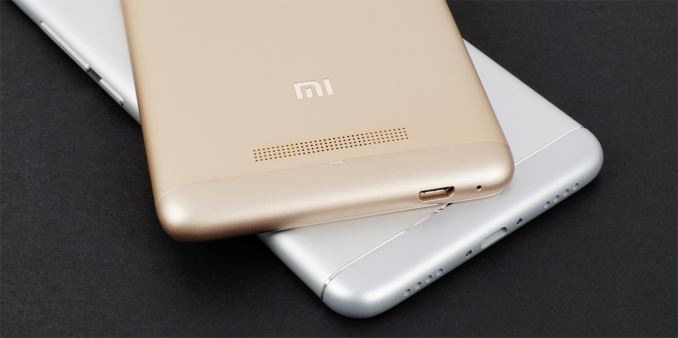
There’s a 3.5mm headphone jack and a noise-cancelling microphone on the top of each phone. The Redmi Note 3 also has a small window for its IR blaster. We see some big differences again when looking at the bottom of the phones. The M3 note uses a symmetrical layout with two sets of holes flanking a central microUSB port. Its single speaker sits behind the right grille, while the primary microphone sits behind the left. Once again Xiaomi shuns symmetry, placing its microphone and microUSB port in the left corner. This placement could lead to compatibility issues with some third-party docks/peripherals that are designed for a central port.
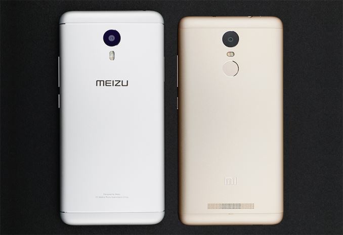
Flipping the phones over we see that both rear cameras are centered within a circular black surround with polished accent and sit flush with the flat aluminum back. Both phones also hide their antennas behind plastic caps at the top and bottom of the phone instead of incorporating plastic antenna lines like we usually see on all-metal phones. The color and texture of the caps closely match the metallic finish on the back, although there is some color variation when viewed from different angles or in certain lighting conditions. Meizu adds some decorative flair to the M3 note by machining some polished slots into the chassis, effectively hiding the seam between the aluminum back and plastic caps.
Unlike the M3 note, the Redmi Note 3’s fingerprint sensor is on the back. This is currently the most common location, although the ideal placement is a matter of personal preference. Placing the sensor on the back puts it within easy reach of the index finger when holding the phone, but it also eliminates the possibility of using it to unlock the phone when it’s resting on a table. The Redmi Note 3’s external speaker is also on the back underneath a series of small holes near the bottom.
While these phones are similar in materials and construction, they each communicate a different design language. Meizu makes heavy use of symmetry, beveled cover glass, and more complicated machining—the concave groove for the buttons on the side and the polished slots on the back—to help elevate the M3 note’s look and feel to flagship levels. Xiaomi’s styling for the Redmi Note 3 is more traditional, with a raised plastic lip around the screen and fixed capacitive buttons below. The Redmi Note 3 also lacks the symmetry and machining flourish of the M3 note. While I personally find the M3 note more visually appealing, neither phone looks or feels cheap. Even the color options—silver with white front, dark gray with black front, and gold on gold for the Redmi Note 3 and gold on white for the M3 note—are subtle and classy looking.





79 Comments
View All Comments
Pissedoffyouth - Tuesday, July 12, 2016 - link
I have a Redmi Note 3 and I generally get >8h SOT over 2 days. I LOVE LOVE LOVE this phone.It's just a pity they can't stick bigger batteries in phones that cost 3x as much
Le Geek - Tuesday, July 12, 2016 - link
I know right!!! I too have the same phone and never have I gotten a sot less than 9 hrs. This device is turning out to be the best Tech purchase I've ever made. Cheers!!ddriver - Tuesday, July 12, 2016 - link
They can, just don't want to.JeffFlanagan - Tuesday, July 12, 2016 - link
They don't want to because it would be a bad choice. This way people who want a bulkier phone with longer battery-life can get a battery-case, and people who want a thinner phone at the cost of battery-life can skip the case. The alternative is a bulky phone that's only appealing to people who need a larger battery, so have to put up with a larger device.TechnikalKP - Wednesday, July 13, 2016 - link
The iPhone 6+ is 7.3mm thick. The Redmi Note 3 is 8.6mm. That's less than the thickness of a US dime.close - Wednesday, July 13, 2016 - link
Bulky? Compared to what? Compared to the thinnest flagships maybe. But compare it to anything any normal person would consider acceptable and it's nowhere near bulky. I've never heard anyone saying "oh I wish this phone wasn't so bulky" when talking about normal phone thickness in the past years. Battery complaints though? All the time. What's the ideal thickness? The S6 Edge was 7mm while the S7 is 7.7mm. So adding 10% to the thickness didn't raise any eyebrows.Yes, putting a bigger battery would be a bad choice for all kinds of ignorant people thinking that a battery case is the same as adding an extra mm to the thickness of the phone and also for phone manufacturers who know that a battery that barely lasts a day when new will push you to get a new phone when the battery is 2 years old and you spend most of the day tethered to an outlet.
Spunjji - Thursday, July 14, 2016 - link
Agreed with this. My Nexus 5 was almost useless to me after 18 months; by 2 years I was charging it 2 or 3 times a day. I can't believe for a second that one or two additional millimeters for 10 to 25% additional battery capacity would have been a bad choice for that device, what with it being very thin already and having a stupid camera bump.Battery cases are a terrible solution - they are restricted to a single device, add unnecessary bulk and increase the complexity of charging.
Impulses - Thursday, July 14, 2016 - link
I was on the same boat, recently decided to open it up and swap the battery as I'm keeping it until the next round of Nexus at year'd end. I hope even the next 5" model goes for at least a 3000mAh (and/or wireless charging)... Otherwise I might be looking at larger phones which I've resisted all these years.Bulat Ziganshin - Wednesday, July 20, 2016 - link
The new battery for Nexus4 costs me $10 at aliexpressImpulses - Thursday, July 14, 2016 - link
A battery case isn't really comparable, or even a viable choice I'd argue. They're only made for a handful of flagship models, and they add a lot more bulk relative to the battery life you gain (and compared with phones that have larger batteries and are just a mm thicker)... You can't honestly be serious.