Hands-On With the Android N Developer Beta: Multi-Window & More
by Brandon Chester on March 10, 2016 8:00 AM EST- Posted in
- Smartphones
- Android
- Mobile
- Tablets
Initial Impressions
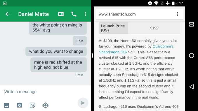
Though I suspect it's not a popular opinion, I have long felt that the software design ecosystem for Android tablets has been stuck in a rut since the early days, and as a result users have struggled to find good, modern applications that really excel at the tablet experience. Android N can't magically bring proper tablet interfaces to all Android apps, but the Multi-Window support is a big help in improving the situation. With split windows in use, on a standard tablet you're really dealing with a screen segmented into two areas, and this is where a phone layout works pretty well. With that in mind, it does help to address the problems that Android tablets currently face, but I do hope that developers will continue to maintain existing tablet UIs, and that new developers will take the time to create ones. I don't know if Google's internal app development groups are prepared for this, but I have faith in the larger Android's developer community.
It's worth noting that the Multi-Window mode technically also works on phones. That said, unless you have a 6.8" phone (which is practically a tablet), I don't think the feature is very useful, but it's there. Even on the Nexus 6 there's just not enough screen space, and I would never use it myself. That said, while I was initially ttempted to recommend that Google just remove the feature on phones, on reflection it doesn't really hurt anyone to have it there for users that want it. On top of that, leaving it to tablets alone may cause some developers to just not support the feature entirely.
Google also has an advantage with Android apps already being designed to support many resolutions and aspect ratios. Several apps that I tried already worked with the split screen mode, and developers aren't going to have to rebuild their UIs like they did when Apple introduced split screen multitasking on iOS. In fact, it's most certainly the case that there are more apps that work with Android N's multitasking than there are that work with multitasking on the iPad, and considering that the feature just launched today in a beta OS I'd say that's a big win for Google and for Android.
If I were to make any recommendations for Google, it would be to make it a bit more obvious to the user that you can hold down the multitasking button inside an app to instantly get into split view mode. I happened to come across it because I figured that Google would have implemented some sort of quick access method, but it's not obvious enough for your average user. In addition, I think the current method of simply filling the view with the background color as you adjust the ratio between apps is not very aesthetically pleasing. These apps still aren't really designed to adjust their UI in real time, and although it's somewhat lame to just blur it out like Apple does on iOS, it looks better than watching the UI frantically try to fill the space.

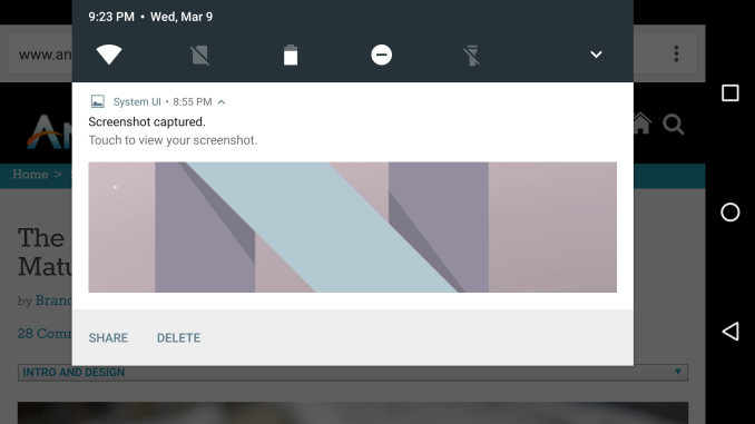
Quick toggles are easier to access in Android N
As for Google's other changes, I think they're in line with what we've come to expect. After Lollipop, Google was able to step back and focus on the lower level problems with their platform, particularly regarding efficiency. The improvements to Doze will certainly have an impact on energy usage, and blocking apps from waking up in large numbers whenever the phone goes on or off of WiFi is a smart move. I expect that we'll see continued improvement of this sort in future Android releases, as problems with energy management are potentially the biggest problem plaguing the platform right now, with performance and usability having been mostly sorted out. These releases also provide a way for Google to make small improvements to areas like notifications and their built in applications to make the user experience a lot better through many little changes.
On that note, I'm sure many of our more technical readers are interested in being part of the beta. I'm very happy that Google has taken the necessary steps to make the process of enrolling in the program much easier for developers and users. Right now the supported devices include the Pixel C, Nexus 9, Nexus 5X, Nexus 6, Nexus 6P, and Nexus Player. To enroll your device in the beta you can visit this link and your device will quickly notify you that an update is available. It does need to be reiterated that this is a developer beta and a true beta at that - it's not a large-stage end-user beta - but I would encourage enthusiasts who do enroll to consider sending some feedback to Google about what they like and what could be improved, as that's ultimately what these beta programs are all about.
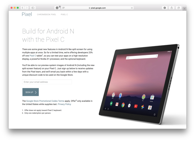
One last thing to note is Google's incentive for developers to test their apps on tablets so they can ensure proper Multi-Window support. For a limited time developers can sign up here to get a promo code which will knock 25% off the cost of the Google Pixel C. With Google recently having patched the most serious bugs on the Pixel C, for $375 it's a pretty good tablet and a very good device for doing application testing considering the fact that the Android N beta only works on two tablets. Interested developers can sign up here, and Google is seemingly taking people on faith that they really do intend to use the unit for development as it only involves entering your email address.
With Android N being in its early stages, I must say that I'm impressed with the stability and usability of the features that Google has added. With Google IO on the horizon we'll certainly be hearing more about what's coming in Android N, and I'm very excited about the direction Google is headed in.


124 Comments
View All Comments
arsjum - Thursday, March 10, 2016 - link
"Though I suspect it's not a popular opinion, I have long felt that the software design ecosystem for Android tablets has been stuck in a rut since the early days, and as a result users have struggled to find good, modern applications that really excel at the tablet experience."I suspect that's actually a very popular opinion and justifiably so. :)
ImSpartacus - Thursday, March 10, 2016 - link
Yeah, no one like android tablets.People can tolerate oversized phone-like devices like the Nexus 7, but not legitimate tablets.
nathanddrews - Thursday, March 10, 2016 - link
Personally, I can't tolerate anything but a x86 Windows tablet. I feel much more comfortable knowing that I can do anything and everything that I need to do from work or play without being trapped by a walled garden. If I have to, I can emulate Android with BlueStacks (like I did to play games like Fallout Shelter) and the experience is so much smoother and better than any other native Android device that I have used.ddriver - Thursday, March 10, 2016 - link
Cuz nothing beats the user experience of a classical windows desktop application on a high resolution small screen tablet :)nathanddrews - Thursday, March 10, 2016 - link
I really like the 1280x800/1366x768 10" format that most budget tablets use. My preference is 1080p in a 12-13" as it strikes a great balance, but I'm not willing to spend that kind of money for something that I throw around and abuse like I do. Even my large fingers can type quickly and close browser tabs with ease. It's a much better experience to me than iOS/Android.darkich - Thursday, March 10, 2016 - link
For $250 you can buy a 2K 10" Android tablet that will, as a matter of fact, provide you with a vastly better screen for video, reading, gaming(touch-oprimised games, you know) and browsing.But yeah, go enjoy your "superior tablet experience" with a 1280x800 screen.
lexluthermiester - Thursday, March 10, 2016 - link
There is nothing wrong with 1280x800 screens. An 8" or 7" IPS screen at that resolution works very well. But I have a 12" Dell with that res screen that looks just fine. A 10" 2k screen is very nice looking, sure, but the GPU has to work harder to push that many pixels which drains that battery. So all in all that a good resolution. Don't be so spoiled.djayjp - Thursday, March 10, 2016 - link
I guarantee you that once you have a truly pixel indistinguishable screen device, you'll never look at those low res devices the same again. You'll find it rather hideous (assuming you do not require reading glasses).metayoshi - Saturday, March 12, 2016 - link
Why don't you get a Surface 3 or wait for a Surface 4 (non-pro) if/when it comes out? I'm in the same boat as you: my preference for tablets is a Windows x86 tablet, like the Surface 3 I'm using to type this comment. I used to have the Acer Iconia W4, which was 1200x800 and admittedly a pretty decent Windows tablet at the time, but the 1920x1280 Surface 3 is a vastly superior experience. The Microsoft built keyboard cover also makes a great addition, as it makes typing for longer bouts much better, but if you don't need to type too much, detaching the keyboard and stowing it away is easy. With the Acer and other 3rd party Windows tablets, you'd need a separate Bluetooth keyboard, which I also had for a time, but it wasn't as convenient as the Microsoft type cover. Some OEMs also provide their own keyboards, but I still feel like none have matched the quality of the keyboard from Microsoft. The full sized USB 3.0 port is also a godsend, as you don't need a micro USB to USB-A connector and you can just plug in anything and everything that already works in normal Windows. It's just much better and worth the little bit of extra money over the really low end budget Windows tablets. Not quite Surface Pro level, but a great middle ground between too cheap and high end.Lolimaster - Thursday, March 10, 2016 - link
Sorry but 16:9 is pure sh*t aside from media consumption. 16:10 or even better 3:2 all the way.